How Player Psychology Shapes Every Game UX Decision
-

Written byDenys Zadoienyi
-

Updated on08.06.2026
-

Time to read22 min

- Why Generic UI Approaches Fail the Player’s Brain
- The Flow Channel: Balancing Challenge and Skill Through Interface Design
- Cognitive Load Is the Invisible Enemy of Player Retention
- How Reward Loops Should Work—and Where Most UX Art Gets It Wrong
- Visual Feedback as a Psychological Signal: What Art Direction Actually Controls
- Applying Player Psychology Principles in Practice: A Production Checklist
- The Psychology Brief That Most Studios Are Not Writing
- From Psychology to Production: What Choosing a UX Partner Actually Requires
- About Nasty Rodent
A game can have spectacular world design, a tight combat loop, and a technically flawless build—and still lose players in the first hour. Not because the mechanics are broken. Because the interface creates friction the player quickly perceives as exhausting or disruptive.
“Editorial illustration created for visual reference purposes. It does not represent a real project, client work, or official software screenshot unless stated otherwise.”
This is where player psychology in game UX stops being a theoretical discipline and becomes a production-critical one. The decisions an art director makes about a HUD element’s opacity, the speed of a feedback animation, the timing of a reward—all of these are psychological decisions as much as aesthetic ones. And when they are made without a cognitive framework behind them, they tend to produce the same failure: players who gradually disengage, not because they stopped finding the game interesting, but because the interface slowly exhausted them.
This article is a practical guide to the three psychological mechanisms that matter most in game UX: flow state, cognitive load, and reward loops. It explains what each one actually does in the player’s brain, how it maps to concrete interface decisions, and what happens to player retention when it is handled poorly.
Player psychology in game UX is the applied study of how cognitive and motivational processes—perception, attention, memory, and emotion—interact with the interface and mechanics of a game to produce engagement, immersion, and continued play. Informed by applied game UX research and the cognitive science brought into the industry by specialists such as Celia Hodent, it treats the UX not as a visual layer but as a system for managing mental load and shaping moment-to-moment player states.
Why Generic UI Approaches Fail the Player’s Brain
The assumption that “clean and minimal is always better” is one of the most persistent misreadings of cognitive science in game interface design. It comes from product UX, where the goal is to reduce friction so users complete tasks as quickly as possible. In games, that framing is wrong from the start.
A game interface has to manage a fundamentally different cognitive contract. Players are not trying to complete a task efficiently—they are trying to stay immersed in a state of active engagement. Sometimes that means the interface needs to pull back entirely. Sometimes it needs to be present and prominent, giving the player real-time information that allows them to act and feel competent. The right answer depends entirely on what psychological state the player is in at that moment.
The problem with generic UI approaches—templates applied without context, visual hierarchies borrowed from mobile productivity apps, feedback systems copied from games of different genres—is that they ignore this dynamic. They treat the interface as a static layer rather than a responsive system that tracks the player’s cognitive state and adjusts accordingly.
Consider what happens in a high-intensity combat sequence in an action RPG. If the UI is designed for a casual navigation moment—sparse, quiet, unobtrusive—it fails the player, because they need fast access to resource readouts, action cooldowns, and positional awareness. Conversely, the same combat UI applied to an inventory management screen or a narrative cutscene sequence creates visual noise that competes with the player’s attention and breaks immersion.
This is the first principle that player psychology brings to game UX: context determines information priority, and information priority should determine interface state. Designing for “any context” means designing well for none of them.
Game UX specialist and cognitive scientist Celia Hodent, who led UX at Epic Games during Fortnite’s development and has contributed multiple sessions to the GDC Vault on the neuroscience of player experience, frames the UX mandate this way: the interface must account for the brain’s limitations in perception, attention, and memory—not by simplifying everything, but by aligning information delivery with the cognitive state the design is trying to sustain. That is a meaningfully more precise brief than “keep it clean.”
The Flow Channel: Balancing Challenge and Skill Through Interface Design
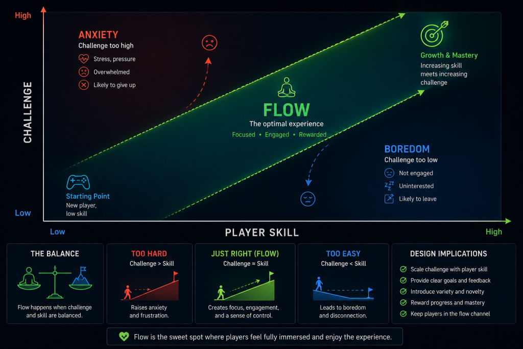
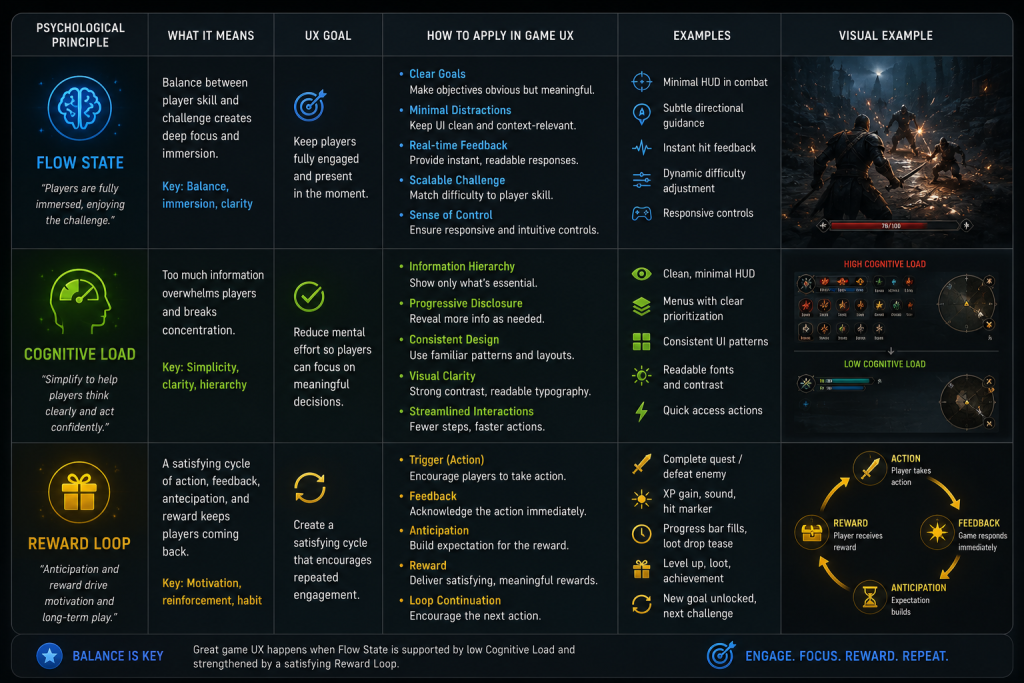
Flow state is the psychological condition in which a player is operating at the exact intersection of their current skill level and the challenge the game is presenting. It is not a vague metaphor for “being really into a game.” It is a specific, documented mental state characterized by deep concentration, loss of self-consciousness, distortion of time perception, and a sense of effortless control—the kind of immersion where someone looks up from a session and discovers that two hours passed in what felt like twenty minutes.
The concept was developed by psychologist Mihaly Csikszentmihalyi and has since been extensively applied to game design. What makes it directly relevant to UX work is this: flow is fragile, and the interface is one of the primary points at which it gets disrupted.
The flow channel is typically visualized as a corridor on a graph between anxiety (challenge exceeds skill) and boredom (skill exceeds challenge). Maintaining a player in that corridor requires two things from the design: progressive difficulty calibration from the game mechanics, and interface transparency from the UX layer. Those two requirements have to work together. A perfectly calibrated difficulty curve delivers nothing if the interface is constantly pulling the player’s attention away from the game state.
Interface elements that disrupt flow typically do so in one of three ways. First: misplaced salience. An element that is visually prominent when it carries no urgent information trains the player’s eye to ignore it—and when the element does carry urgent information, it fails to register. Second: friction at state transitions. When the interface introduces loading screens, modal interruptions, or un-skippable animations at moments when the player’s intent is to act, it breaks the concentration loop that sustains flow. Third: inconsistency between interface language and game state. If the visual feedback for an action does not match the expected response—if a successful hit produces a quiet, unremarkable effect—the player receives a signal that their action either did not register or did not matter. Both destroy the sense of competence that flow depends on.
The game Tetris Effect is frequently cited in UX analysis for the precision with which its interface supports flow maintenance. As players enter deeper concentration and blocks fall faster, the visual elements of the game progressively simplify—background animation intensifies but never demands attention, score indicators update peripherally without requiring conscious processing, and feedback intensifies with performance without interrupting focus. The interface is doing active work to preserve the psychological state, not simply presenting information neutrally.
God of War handles state transitions with similar intentionality. As the player approaches a combat area, the interface subtly shifts: it prioritizes combat-relevant information while reducing non-essential environmental prompts. When combat ends, the reverse happens. The interface anticipates psychological state changes and prepares the player for them, reducing the cognitive friction of transition.
The UX implication for art direction is significant. Flow state preservation is not solely a game design responsibility—it requires every visual element of the interface to earn its presence. An art director working on HUD design for a mid-core action title needs to be asking, at every element: does this belong in the player’s visual field during a flow moment? If it does not carry information the player needs to act, or sustain the emotional quality of the experience, it is creating cognitive debt. The same principle applies to environmental visual design: when the 3D environment art carries narrative and spatial information that the HUD would otherwise need to display, the interface can recede—and flow deepens.

“Editorial illustration created for visual reference purposes. It does not represent a real project, client work, or official software screenshot unless stated otherwise.”
The professional game UX design agency work that actually holds players in flow tends to share one characteristic: the interface team had a psychological brief, not only a visual brief.
Did you know that…?
fMRI studies measuring brain activity during gameplay found that the striatal reward circuits—the same dopaminergic pathways involved in processing wins and losses in real life—respond significantly more strongly when a player is actively controlling the game than when watching identical gameplay as a passive observer. The difference isn’t in what happens on screen. It’s in whether the player’s actions are causing it. This is precisely why visual feedback timing and clarity matter so much from a psychological standpoint: the brain’s reward response is contingent on the player feeling that they produced the outcome — not that the game delivered a show while they watched.
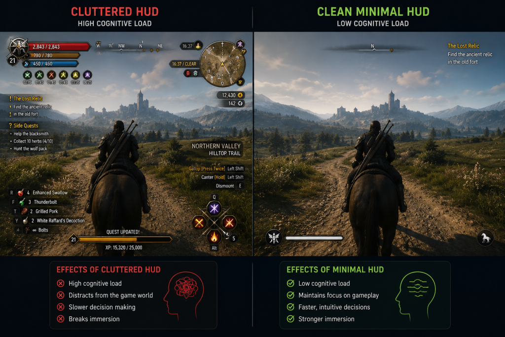
Cognitive Load Is the Invisible Enemy of Player Retention
Cognitive load is the measure of mental effort required to process information in working memory. Working memory is the cognitive system that holds and manipulates information in the short term—what you are actively thinking about at a given moment. Its capacity is highly limited and context-dependent: cognitive science research generally estimates it can process around four chunks of information at a time before performance begins to degrade.
In game UX, cognitive load is typically discussed in terms of “how much information is on screen.” But that framing undersells the problem. Cognitive load accumulates from everything the player’s brain has to interpret, remember, and decide simultaneously: the game state, the interface readouts, the control scheme, the current objective, the spatial model of the environment, and the emotional arc of the narrative. The HUD is one input in that stack, not the whole picture.
There are three types of cognitive load that matter to interface design:
Intrinsic load is the complexity native to the game itself—the rules, the systems, the mechanics. A deep strategy game has high intrinsic load; a reflex-based platformer has lower intrinsic load for most interactions. This is largely fixed by the game design, and the UX cannot change it.
Extraneous load is the load introduced by poor design decisions—unclear icons, inconsistent visual language, interface elements that require interpretation before they can be acted upon. This is entirely the UX’s responsibility. Extraneous load is load the player should never have had to bear.
Germane load is the cognitive work the player is doing to build understanding of the game’s systems—learning a new mechanic, internalizing a new enemy type’s behavior, forming a mental model of a new map. This type of load is productive; it is the work of becoming better at the game. The UX should support it rather than compete with it.
The mistake that generic interface approaches make most often is adding extraneous load under the belief that they are managing intrinsic complexity. A cluttered HUD does not help a player manage a complex game—it adds a second layer of complexity on top of the first. The art director and UX lead have a shared responsibility to audit for extraneous load in every review pass.
“Editorial illustration created for visual reference purposes. It does not represent a real project, client work, or official software screenshot unless stated otherwise.”
Concrete indicators of excessive extraneous cognitive load in a game interface:
- Players consistently fail to notice critical information that is visibly present on screen.
- New players require significantly more time to form accurate mental models of basic systems than design intent anticipated.
- Player frustration correlates with specific interface moments rather than with game difficulty spikes.
- Playtesting reveals that players are spending more visual attention on the interface than on the game world.
Managing cognitive load in practice means applying progressive disclosure—introducing information and mechanics in layers tied to player readiness, rather than presenting the full system at once. It means building consistent visual language: if a color carries a meaning in one context, it must carry the same meaning across all contexts. It means designing for chunking—grouping related information into single visual units the brain can read as one item rather than several. In character-driven games, this extends to how 3D character design communicates role and threat level through silhouette and color coding alone, reducing the interface’s burden at a glance.
At the level of AAA production, where interface systems interact with narrative systems, progression systems, and live-service content simultaneously, cognitive load management is not a design-phase consideration—it is a continuous audit responsibility that runs across the production pipeline.
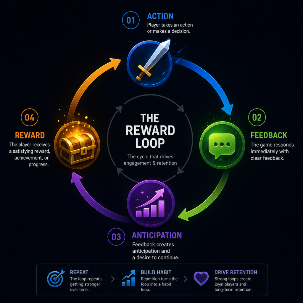
How Reward Loops Should Work—and Where Most UX Art Gets It Wrong
The phrase “dopamine hit” has become nearly meaningless in game design discourse. It is applied to every feedback event indiscriminately, and in doing so it obscures what is actually happening in the player’s brain—and what the interface actually needs to do to support it.
A GDC session aptly titled “Throwing Out the Dopamine Shots: Reward Psychology Without the Neurotrash” makes this point precisely: the neurochemical framing has produced a generation of reward systems designed around intensity rather than meaning, frequency rather than context. The result is feedback loops that feel hollow, or worse, manipulative—and players who burn out on them quickly.
What the underlying psychology actually describes is more nuanced. Reward processing in the brain distinguishes between anticipation and receipt of a reward. The motivational charge—the thing that drives continued engagement—is largely produced during the anticipation phase, not the moment of receipt. This means the design of a reward loop is not primarily about making the reward feel spectacular at the moment it arrives; it is about structuring the activity cycle so that the anticipation phase is legible, meaningful, and appropriately timed.
A well-structured reward loop has three elements: a clear action the player takes, immediate and proportional feedback that confirms the action registered and produced a meaningful result, and a reward that feels earned relative to the investment. When any one of these elements is weak, the loop degrades.
“Editorial illustration created for visual reference purposes. It does not represent a real project, client work, or official software screenshot unless stated otherwise.”
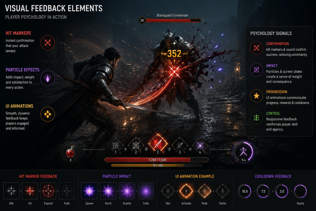
The feedback element is the one most directly controlled by UX art and animation. And this is where a significant amount of game UX work goes wrong: the visual feedback system is treated as a VFX deliverable rather than a psychological signal system.
The distinction matters. A VFX deliverable is evaluated for visual quality, technical performance, and stylistic consistency. A psychological signal system is evaluated for whether it successfully communicates to the player: your action registered, it had this magnitude of effect, and it moved you toward or away from your goal by this amount. Those are different specifications, and they require different thinking in the art review pass.
Consider a weapon impact system in an action game. A hit marker that is visually impressive but takes 120 milliseconds to appear has already weakened the feedback loop—the player’s sense of cause and effect has moved on by the time the signal arrives. Response delays above roughly 100 milliseconds become noticeable in fast interactive contexts; at frame-rate latency the response feels immediate, but the key threshold is perceptual: the player must feel that the game responded to them, not that it caught up. These are not aesthetic specifications; they are cognitive ones, and they should be in the production brief.
Variable reward scheduling—the principle that unpredictable rewards produce stronger sustained engagement than predictable ones—is often misapplied in game UX as a license to make feedback inconsistent. This is a misreading of the psychology. Variable reward schedules work in specific contexts: primarily in the anticipation structure of loot systems, not in moment-to-moment gameplay feedback. Moment-to-moment feedback must be consistent. The unpredictability that sustains engagement belongs to reward magnitude and timing at the macro loop level, not to the microinteraction layer.
The reward loops that sustain long-term player retention—the kind measured in D1/D7/D30 retention metrics and session frequency—tend to be nested. Short loops (completing a combat encounter, solving a puzzle) provide frequent feedback and sustain moment-to-moment engagement. Medium loops (completing a quest, advancing a character build) provide the sense of meaningful progress. Long loops (unlocking a story chapter, reaching a competitive rank) provide the aspirational horizon. The UX has an obligation to make all three loop levels legible: the player should be able to read, at any point, where they are in each loop and what the next beat looks like.
Visual Feedback as a Psychological Signal: What Art Direction Actually Controls
Everything discussed above—flow state maintenance, cognitive load management, reward loop clarity—converges on a single production domain: the visual feedback system. The visual feedback layer is where the psychological brief becomes a deliverable, and it is where art direction makes decisions that are psychological decisions whether they are framed that way or not.
Visual feedback, in the context of player psychology, means every visual response the interface produces to a player action or a game state change: hit confirmation, health change indicators, resource collection effects, damage received responses, objective updates, status effect visualizations, environmental hazard signaling, and narrative progression cues. Each of these is a psychological event. Each one communicates something to the player’s brain about the state of the game and the efficacy of their actions.
“Editorial illustration created for visual reference purposes. It does not represent a real project, client work, or official software screenshot unless stated otherwise.”
The art direction brief for visual feedback should contain, at minimum:
- Magnitude mapping: how does visual intensity scale with the importance of the event? A critical hit and a glancing blow should not feel the same.
- Timing specification: what is the maximum acceptable latency for this feedback event? This should be specified in milliseconds, not described as “fast.”
- Hierarchy: when multiple feedback events occur simultaneously—as they frequently do in combat-heavy games—which ones take visual priority? The answer cannot be “all of them,” because that answer produces visual noise that overwhelms the player and erodes the signal quality of every individual event.
- Consistency protocol: which visual elements carry fixed meanings across all contexts, and which are context-variable? This should be documented in the UX style guide, not left to individual artist judgment in production. As practitioners working across different game genres have noted, maintaining cross-device and cross-context consistency is one of the persistent challenges in game UI/UX design—and one that compounds quickly when the visual brief and the psychological brief are not aligned from the start.
The relationship between visual feedback quality and player psychology is direct: players whose actions produce clear, proportional, well-timed feedback feel competent and in control. Players whose actions produce delayed, disproportionate, or inconsistent feedback feel uncertain, frustrated, or disconnected from the game world. Competence is one of the three basic psychological needs identified in Self-Determination Theory—alongside autonomy and relatedness—as foundational to sustained intrinsic motivation. An interface that consistently undermines the player’s sense of competence is eroding the motivational foundation of their engagement, regardless of how good the underlying game is.
The game concept art services brief and the UX brief need to share a common vocabulary around this: visual hierarchy, signal magnitude, and feedback timing are concepts that belong in both, and they need to be aligned before production begins, not reconciled in review.
At Nasty Rodent, when we approach a UX design project, the first question we ask is not what the interface should look like—it is what cognitive state the player should be in at each interface moment, and what the visual layer needs to do to support or sustain that state. That framing changes the brief considerably. It means feedback animations are specified with timing constraints from the start, not adjusted in polish. It means visual hierarchy decisions reference the flow model, not just aesthetic preference. And it means that art review passes include a psychological signal audit alongside the style guide check.
This is the standard that AAA-level UX art actually demands. It is not the standard that most outsource briefs are written to—and that gap is where sessions of rework tend to originate.
Applying Player Psychology Principles in Practice: A Production Checklist
The psychological principles described above translate into a concrete set of production checkpoints. The following matrix is designed as a working reference for art directors evaluating UX deliverables against psychological criteria, not only aesthetic or technical ones.
“Editorial illustration created for visual reference purposes. It does not represent a real project, client work, or official software screenshot unless stated otherwise.”
| UX Layer | Psychological Principle | Production Check | Red Flag |
| HUD & Readouts | Cognitive load management | Is every visible element carrying information the player needs to act right now? | Elements present during high-focus moments that carry no actionable data |
| Visual Feedback | Flow state maintenance | Is feedback timing under 100ms for all moment-to-moment gameplay events? | Feedback latency above 100ms; feedback absent for any player-initiated action |
| Reward Signalling | Reward loop clarity | Does visual reward magnitude scale proportionally with reward importance? | Critical rewards and minor rewards receive similar visual treatment |
| Interface State | Player state responsiveness | Does the interface modulate between combat-mode, exploration-mode, and narrative-mode states? | Static interface that does not adjust to game state transitions |
| Onboarding | Progressive disclosure | Are mechanics introduced in layers tied to player readiness rather than all at once? | Core systems explained in tutorials before the player has context to understand them |
| Visual Language | Consistency protocol | Does every color, icon, and animation carry the same meaning across all contexts? | Visual elements that change meaning between screens or game modes |
The Psychology Brief That Most Studios Are Not Writing
The practical gap between knowing these principles and applying them in production is not primarily a knowledge gap. It is a brief-writing gap.
Most game UX briefs are written in visual and functional language: the HUD should display these six elements, the feedback should look polished and satisfying, the menus should be clean and easy to navigate. These are necessary specifications. They are not sufficient ones, because they do not tell the interface team what psychological outcomes the design is required to produce.
A psychological UX brief adds a second layer of specification alongside the visual one. It describes the intended player state at each interface moment: what the player should be feeling, what cognitive state they should be in, what their sense of agency should be. It specifies the psychological success criteria—not just “the feedback looks great” but “the player receives confirmation that their action registered within 80 milliseconds, the magnitude of the effect is legible from the feedback animation, and the experience of seeing it reinforces rather than disrupts their concentration.”
Writing briefs at that level of specificity requires the art director and UX lead to have done the cognitive science homework. It requires them to understand the flow model not as a vague aspiration but as a practical framework: what disrupts flow, what restores it, and what the interface is responsible for in that cycle. It requires them to understand the difference between extraneous and germane cognitive load—and to be able to distinguish, in a review pass, whether a piece of feedback that feels confusing is confusing because the player is learning something difficult or because the design is creating unnecessary ambiguity.
The studios that consistently produce interfaces that hold players are the ones where this homework has been done before the brief is written, not after the review reveals problems. That investment in the psychological framework pays forward into every subsequent deliverable on the project. It is also, practically speaking, what determines whether an outsourced UX team can deliver work that integrates cleanly into the production pipeline—or whether every review cycle turns into a renegotiation of the underlying specification.
From Psychology to Production: What Choosing a UX Partner Actually Requires
The principles outlined in this article define what rigorous game UX work actually demands of the teams producing it. They also define what a studio should be looking for when evaluating a UX partner.
A game UX partner that understands player psychology will approach a project brief with specific questions: What is the target player state during each major gameplay segment? How is cognitive load distributed across the session arc? What is the reward loop structure, and how does the visual feedback system map to it? These are not questions that can be answered from a style reference sheet alone. They require a shared vocabulary between the studio’s design team and the UX partner.
The alternative—outsourcing UX art to a team that delivers visually strong work without the psychological brief—produces a predictable outcome: beautiful interfaces that do not hold players, beautiful feedback systems that undermine rather than reinforce the reward loop, beautiful menus that add cognitive load instead of removing it. Beautiful work that misses the psychological specification is expensive rework waiting to happen.
The right partnership begins with aligning on the psychological brief before a single wireframe is drawn. It means the partner team can articulate the flow state implications of a HUD decision, not just its visual qualities. It means the art review pass includes cognitive criteria alongside aesthetic ones—and that the partner team can respond to both. For studios who want to go deeper on the production side of these decisions, our game art blog covers additional topics across UX, 3D production, and art direction practice.
For studios building mid-core or AAA games where player retention is a measurable production goal, the psychological layer of the UX brief is not optional. It is where the interface either earns its place in the experience or silently erodes the engagement that every other production discipline worked to create.
If your next project needs a UX team that works from a psychological brief, not just a visual one—reach out to Nasty Rodent for a UX discovery call with our senior art lead. In 30 minutes, we can assess whether our approach fits your pipeline and identify where the psychological UX brief for your game currently has gaps. No commitment required.
About Nasty Rodent
Creating seamless player experiences and captivating visuals requires a team that truly understands player behavior. At Nasty Rodent, we blend behavioral psychology with high-end execution to deliver premier game UI/UX design services and stunning 3D art production. From minimizing cognitive load in complex interfaces to crafting immersive environments that drive retention, our studio ensures your game is as engaging as it is beautiful. Explore our expertise and our production cases to see how we can elevate your next project.