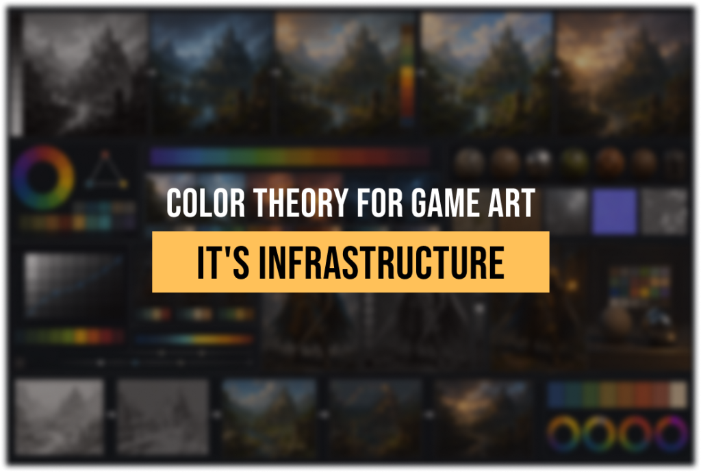
Color Theory for Game Art: Production Application from Value Study to Engine
-

Written byDenys Zadoienyi
-

Updated on24.06.2026
-

Time to read22 min
- What color theory in game art actually means — and what it doesn’t
- Why value hierarchy comes before any color decision
- What a color script is, what it contains, and who owns it
- Color harmony in production: when rules apply and when they don’t
- Where color drift enters the pipeline — and how to identify it early
- Technical matrix: color theory from mood board to PBR delivery
- Color language: how palette decisions encode narrative without dialogue
- The four places color breaks down on outsource projects — and how to close them
- How to build a color-stable brief for an outsource partner
- About Nasty Rodent
Color theory for game art is the discipline that connects a mood board on day one of pre-production to a pixel-accurate texture in the engine on delivery day — and most projects treat it as decoration rather than infrastructure.
The result is predictable. A concept artist builds a palette that communicates exactly the right mood. A 3D modeler interprets it generously. The engine’s tone mapping shifts it further. An outsource team working on the third milestone never saw the original color script. By vertical slice, the team is having uncomfortable conversations about why nothing quite coheres — and the answer is almost always the same: color decisions were made intuitively at every stage instead of being held accountable to a documented system.
This guide is not about the color wheel. It is about what happens in production: how value hierarchy gets established before a palette is chosen, what a color script actually contains and who owns it, where color drift enters the pipeline and how to close the gap, and how to write a color-stable brief — a production document designed to preserve palette, value, and color-language decisions across vendors — when you bring an outsource partner into the picture.
What color theory in game art actually means — and what it doesn’t
Color theory for game art is the applied practice of using the properties of color — hue, saturation, value, temperature, and harmony — to achieve three simultaneous production goals: readability (the player sees what matters), emotional coherence (the palette supports the narrative and tone), and technical stability (color choices survive the pipeline from concept art to PBR material to engine output).
The standard industry explanation of color theory describes a color wheel, names complementary and analogous schemes, and explains what warm and cool colors “feel like.” All of that is true. None of it is sufficient for production.
A senior art director on a production is not asking “what are complementary colors.” They are asking: does this value structure hold at gameplay camera distance? Does this color script communicate the emotional shift at the midpoint of the game without dialogue? Will this palette survive Lumen’s indirect lighting without losing its identity? Can an outsource team working from a PDF understand the difference between the three palette zones well enough to produce an environment set that doesn’t need a full lookdev pass before it integrates?
Those are the questions that production color theory answers. The fundamentals exist to support those answers — but they are the vocabulary, not the practice.
“Editorial illustration created for visual reference purposes. It does not represent a real project, client work, or official software screenshot unless stated otherwise.”
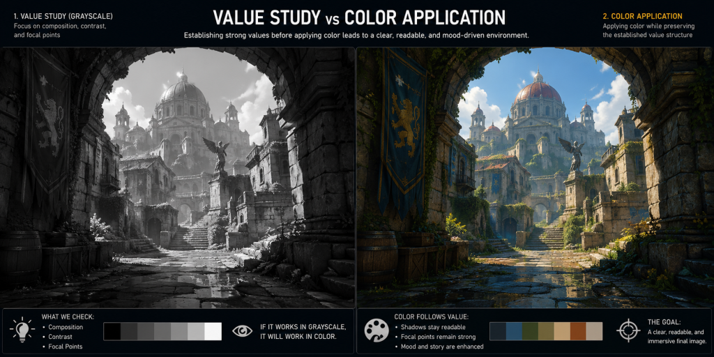
Why value hierarchy comes before any color decision
The most common mistake in game art color work is choosing a palette before establishing a value structure. Value — the lightness and darkness of any color — is what the player reads first. Hue is the second thing their eye processes; saturation is the third.
In practical terms, this means a strong grayscale composition will survive almost any palette choice. A weak grayscale composition will not be saved by interesting colors — it will be obscured by them.
The professional discipline is to resolve value before introducing color. This is not a stylistic preference. It is a production efficiency measure. When value structure is locked, palette decisions become replaceable without structural consequences. An art director can shift temperature, swap scheme, or adjust saturation without rebuilding the composition. When color and value are decided simultaneously, changing either one breaks the other.
In a mid-core or AAA production pipeline, value hierarchy operates at three scales simultaneously.
The first scale is the scene or environment level. The question is: what is the dominant value mass? Where is the player’s eye drawn first, second, and third? A well-designed environment has a clear focal hierarchy — the primary point of interest is the lightest or highest-contrast zone, and background elements sit comfortably in a mid-to-dark value range. This is not always literal; a darkly lit game like Miasma Chronicles can have a dark focal point surrounded by even darker surroundings, as long as the relative contrast holds.
The second scale is the asset level. Each character model, environmental prop, and hero asset needs its own value structure that reads clearly in silhouette before color is applied. This is where silhouette testing and value compression come in — an asset with values that are all bunched in the midtones will look flat regardless of how technically correct its materials are.
The third scale is the UI and HUD level, which is a different discipline but follows the same principle: interface elements need to occupy a distinct value territory from the environment so they remain readable without pulling the player out of the world.
The practical protocol in a production studio is to produce grayscale value studies during concept review before any palette discussion. The value study confirms that the composition, the focal hierarchy, and the depth reading are all working. Only after that stage does color enter the conversation — and when it does, it enters with a constraint already defined: whatever palette is chosen must preserve the value relationships established in the grayscale pass.
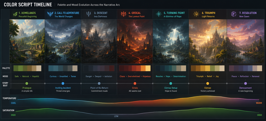
What a color script is, what it contains, and who owns it
A color script is a production document. It is a sequence of palette frames — small images, usually simplified environment thumbnails — that maps how the game’s dominant colors change across the narrative arc or across biome zones, levels, or act structures.
The color script originated in feature animation, where it was used to plan the emotional arc of a film in visual terms before any shots were finalized. In game production, the logic translates directly, but the implementation is more complex. A game may have a nonlinear structure, multiple biomes, a live-service cadence of new content drops, or a multiplayer environment where players experience the world in any order. Each of these contexts requires a different approach to the color script — but the underlying principle remains the same: color decisions should be planned at the project level before they are implemented at the asset level.
In practice, a color script for a mid-core game typically contains four elements.
The dominant palette per zone or chapter — a restricted set of three to five key hues that define the emotional territory of each area. These are not swatches; they are value-and-temperature relationships. A desert biome might be defined as “warm high-value dominance, with saturated orange-red accents and cool blue-gray in shadow zones,” not as a specific hex code.
A temperature arc — the overall shift in color temperature from one end of the game experience to the other. Many games move from warm to cool as narrative tension increases, or from desaturated neutral tones at the opening to progressively more saturated environments as the world expands. The color script makes this arc explicit so that individual assets and environments can be evaluated against it.
A saturation map — which palette zones are high-saturation, which are desaturated, and where accent colors are permitted. This is particularly important in outsource pipelines, where different artists working in parallel can independently drift toward oversaturation without a reference document.
A list of protected hues — colors reserved for specific gameplay functions. If red means danger and proximity indicators, red cannot be freely used as an ambient color in any environment without breaking the player’s readability training. These are the non-negotiable restrictions that the color script encodes.
“Editorial illustration created for visual reference purposes. It does not represent a real project, client work, or official software screenshot unless stated otherwise.”
Who owns the color script? In a well-functioning art pipeline, the art director owns the color script and is responsible for defending it at every milestone. Not reviewing it once at pre-production and filing it. Defending it — which means referencing it at concept reviews, running environment assets against it before LOD production starts, and calling out violations before they become batch problems.
A color script that exists as a single document produced in pre-production and never referenced again is functionally useless. Its value is entirely in the enforcement.
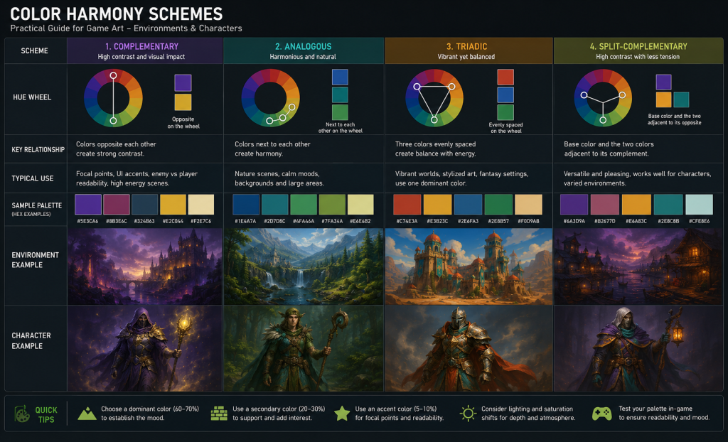
Color harmony in production: when rules apply and when they don’t
The complementary, analogous, triadic, and split-complementary schemes described in color theory textbooks are not production mandates. They are starting points for palette construction. A senior art director does not look at an environment and say “this should be a complementary scheme.” They build a palette that serves the emotional intent, the genre conventions, and the readability requirements — and then they verify that it has sufficient internal coherence to sustain variation across dozens or hundreds of assets.
That said, understanding why harmony schemes work is operationally useful. It explains why certain palette failures occur and how to diagnose them. As documented in color research published on Game Developer, color in games functions simultaneously as an identifier, an emotional signal, and a readability tool — and harmony schemes are the structural grammar that makes all three functions cohere.
“Editorial illustration created for visual reference purposes. It does not represent a real project, client work, or official software screenshot unless stated otherwise.”
Complementary schemes — colors opposite each other on the color wheel, like orange and blue — generate the strongest contrast. This is why they appear so frequently in fast-paced action games: the contrast accelerates reading speed, which is perceptually useful when the player needs to identify threats and interact with elements quickly. Overwatch’s character design is a widely cited use of complementary contrast at the asset level, where character colors are deliberately pushed against environment palettes to maintain foreground/background separation at any viewing distance.
Analogous schemes — adjacent colors, like green, yellow-green, and yellow — generate harmony at the cost of contrast. They are the correct choice for environments intended to feel natural, cohesive, or undisturbed. A forest biome with an analogous green-teal-amber palette feels visually settled. The production risk is that analogous palettes have low internal contrast and depend heavily on value differentiation to maintain readability. When saturation is pushed too high in an analogous scheme without value variation, everything blends.
Triadic schemes — three colors equidistant on the wheel — create a sense of visual balance with enough contrast to sustain complex scenes. They are often the choice for stylized games with distinct visual sections — a medieval zone, a technological zone, and a natural zone might each occupy one point of a triad, creating visual variety within a unified system.
The practical production lesson from all three: scheme choice should follow emotional function, not precede it. Decide what the environment needs to feel like. Derive the scheme from that decision. Do not select a scheme and then try to make an environment feel appropriate to it.
Did you know that…?
Color-script examples from feature animation — including Pixar productions like Coco, which are widely studied in art direction education — illustrate a consistent principle: scenes that feel visually rich often rely on a small set of dominant hues, with the apparent complexity coming from value variation and temperature modulation within that narrow palette. Game art teams working on AAA environment production regularly apply the same constraint: the goal is not more colors, but more variation within fewer colors. A palette of three well-chosen hues with disciplined value and saturation ranges will hold visual coherence across a 20-environment game; a palette of fifteen hues with no hierarchy will fragment visually within the first set of assets.
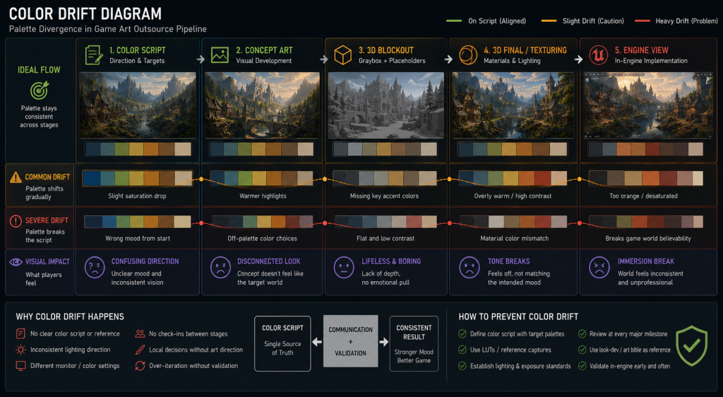
Where color drift enters the pipeline — and how to identify it early
Color drift is the gradual divergence between the color script and the actual color of production assets. It is the most common color-related failure mode in projects that use outsource teams, but it also occurs in internal production when color decisions are made locally rather than evaluated against the script.
Drift rarely announces itself clearly. It accumulates in increments. An environment artist makes the ambient light slightly warmer because it reads better on their monitor. A texture artist adds more saturation to a material because it looks flat in Marmoset Toolbag under neutral lighting. A character artist tightens the value range on a costume piece because it gets lost against the background in screenshots. Each of these decisions might be locally correct. Their cumulative effect is that the game looks different from what was planned — and the difference is noticed at integration, not at the asset level.
The four most common entry points for color drift are worth examining in sequence.
Concept-to-3D translation. Color scripts and mood boards are 2D. 3D assets rendered in Marmoset Toolbag under HDR lighting with physically-based materials will naturally shift in perceived hue and value compared to the concept painting. Without a deliberate calibration step — matching the 3D lookdev to the concept’s color intent — the shift accumulates across the asset list.
Tool-to-engine shift. Assets that look correct in Marmoset Toolbag or Substance Painter may shift significantly in the target engine under its specific lighting, tone mapping, and post-processing settings. Unreal Engine 5’s Lumen calculates diffuse indirect lighting through multi-bounce global illumination, which means reflected light carries the color of nearby surfaces — a phenomenon known as color bleeding. Shadow areas that read as neutral in Marmoset may pick up a chromatic tint in engine depending on what surrounds them. If the color script was validated against Marmoset previews rather than engine renders, the entire script may need recalibration at integration.
Batch production without shared reference. When multiple artists work on the same asset list simultaneously — a standard mode in outsource production — each artist interprets the color direction from their own understanding. Without a shared lookdev environment, calibrated reference HDRIs, and a documented palette with specific value ranges, the batch will diverge in ways that are visible at assembly.
Milestone-to-milestone decay. A color standard that was validated at milestone two becomes the implicit reference for milestone three without anyone formally re-verifying it. By milestone four, the implicit reference has shifted enough from the original script that drift is visible — but tracing it back to a specific decision point is difficult.
“Editorial illustration created for visual reference purposes. It does not represent a real project, client work, or official software screenshot unless stated otherwise.”
Identifying drift before it becomes a batch problem.
The most effective early-warning method is a periodic hero asset comparison. Pull three to five approved hero assets from different production stages and render them under identical conditions — same lighting setup, same engine settings, same camera position — and compare them side by side against the corresponding color script frames. If they track the script, the pipeline is holding. If they diverge, the divergence can be traced to the production stage where it entered.
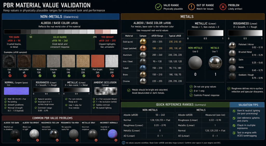
The second method is an albedo value audit. In PBR workflows, albedo values for non-metal materials should stay within a documented sRGB range — typically between 50 and 240, with most values clustering between 80 and 200. Textures that violate this range will respond incorrectly to engine lighting and introduce a visible inconsistency that looks like a color problem but is actually a value problem. Running a histogram check on texture batches at delivery is a ten-minute process that catches a disproportionate share of integration problems.
Technical matrix: color theory from mood board to PBR delivery
Understanding where each color decision gets made — and what technical constraints apply at each stage — is the foundation of a stable color pipeline.
| Stage | Primary Color Decisions | Key Constraint | Failure Mode |
| Pre-production / mood board | Dominant hue palette, temperature arc, saturation map | None — creative exploration | No documented output → nothing to enforce downstream |
| Color script | Per-zone palette frames, emotional arc, protected hues | Must be validated by art director | Script created but never referenced → decorative document |
| Concept art | Local colors per asset, value structure, color language | Must track color script palette zones | Artist interprets brief freely → individual assets diverge from script |
| 3D / lookdev | Material base colors, roughness/metallic calibration | PBR albedo validation for non-metals (sRGB 50–240); measured base-color references for metals per material category | Values out of range → lighting behaves incorrectly in engine |
| Texturing | Albedo, emissive, color grading in material | sRGB workflow for Base Color / Albedo; linear for data channels (normal, roughness, AO) | Wrong color space on data channels → material corruption |
| Engine integration | Post-processing, tone mapping, LUT calibration | All previous stages evaluated in actual engine lighting, not Marmoset | Marmoset-only validation → unexpected shift at integration |
| Outsource handoff | Color brief, palette reference, value range documentation | Vendor must have access to the same lookdev environment | Vague brief → vendor interprets independently → batch drift |
On PBR color constraints specifically: the physically-based rendering workflow that governs most current-generation games imposes hard limits on how dark or how bright base color (albedo) textures can be before they produce incorrect lighting behavior. A non-metal material with an sRGB albedo value below 50 will absorb too much light and appear unnaturally black under indirect illumination. A value above 240 will reflect too much and appear to float disconnected from the scene. Most production studios maintain a documented albedo value range per asset category — concrete reads differently than fabric, which reads differently than painted metal — and these ranges are checked at texture delivery, not during the final review.
“Editorial illustration created for visual reference purposes. It does not represent a real project, client work, or official software screenshot unless stated otherwise.”
This is color theory operating at the technical layer, not the aesthetic one. The choice of orange and blue as a complementary pair is aesthetic. The requirement that the albedo value for that orange surface tracks toward the 150–180 sRGB range appropriate for a bright warm material — rather than drifting down to the 50–80 range where dark earth and mud belong — is technical. Both are real constraints; both matter.
Color language: how palette decisions encode narrative without dialogue
Color language in game art is the systematic use of color to carry meaning that would otherwise require text, dialogue, or explicit player instruction. It is one of the most powerful tools available to an art director — and one of the least formally documented.
The most literal use of color language is gameplay communication: red means danger, green means health or safety, yellow marks interactive objects, cyan indicates objective markers. These are conventions that players learn in the first hours of play and apply automatically. Breaking them — even for aesthetic reasons — creates friction and reduces readability without any corresponding gain.
The more sophisticated use of color language is narrative encoding: using palette shifts to signal emotional territory, character arc, or world state without explicit exposition. A game environment that transitions from warm amber tones to cold desaturated blues as the player enters a hostile zone is communicating that something is wrong before a single enemy appears. A character whose costume gradually desaturates across a game’s three acts is showing, not telling, their psychological erosion.
The games that use this most effectively treat color as a scripted element with the same intentionality as dialogue. Inside — a game with almost no explicit narrative scaffolding — uses value contrast and selective color introduction so precisely that players understand the emotional arc of the entire experience through visual language alone. Journey communicates a progression from isolation to connection through a palette that moves from the warm amber of the desert to the cold blue of the mountain and back to warmth at the ending — a complete emotional arc expressed entirely through color.
In production, color language requires formalization to be usable. An art director who has a clear color language in mind but has not documented it cannot enforce it across a team of twenty artists and an outsource partner of thirty. The documentation does not need to be exhaustive — it needs to be specific enough that a senior artist can evaluate any new piece of work and make a judgment call about whether it respects the language.
A minimal color language document includes three components: the protected hue list (what each gameplay-functional color means and where it can be used), the narrative palette map (what the dominant colors of each zone communicate emotionally), and the prohibited combinations (pairs of colors that appear to conflict or cancel each other’s narrative meaning).
This document lives alongside the color script and is equally enforceable. It is the semantic layer of the color system; the color script is the structural layer.
The four places color breaks down on outsource projects — and how to close them
Concept art production and environment art production both depend on one thing that is rarely discussed explicitly: color direction that transfers. An internal art team builds color intuition over months of working together on the same project. An outsource partner walks in at milestone three with a PDF and has to reconstruct that intuition from documentation. The quality of that documentation is directly proportional to how much color drift the project will experience.
Gap 1: The mood board is not a brief. A collection of cinematic references communicates aesthetic aspiration, not production parameters. An outsource team looking at a mood board understands the feel the client is after, but they cannot extract the specific palette constraints, value ranges, or color language rules from it. The mood board needs to be accompanied by a simplified palette document that specifies: dominant hues, temperature direction, saturation range per zone, and at least three example assets with explicit notes on what is and is not working about their color.
Gap 2: Validation happens in the wrong environment. Outsource teams commonly validate assets in Marmoset Toolbag or Substance Painter under standardized HDRI lighting. If the target game uses a custom Unreal Engine 5 scene with Lumen and specific post-processing, the validation environment is wrong. The only reliable validation is in the target engine under the target lighting. This requires the outsource partner to have access to a build or a lighting scene from early in the project — a logistical investment that pays for itself in reduced revision rounds.
Gap 3: Color feedback is descriptive, not specific. “This looks too cold” is not actionable. “The shadow values on this surface are reading blue-green; they should read neutral gray with a slight warm shift to match zone 2 of the color script” is actionable. Art directors reviewing outsource work need to give color feedback in production language — value range, temperature direction, specific palette reference — not in qualitative terms that each artist will interpret differently.
Gap 4: The color brief is one-time, not living. A color document produced at the start of an outsource engagement and never updated is a record of what the game was supposed to look like before production revealed anything. Color decisions change during development — a zone gets redesigned, a time-of-day setting gets locked, a post-processing LUT gets implemented that shifts everything. The color brief needs to be updated at the same cadence as the production style guide. If it isn’t, the outsource team is working from stale direction.
“Editorial illustration created for visual reference purposes. It does not represent a real project, client work, or official software screenshot unless stated otherwise.”
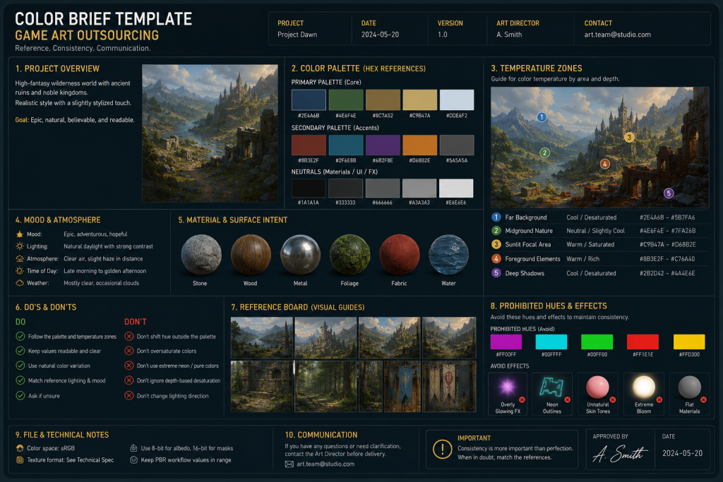
How to build a color-stable brief for an outsource partner
A color-stable brief is not a mood board, not a color wheel, and not a list of reference images. It is a production document that gives an outsource team everything they need to make locally correct color decisions that will integrate correctly with the internal pipeline.
The minimal structure of a color-stable brief contains five components.
1. The palette reference. Three to five key hues defined not as hex codes but as value-and-temperature descriptions — “warm mid-value amber as dominant, desaturated warm gray as filler, cool dark blue as shadow accent.” Hex codes are useful as tie-breakers but should not be the primary specification, because they describe a specific sRGB value rather than a tonal relationship.
2. The zone map. A labeled environment diagram showing which color palette applies to which spatial zone — foreground elements, midground structures, background sky and distance, interactive props, character-specific areas. The zone map makes clear that “this section of the environment should read warm” without requiring the outsource artist to make that deduction independently.
3. The value range table. For each material category in the asset list (stone, metal, fabric, wood, emissive), the acceptable sRGB albedo range. This is the most technical part of the brief and the most frequently skipped — and its absence is responsible for a significant proportion of integration problems.
4. The color language reference. A one-page summary of which colors carry gameplay meaning, which carry narrative meaning, and which are restricted. This prevents an outsource artist from using the danger-red in an ambient texture, or placing an interactive-yellow highlight on a non-interactive prop.
5. The validation environment. An Unreal Engine or Unity scene file, or at minimum a Marmoset scene file calibrated against the target engine output, so the outsource team can evaluate their work under correct conditions before delivery. ArtStation Learning’s course series on color scripts and production lighting covers this calibration problem in depth from the perspective of a working environment art team.
A brief that contains all five components takes one to two days to produce at the start of a project. It can materially reduce color-related revision rounds across milestones — the production trade-off is usually clear.
The investment is in documentation. The return is in first-pass approval rates — the metric that determines whether an outsource engagement runs smoothly or becomes an expensive revision loop. When we work with clients on environment art and concept art color development, establishing a shared color standard at the start of the engagement is among the most consistent predictors of whether the production runs on schedule.
About Nasty Rodent
Nasty Rodent is a game art outsourcing studio based in Tallinn, Estonia. We produce environment art, character art, concept art, and UX/UI for mid-core and AAA game productions.
The art direction principles described in this article reflect the production discipline our team applies across every client engagement. When color consistency across a long production cycle matters, the foundation is always the same: a documented color script, a calibrated lookdev environment, and a brief specific enough to be enforceable.
Our clients include Offworld Industries, The Bearded Ladies Consulting, Reburn, Whimsy Games, Galaxy 4 Games, and Benner Games. If you are working on a project where color coherence across concept, 3D, and engine needs to hold across multiple production milestones, get in touch.