Game UI vs UX: Differences That Matter for AAA Production
-

Written byDenys Zadoienyi
-

Updated on01.07.2026
-

Time to read12 min
- Why Treating UI and UX as the Same Word Backfires in AAA
- What to Actually Check Before You Greenlight a UI vs UX Split
- The Technical Matrix: UI Work vs UX Work in Production
- Where the Trap Hides: When UX Decisions Get Mistaken for UI Polish
- Why You Can’t Cut Corners on UX Ownership
- UI Artist, UX Designer, Art Director: Who Owns What
- How to Get the Split Right Without Burning a Milestone
- Game UI vs UX at a Glance
- How to Choose the Right Split for Your Project
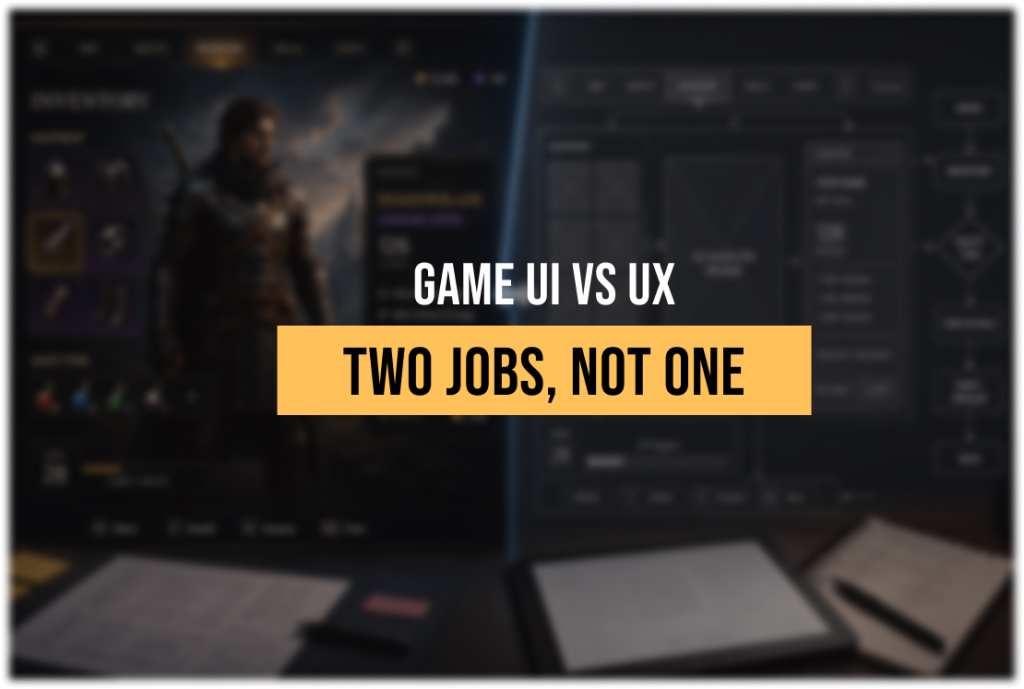
Game UI vs UX gets treated as one job title on too many art briefs, and that single decision is why HUD redesigns turn into late-stage rework on projects that had a perfectly good art bible from day one. UI is the interface layer the player perceives and interacts with. UX is the reasoning that decides what belongs on that layer, in what order, and why. Confuse the two on a hero asset spec and you’ll ship a beautiful menu that nobody can navigate under combat pressure – and find out during a vertical slice review, not before.
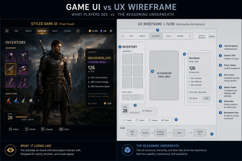
Game UI is the visual interface – buttons, HUD elements, menus, icons, and the diegetic, spatial, or screen-space layers a player perceives and interacts with. Game UX is the discipline behind it: the research, information hierarchy, and interaction design that shape the felt experience of moving through that interface – the player journey from “I see a menu” to “I found what I needed without thinking about it.” UI answers “what does it look like and where does it live.” UX answers “does the player understand it in three seconds, mid-firefight, without reading a tooltip.”
“Editorial illustration created for visual reference purposes. It does not represent a real project, client work, or official software screenshot unless stated otherwise.”
Why Treating UI and UX as the Same Word Backfires in AAA
If you’re an art director signing off on interface work, the failure mode is specific: you review a menu screen for style consistency – does it match the art bible, does the typography sit inside the visual target – and you approve it. Nobody checked whether the information hierarchy actually supports the player’s decision-making load in that moment. Style passed. Usability was never on the checklist, because “UI” absorbed both jobs on the brief.
That’s how a beauty shot can survive three lookdev passes and still fail the first closed playtest. The visual layer was correct. The reasoning behind the layout – what UX is supposed to own – was never separately reviewed, because the brief never separated it.
On briefs we scope for mid-core and AAA teams, this is one of the most common gaps: one line item called “UI/UX,” one deliverable, one review pass. UX gets folded into UI as an assumed byproduct instead of a distinct set of decisions with its own approval gate.
What to Actually Check Before You Greenlight a UI vs UX Split
Five checks separate a brief that treats UI and UX as one job from one that doesn’t:
- Is there a named owner for interaction logic, separate from whoever owns the visual style guide? If the same person signs off on both without a distinct usability pass, UX is being rubber-stamped, not reviewed.
- Does the wireframe stage happen before visual design starts, or does the team jump straight to styled mockups? Wireframes are where information hierarchy and onboarding flow get tested – skip them and you’re testing UX decisions on finished art, which is expensive to unwind.
- Is there a playtesting checkpoint dedicated to interface comprehension, not just bug-hunting? General QA passes catch broken buttons. They rarely catch “the player didn’t notice the objective marker changed.”
- Are accessibility requirements written into the UX spec, not bolted onto the UI pass at the end? Color-only state indicators, minimum readable text at target viewing distance, control remapping – these are UX-layer decisions, not late visual polish.
- Does the art bible cover interaction states, not just static screens? A style guide that only shows the “idle” version of a menu gives the UI artist nothing to work from for hover, error, or loading states – and those get improvised under deadline.
If two or more of these are missing on a brief, the project is likely treating UX as an assumption rather than a validated production step, and it will surface at the worst possible review – usually the one with a publisher or a milestone gate attached.
Did you know that…?
Usability heuristics for interface design predate modern game UI by decades – Jakob Nielsen’s original ten usability heuristics date back to 1994 and have been kept current through periodic updates since, and they still map directly onto HUD and menu design today, because the underlying cognitive load problem hasn’t changed, only the screen.
The Technical Matrix: UI Work vs UX Work in Production
| Parameter | UI Work | UX Work | Red Flags |
| Primary deliverable | Styled screens, icons, HUD art | Wireframes, flow maps, interaction logic | UX skipped straight to visual mockups |
| Owner | UI artist / 2D artist | UX designer / interaction designer | One person owns both with no separate review |
| Validation method | Lookdev pass, style guide match | Playtesting, heuristic evaluation | No comprehension testing before integration lock |
| AAA cost of error | Extra polish pass, style rework | Rework touches engine integration and gameplay logic | UX fix requested after engine integration is locked |
| Typical revision cycle | 1–2 rounds against art bible | 2–4 rounds against playtest data | Revisions treated as “UI feedback” and routed to the wrong owner |
The row that matters most for planning is the cost of error. A UI fix is a style pass – swap an icon, adjust a color, redo a panel. A UX fix discovered late usually means touching engine integration, because the interaction logic was already wired to gameplay systems by the time anyone noticed the flow didn’t work. That difference in blast radius is the real argument for separating the two disciplines on the brief, not just in the org chart.
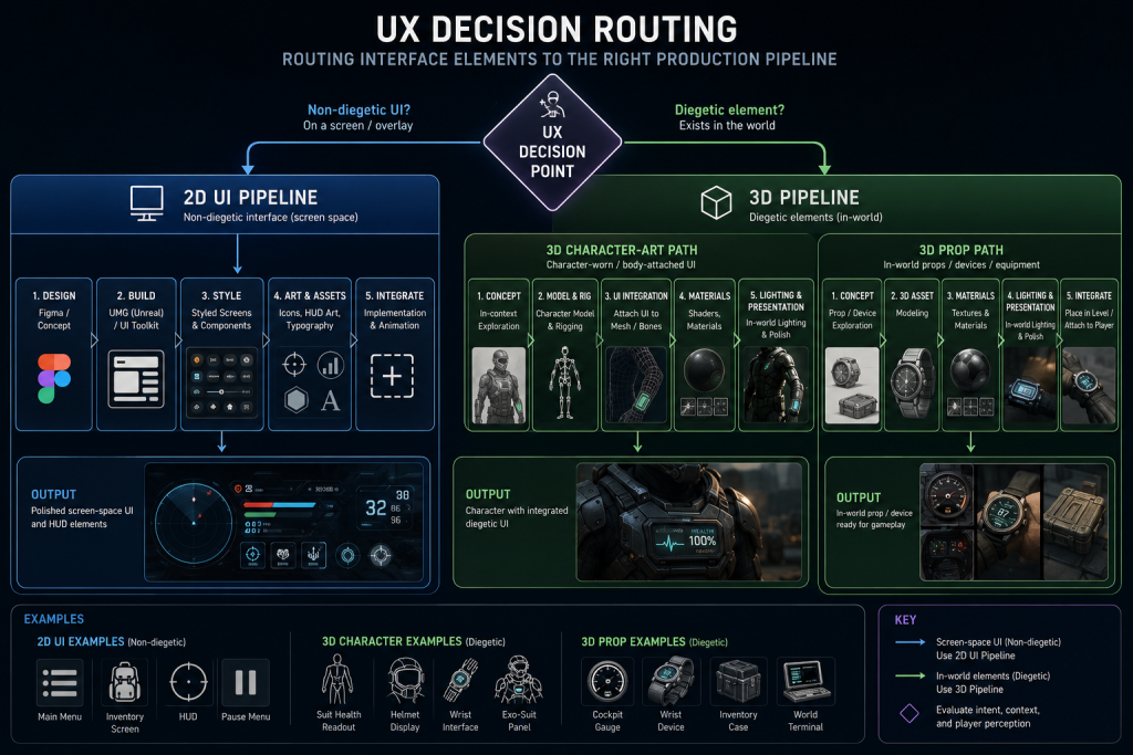
That blast radius gets bigger the moment a UX decision pushes an interface element off the 2D screen and into the 3D world. A diegetic health readout embedded on a character’s suit routes through the character art pipeline rather than a 2D UI toolset, because that specific asset needs rigging, materials, and in-world lighting response. The same diegetic call made for a static cockpit gauge, a wrist device, or a physical inventory case more often lands in game-ready prop production instead – no rig required, but still a 3D asset with its own material and lighting response. Either way, the owner is decided by where the interface lives in the game’s fiction and geometry, not by a UI artist’s Figma file, and that call gets made in pre-production.
“Editorial illustration created for visual reference purposes. It does not represent a real project, client work, or official software screenshot unless stated otherwise.”
Where the Trap Hides: When UX Decisions Get Mistaken for UI Polish
The trap shows up mid-production, usually when the art team is deep into a polish pass and someone – a producer, a publisher rep, sometimes the art director – flags that a menu “feels confusing.” The instinct is to route it to the UI artist as a visual note: make it clearer, add contrast, resize the buttons. Sometimes that fixes it. More often it doesn’t, because the confusion isn’t visual – it’s a mental model problem. The player expected the inventory to sort by rarity and it sorts by acquisition order. No amount of contrast fixes a wrong mental model.
This is where PBR consistency and silhouette readability – the vocabulary an art director reaches for during review – stop being useful diagnostic tools, because the problem isn’t rendering, it’s information architecture. The fix goes back to interaction design, not the shader.
We’ve seen this pattern stall a milestone review: a settings menu that passed every lookdev check, matched the art bible, and still generated a wall of confused playtest feedback, because the navigation hierarchy buried accessibility toggles three menus deep. The style guide specified visual treatment, never navigation depth. Nobody owned that gap until it showed up as negative playtest data two weeks before a publisher review.
Why You Can’t Cut Corners on UX Ownership
Skipping a dedicated UX owner doesn’t save a line item – it moves the cost downstream and multiplies it. A menu rework caught at wireframe stage costs a day or two of an interaction designer’s time. The same rework caught after engine integration – flow already wired into UMG or UI Toolkit, animations built, the art team on to the next milestone’s assets – can easily consume one to two weeks of cross-department time, because it now touches art, engineering, and QA at once instead of one discipline in isolation.
For an art director, that shows up as a second and third polish pass on work that should have shipped clean the first time, and a visual target that keeps sliding because the team is patching interaction logic instead of building new screens. For a producer watching the same schedule, it shows up as a milestone gate that slips because a “UI bug” turned out to be a structural UX rework nobody scoped for. Both read the same root cause from different sides of the calendar: UX treated as a subset of UI instead of its own line item with its own review gate.
The review gate for UX belongs at wireframe stage – before a single pixel of styled art gets built on top of an interaction flow that was never separately validated.
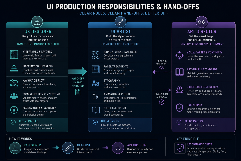
UI Artist, UX Designer, Art Director: Who Owns What
Production routing is where most briefs quietly fall apart, because the three roles overlap just enough to make ownership feel obvious when it isn’t.
The UI artist owns the visual execution – icons, panel treatments, typography, animation polish on interface elements, and matching the art bible’s visual target. They work from a spec that should already answer the interaction questions.
The UX designer owns the interaction logic that spec is built on – wireframes, information hierarchy, navigation flow, playtesting for comprehension, and accessibility requirements baked into the structure rather than added later. This is the role most commonly missing entirely from mid-core briefs, folded silently into either the UI artist’s scope or the art director’s review.
The art director owns visual target and art direction continuity across every screen the UI artist produces, and – critically – should be the one enforcing that UX gets a separate sign-off before visual production starts, not after.
This routing question gets more specific once you’re inside the HUD, since HUD is a subset of UI with its own production split between diegetic and non-diegetic elements – a distinction that changes which team owns a given asset before a single UX decision even gets made.
“Editorial illustration created for visual reference purposes. It does not represent a real project, client work, or official software screenshot unless stated otherwise.”
Nasty Rodent’s production breakdown of HUD types and their production pipeline covers exactly where that boundary sits.
For the full four-category taxonomy – diegetic, non-diegetic, spatial, and meta – that decides whether an interface element routes through the 2D UI pipeline or the character art pipeline, see our breakdown of the diegetic vs non-diegetic UI framework. As a reference point for how much this taxonomy varies across shipped titles, the Game UI Database – a searchable, continuously growing catalog of UI screenshots across shipped games, filterable by exactly this kind of production category – is worth an hour of browsing before you write the interaction spec, not after. The type decision changes who owns the asset, and getting it wrong mid-production is exactly the kind of rework this article is trying to help you avoid.
How to Get the Split Right Without Burning a Milestone
Three moves fix most of what’s described above, and none require adding headcount if the existing team gets a clearer brief.
First, split the deliverable on the brief itself. “UI/UX design” as one line item guarantees UX gets treated as a subtask. Separate wireframe-and-flow deliverables from visual-design deliverables, even if the same studio eventually does both – the separation forces a review gate between them.
Second, put a comprehension checkpoint in the schedule before the visual polish pass, not after. A rough wireframe or a low-fidelity prototype tested with a small group of representative players catches navigation and hierarchy problems for a fraction of what the same problem costs once it’s wrapped in finished art.
Third, write interaction states into the art bible from the start – hover, error, loading, disabled, accessibility-mode variants – so the UI artist has a real spec to build from instead of improvising states nobody signed off on.
When we scope UX/UI work for mid-core and AAA studios, the brief separates interaction logic from visual execution before a single screen gets styled – collapsing them into one deliverable is exactly the pattern that produces beautiful menus nobody can use under pressure. Nasty Rodent’s game UI/UX design services cover both sides of that split, from wireframe through final engine-ready delivery, so the handoff between UX decisions and UI execution doesn’t get lost between two vendors or two milestones.
Game UI vs UX at a Glance
| Question | UI Answer | UX Answer |
| What does it produce? | Styled screens and interface art | Wireframes, flows, interaction logic |
| What does it validate? | Visual consistency, art bible match | Comprehension, usability, accessibility |
| When is it tested? | Lookdev review | Playtesting before visual polish |
| Who typically owns it? | UI artist | UX designer / interaction designer |
| What breaks if skipped? | Inconsistent visual style | Confused players, late-stage rework |
The split isn’t academic: UI answers “does it look right,” UX answers “does it work right,” and a AAA production brief needs a separate gate for each – because a screen can pass the first and fail the second without anyone noticing until playtest.
How to Choose the Right Split for Your Project
The studios that get this right don’t add process for its own sake – they add exactly one review gate: a wireframe-and-flow sign-off before visual production starts, owned by someone other than whoever signs off on style. If your current pipeline routes UI and UX through the same review with no separate usability check, that’s the fix, and it’s cheaper to build now than to discover at the next playtest.
If you’re an art director scoping this for an upcoming milestone, a 30-minute visual style match call with a senior art lead is the fastest way to see whether a vendor separates these two disciplines in practice, not just in a pitch deck – and where the risk points sit for your specific project. A rough milestone goal and platform target are enough to start that conversation.