Diegetic and Non-Diegetic UI in Games: Design Principles and Use Cases
-

Written byDenys Zadoienyi
-

Updated on14.05.2026
-

Time to read16 min

- The Origin of the Framework: Fagerholt and Lorentzon
- The Four Types: A Complete Taxonomy
- The Two-Axis Decision Matrix
- When to Use Each Type: Design Principles for AAA Production
- The Production Decision Framework: Pre-Production Questions
- UI Type Comparison at a Glance
- How Nasty Rodent Approaches UI Type Decisions
Two games. Same genre. Similar production budgets. One feels like you’re inside a world. The other feels like you’re operating a dashboard.
The difference isn’t art direction. It isn’t writing. Often it isn’t even the quality of the UI assets themselves. It’s a single architectural decision made early in production — where does this interface live relative to the game world?
That question is what separates diegetic from non-diegetic UI, and it sits at the center of every immersive game experience that has ever made a player forget they’re holding a controller. If you’re an art director or game UI designer working on a mid-core or AAA title, understanding this distinction isn’t theoretical vocabulary — it’s a production decision that cascades through your art pipeline, your UX system, your narrative design, and your milestone reviews.
This guide covers the full four-type UI taxonomy, the design principles governing each type, how to decide which approach fits your game, and what production-side execution actually looks like.
The Origin of the Framework: Fagerholt and Lorentzon
The terminology used across the industry today — diegetic, non-diegetic, spatial, meta — comes from a 2009 Master’s thesis by Erik Fagerholt and Magnus Lorentzon at Chalmers University of Technology: “Beyond the HUD — User Interfaces for Increased Player Immersion in FPS Games.”
Their framework organizes game UI elements along two axes:
- Fiction axis: Is the element part of the game’s narrative world — can characters within the fiction see, hear, or interact with it?
- Geometry axis: Is the element placed within the game’s 3D space, or rendered as a 2D overlay on the screen?
Crossing these two axes produces four categories. Understanding both axes simultaneously prevents the most common misclassifications — and more importantly, prevents the most common design mistakes.
Definition: A game UI element is diegetic when it exists within both the fiction (characters are aware of it) and the geometry (it has a physical presence in the 3D world). It is non-diegetic when it exists outside both — invisible to characters, rendered as a 2D overlay. Spatial and meta occupy the intermediate positions.
As a UI/UX designer at Nasty Rodent, I’ve seen the cost of making this decision late — mid-production, when the art pipeline is set and the style guide is locked. A UI system built on the wrong foundation generates rounds of revision that wouldn’t have happened if the diegetic/non-diegetic question had been answered in pre-production.
The four-type framework isn’t academic. It’s a pre-production decision tool.
[BANNER: about-us-top]
The Four Types: A Complete Taxonomy
Type 1 — Diegetic UI
Fiction: Yes — characters can see, hear, or interact with it. Geometry: Yes — exists in the 3D game world as a physical object.
Diegetic UI is the most immersive type. The interface element is a game world object — it has spatial presence, obeys the game’s fiction, and the player character interacts with it as they would with anything in the environment.
Canonical examples:
Dead Space (Visceral Games, 2008) remains the reference case for diegetic UI executed at AAA scale. Isaac Clarke’s health is displayed as a light strip on the spine of his RIG suit — visible to the player from behind, part of the character model, occupying real geometry in the scene. His stasis meter is on his left arm. His inventory is a holographic projection that appears in front of him when accessed. The in-game map is a 3D hologram the character interacts with physically.
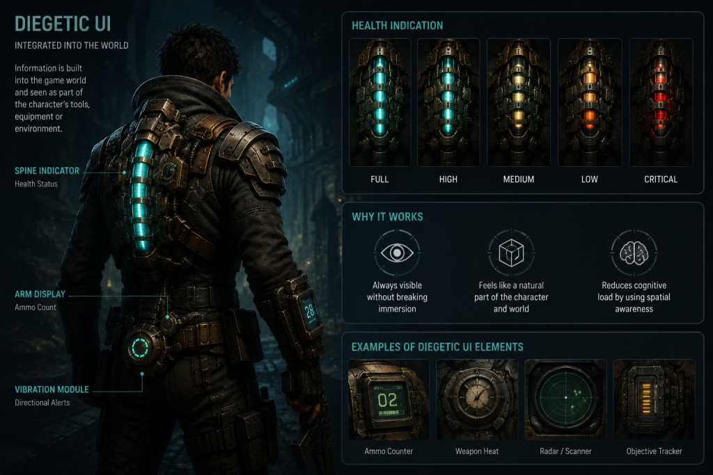
“Editorial illustration created for visual reference purposes. It does not represent a real project, client work, or official software screenshot unless stated otherwise.”
At a GDC 2013 panel, Dead Space’s lead UI designer Dino Ignacio described the studio’s philosophy: “We were not just diegetic by design, we were diegetic by implementation.” The team treated the space vessel Ishimura as a character — and the UI became its voice. Every element that didn’t belong to Isaac was placed behind him, maintaining a consistent fiction.
Far Cry 2 (Ubisoft, 2008) used diegetic UI for navigation — the player character physically raises a paper map and compass to check their position. Weapon degradation was also diegetic: the character visually examined their weapon when it jammed.
Firewatch (Campo Santo, 2016) blended diegetic and non-diegetic deliberately. The protagonist Henry holds a physical map when navigating, but the walkie-talkie conversation with Delilah is a diegetic audio interface — information that exists within the fiction, delivered through a prop the character uses.
Design strengths: maximum immersion, reinforces narrative coherence, no fourth wall breakage.
Design constraints: information must be legible at in-world scale; characters must plausibly have access to the UI element; environmental context must support the fiction; production cost is higher — UI elements must be modeled, textured, rigged to animation, and integrated into the scene.
Type 2 — Non-Diegetic UI
Fiction: No — characters are unaware of it. Geometry: No — rendered as a 2D overlay on the screen.
Non-diegetic UI is the most common type in game history. The health bar, the minimap, the ammo counter, the objective tracker — these are 2D graphic elements superimposed on the screen, existing purely for the player. No character in the game world can see or acknowledge them.
Canonical examples:
World of Warcraft — the entire HUD: health and mana bars, hotbar abilities, target frames, raid UI. All non-diegetic. None of this exists in Azeroth; it’s operational data for the player.
The Legend of Zelda: Breath of the Wild — the stamina wheel, hearts, minimap, objective markers. The world is designed to feel open and physical, but the UI sits as a clean overlay above it, never pretending to be part of Hyrule.
Uncharted 4 — ammo counter, gun icons, grenade count in the lower left. Naughty Dog’s team makes these as visually lightweight as possible — minimal chrome, no screen clutter — but they remain non-diegetic: Nathan Drake doesn’t look at a HUD readout.
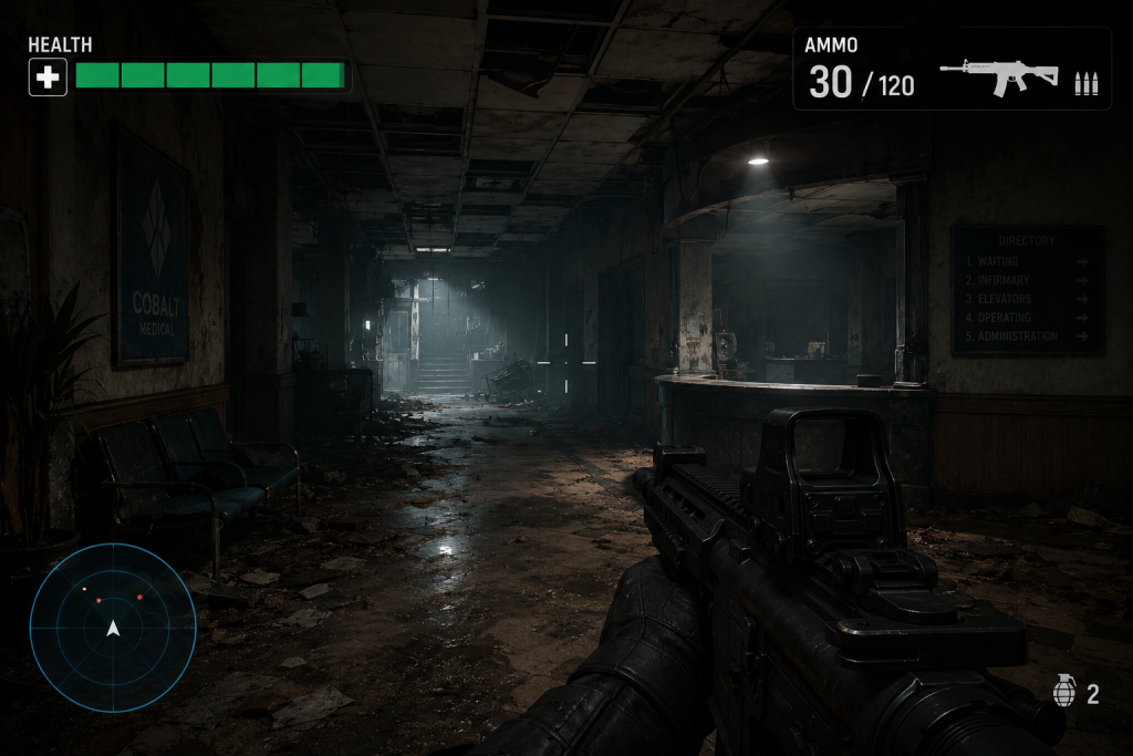
“Editorial illustration created for visual reference purposes. It does not represent a real project, client work, or official software screenshot unless stated otherwise.”
Design strengths: maximum information clarity, full design control over placement and hierarchy, platform-independent, fastest iteration in production, no dependency on 3D geometry or character animation.
Design constraints: can break immersion in narrative-heavy games; requires careful visual restraint to avoid cluttering the screen; in VR, non-diegetic overlays cause comfort issues.
Type 3 — Spatial UI
Fiction: No — characters are not aware of it. Geometry: Yes — placed in 3D space, but not part of the game world’s fiction.
Spatial UI occupies 3D space without being acknowledged by the game’s characters or narrative. It uses world geometry as a canvas but doesn’t pretend to be a real object in the world.
Canonical examples:
Left 4 Dead — character outlines that appear through walls to indicate ally positions. These glow effects exist in 3D space — they’re rendered in the scene geometry — but no character in the fiction can see a glowing outline of their teammates. It’s a purely player-facing spatial overlay.
The Callisto Protocol — door interaction prompts rendered as spatial holograms above certain objects. Critically, this is where the comparison with Dead Space becomes instructive. Dead Space’s door holograms were diegetic: they existed within the fiction as part of the ship’s real systems. The Callisto Protocol’s holograms were spatial — projected over objects without fictional grounding, purely contextual button prompts. The visual similarity masked a fundamental difference in design philosophy, contributing to the immersion inconsistency critics noted.
Most 3D waypoint markers — floating indicators above objectives, above NPCs, above quest items. They exist in the scene’s 3D coordinates, but they hover in a way no in-world system could produce. The player accepts this as a navigational convention.
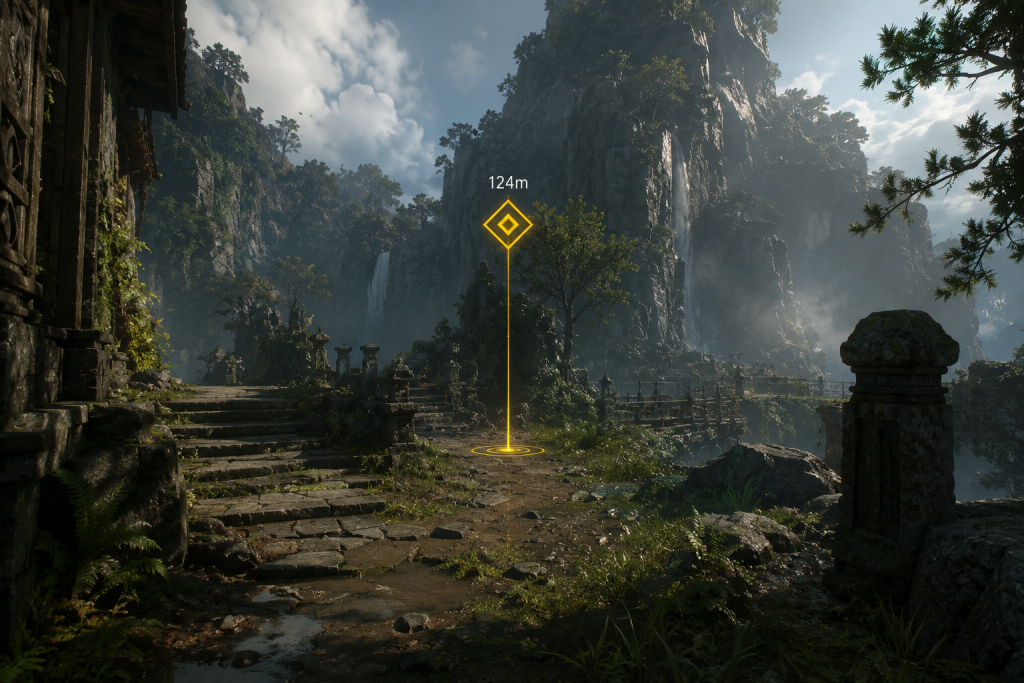
“Editorial illustration created for visual reference purposes. It does not represent a real project, client work, or official software screenshot unless stated otherwise.”
Design strengths: world-grounded visual language without requiring full diegetic fiction; works well for navigation, object interaction prompts, multiplayer awareness.
Design constraints: can feel inconsistent if the game aspires to diegetic immersion; overdependence on spatial UI in narrative games creates visual noise.
Type 4 — Meta UI
Fiction: Yes — implied or represented within the narrative, often as character state. Geometry: No — expressed as screen-space effects, not in the 3D world.
Meta UI exists in an ambiguous space — it has a narrative or fictional grounding, but it’s expressed through screen effects rather than geometry. It represents what the character experiences — not what they see in the world.

Canonical examples:
Blood splatter on screen — the screen fills with red when the player character takes damage. In fiction, this represents the character’s injury or point of view. The effect is rendered on the screen surface, not in the 3D scene. The character experiences the wound; the player experiences a visual effect.
Screen blur when drunk — games like Grand Theft Auto V apply visual distortion when the protagonist is intoxicated. The character is aware of being drunk; the screen effect represents their perceptual state. It’s fictional, but not geometrically placed in the world.
Vignetting and desaturation at low health — common in modern shooters. The character is in distress; the screen conveys their deteriorating state. No health bar needed if the visual degradation carries the information.
BioShock — the screen effect when interacting with liquor in-game applies visual distortion representing the character’s intoxication. The character is aware of the experience; the player sees a meta representation of it.
Design strengths: conveys character state emotionally, supports narrative immersion without requiring 3D UI geometry, powerful for horror and psychological genres.
Design constraints: can obscure critical gameplay information at the worst moment (heavy screen distortion when health is lowest is the exact moment the player most needs clarity); accessibility concerns — players with vestibular disorders can find strong meta effects disorienting.
The Two-Axis Decision Matrix
Every UI element you design can be placed on this grid. The decision of where to place it is a design choice with production consequences.
| In game’s fiction (characters aware) | Outside game’s fiction (players only) | |
| In 3D world geometry | Diegetic | Spatial |
| As 2D screen overlay | Meta | Non-diegetic |
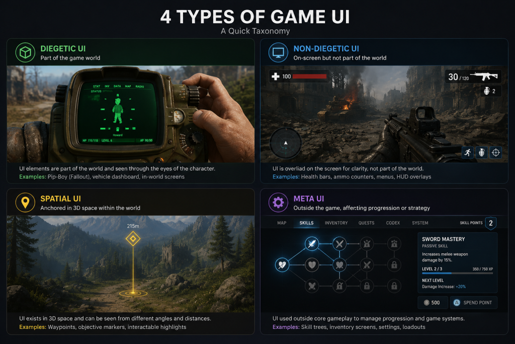
“Editorial illustration created for visual reference purposes. It does not represent a real project, client work, or official software screenshot unless stated otherwise.”
Use this matrix as a first-pass classification for every UI element in a new production. Classification forces the design question: does this element need to be in the world, or can it live on the screen? Does the character need to know about this, or is it purely for the player?
When to Use Each Type: Design Principles for AAA Production
The choice is never simply “diegetic is better.” The right type depends on your game’s genre, tone, camera perspective, and player-experience goals. These principles translate to production decisions.
Principle 1: Match UI type to narrative contract
Your game establishes a contract with the player about how fictional the experience is. A survival horror title with a single protagonist and a close third-person camera makes a strong immersion promise — diegetic UI supports that promise. A real-time strategy game with a top-down camera and dozens of simultaneous units makes a clarity-first promise — non-diegetic UI serves that priority.
Breaking the contract is the most common UI design failure. The Callisto Protocol established a diegetic precedent through its Dead Space comparisons and its genre expectations, then deployed spatial UI elements inconsistently — the result was a spatial-diegetic mismatch that reduced immersion without improving clarity.
Principle 2: Diegetic UI requires full production integration
This is the principle most commonly underestimated in pre-production. A diegetic health indicator isn’t a UI asset — it’s a character asset. It requires:
- 3D modeling and texturing as part of a production-ready character art pipeline when the interface is physically embedded into the character design.
- Animation rigging if it changes state dynamically
- LOD consideration — will it be readable from standard gameplay distances?
- Art direction alignment — it must match the visual language of the world, not look like a UI element dropped onto a character
Committing to diegetic UI mid-production, after the character pipeline is set, costs significantly more than making that decision during pre-production. The art director and UI lead need to align on UI type in the same meeting where they align on visual target.
Principle 3: Hybrid systems are the AAA standard
Most successful AAA games use all four types simultaneously — not because they couldn’t commit to a single approach, but because different information types have different design requirements.
Dead Space itself is not purely diegetic. The holographic 3D map was diegetic — and it largely failed to aid navigation, as documented in the Gamedeveloper.com analysis of the title. The solution was the “locator” system — a light trail projected on the floor to guide the player. This locator is spatial: it exists in the 3D environment, but no character in the fiction produces or acknowledges it. The team recognized that pure diegetic commitment compromised navigation usability, and they added a spatial element to solve it.
Firewatch uses diegetic navigation (physical map), non-diegetic dialogue subtitles, and meta audio for environmental feedback. The combination serves different player needs without forcing a single type to carry all information.
Production guideline: classify each UI element by type during the UX specification phase, not the visual design phase. The type determines the pipeline the element goes through — character art, environment art, 2D UI, VFX — and mixing up pipeline assignments mid-production creates both schedule and quality risk.
Principle 4: Non-diegetic UI is not a concession — it is a design tool
The industry has developed a bias toward diegetic UI as the “advanced” approach. This is inaccurate. Non-diegetic UI done with restraint and visual discipline produces some of the most elegant UI systems in games.
The Last of Us Part II‘s non-diegetic UI is minimal and contextual — information appears only when needed, uses muted colors, and never competes with the environment for visual attention. The restraint is a design achievement equal to any diegetic solution. Naughty Dog’s UI team worked to ensure that non-diegetic elements felt like they belonged aesthetically — inheriting the visual language of the world even though they existed outside it.
Non-diegetic UI should always ask: is this information visible only when the player needs it? Persistent, prominent non-diegetic elements that display constant data the player has already internalized (after the first hour of play) are the primary source of immersion disruption — not the fact that they’re non-diegetic.
Principle 5: Accessibility cannot be an afterthought for any type
Diegetic UI faces specific accessibility challenges. A health indicator on a character’s back requires the player to track a specific point in the 3D scene — this may disadvantage players with visual processing differences. A meter on a suit spine is small by necessity, which disadvantages players with low vision.
Most AAA titles with diegetic UI offer a traditional HUD option — allowing players to enable a conventional non-diegetic overlay if the diegetic system doesn’t work for them. This is not a design failure. It’s inclusive design. Planning for this option from the start of production is cheaper than retrofitting it after accessibility testing.
Meta UI — screen effects — carries specific risks for players with vestibular disorders. Strong screen shaking, blur, or distortion should always be accompanied by a settings option to reduce or disable intensity.
The Production Decision Framework: Pre-Production Questions
Before your UI system design begins, answer these five questions. The answers determine your type selection.
1. What is the player’s camera relationship to the character?
First-person: diegetic elements can be placed on the character’s hands, equipment, or wrist — the player sees them naturally. Third-person: diegetic elements on the character’s back are visible in standard gameplay camera positions. Top-down or isometric: diegetic UI is almost impossible to read at the necessary scale — non-diegetic or spatial becomes the practical choice.
2. What does the genre promise about immersion?
Survival horror, narrative adventure, simulation: high immersion contract — diegetic or meta preferred. Strategy, MOBA, battle royale: information-density contract — non-diegetic preferred. Action RPG, open world: hybrid — diegetic for atmospheric elements, non-diegetic for complex inventory and progression systems.
3. What is the information update frequency?
Real-time changing data (health under fire, ammo while shooting): needs immediate legibility — non-diegetic is often more reliable. Contextual data (map when navigating, objectives when pausing): can be diegetic — the player stops to check it.
4. Does the fictional world support the UI element’s existence?
Sci-fi: holographic displays, suit-integrated readouts — diegetic fiction is plausible. Fantasy: magical runes, enchanted compasses — diegetic fiction is plausible if established early. Contemporary realism: smartphones, paper maps, physical instruments — diegetic fiction works. Abstract or surreal: the fictional rules can be defined to support any UI type.
5. What is the production cost of diegetic vs non-diegetic for this element?
Diegetic: character art or environment art pipeline, rigging dependency, animation consideration, scene integration. Non-diegetic: 2D UI pipeline, faster iteration, no 3D dependency. Cost is a legitimate design input. A diegetic system that cannot be executed cleanly within the production schedule is worse than a well-executed non-diegetic system.
UI Type Comparison at a Glance
| Diegetic | Non-Diegetic | Spatial | Meta | |
| Characters aware? | Yes | No | No | Implied |
| In 3D geometry? | Yes | No | Yes | No |
| Immersion potential | Highest | Lower | Medium | High |
| Information clarity | Requires care | Highest | Medium | Medium |
| Production complexity | High | Low | Medium | Medium |
| VR suitability | Excellent | Poor | Good | With caution |
| Accessibility risk | Legibility | Clutter | Overdependence | Vestibular |
| AAA examples | Dead Space, Far Cry 2, Firewatch | WoW, BotW, Uncharted 4 | Left 4 Dead, waypoints | BioShock, damage effects |
How Nasty Rodent Approaches UI Type Decisions
Game UI isn’t decoration applied to a finished game — it’s a structural system designed in parallel with the game world and the character pipeline. At Nasty Rodent, our UX/UI work starts from the same pre-production questions above, and the UI type classification happens before visual design begins.
For diegetic elements, our pipeline routes through 3D character and environment teams — the UI is a prop with its own spec, its own polycount, its own animation requirements. For non-diegetic and meta elements, our 2D UI pipeline owns the delivery. Mixing these up mid-production creates bottlenecks that delay both pipelines.
Our clients on mid-core and AAA titles — including productions with Whimsy Games, Offworld Industries, Galaxy 4 Games, Benner Games, The Bearded Ladies Consulting, and Reburn — work with us on UX/UI systems that range from full diegetic interface design to hybrid systems with complex HUD logic. The brief always starts with the four-type classification, because that decision determines everything that follows in the pipeline.
If you’re planning a UI system for an upcoming production and need to establish the type framework before visual design begins — that’s exactly where we can help. See our UX/UI work, our portfolio, or reach out to discuss your project’s UI architecture.