What Is UX Design in Games? The Player Experience Layer, Explained
-

Written byDenys Zadoienyi
-

Updated on16.06.2026
-

Time to read16 min
- Game UX is not the same discipline as product UX
- UX, UI, and HUD: what each layer actually owns
- The four interface types every art director should be able to brief
- The part of UX that never appears on screen: player experience
- Where the trap hides: UX is the most-seen art in your game
- Accessibility and readability are art-direction decisions
- Five UX mistakes that surface at the first review
- How game UX gets built: from wireframe to engine state
- Our approach at Nasty Rodent
- UX, UI, and HUD compared at a glance
- How to get UX design in games right
UX design in games is the discipline that decides whether a player understands your game or quietly puts it down — and for an art director, it is also the part of the game players look at more than any hero asset you will ever ship. The HUD, the menus, the in-world prompts: that is the interface a player stares at for the entire playthrough, and it lives or dies on decisions most teams treat as an afterthought.
“Editorial illustration created for visual reference purposes. It does not represent a real project, client work, or official software screenshot unless stated otherwise.”
Game UX design is the discipline of shaping how players perceive, understand, and feel their way through a game: the menus, HUD, onboarding, feedback, and in-world signage that sit between a player’s intention and the game’s response. It is broader than UI. UI is what players see; UX is whether what they see actually works under the pressure of play.
Game UX is not the same discipline as product UX
Here is the trap most teams fall into: they hire a product-UX mindset and point it at a game. It half-works, and the half that fails is the half that matters. Product UX has one north star — remove friction so the user reaches their goal with as little thought as possible. A banking app that makes you think has failed. A game that makes you think is often doing its job.
The cleanest way I’ve heard the distinction framed is this: product UX is clarity that hides complexity, while game design is clarity that teaches complexity. A strategy game wants you to slowly master supply chains; a shopping cart wants to hide them. Game UX sits in service of that: its job is to strip friction out of the control and perception layers — confusing menus, illegible HUDs, unclear feedback — so the player spends every bit of cognitive budget fighting the game, not the interface. The challenge itself isn’t UX’s to invent or protect; that belongs to game design — the balance, the timing, the economy. What game UX guarantees is that nothing in the interface stands between the player and that designed challenge. An art director who confuses the two — who tries to “add friction” through the UI to make a game feel harder — is solving a game-design problem in the wrong layer, and usually just makes the game annoying instead of difficult.
This is also why “good UX” can’t be judged in a static mockup. A menu in a productivity app responds to a known viewport and a calm user. A game interface responds to engine state, time pressure, controller input, and a player whose attention is already spent on staying alive. The same HUD that scores perfectly in a still frame can become unreadable the moment combat starts and the screen fills with effects.
For an art director, the stakes of getting this wrong land on two surfaces. On the player-facing side, interface friction is one of the quietest causes of early churn — players rarely write “the menu confused me” in a review; they just stop playing. On the art side, UX discovered late becomes rework on finished work: when readability fails at a review, you are no longer adjusting a wireframe, you are re-cutting finished UI art, re-exporting assets, and re-validating in engine. From what we’ve seen on mid-core projects, a HUD reworked after art lock can cost several polish passes nobody planned for — and they land at the worst possible time, when the look should be locking down, not reopening. The cost isn’t the redesign; it’s that the redesign arrives after everything downstream was built on the wrong visual assumptions.
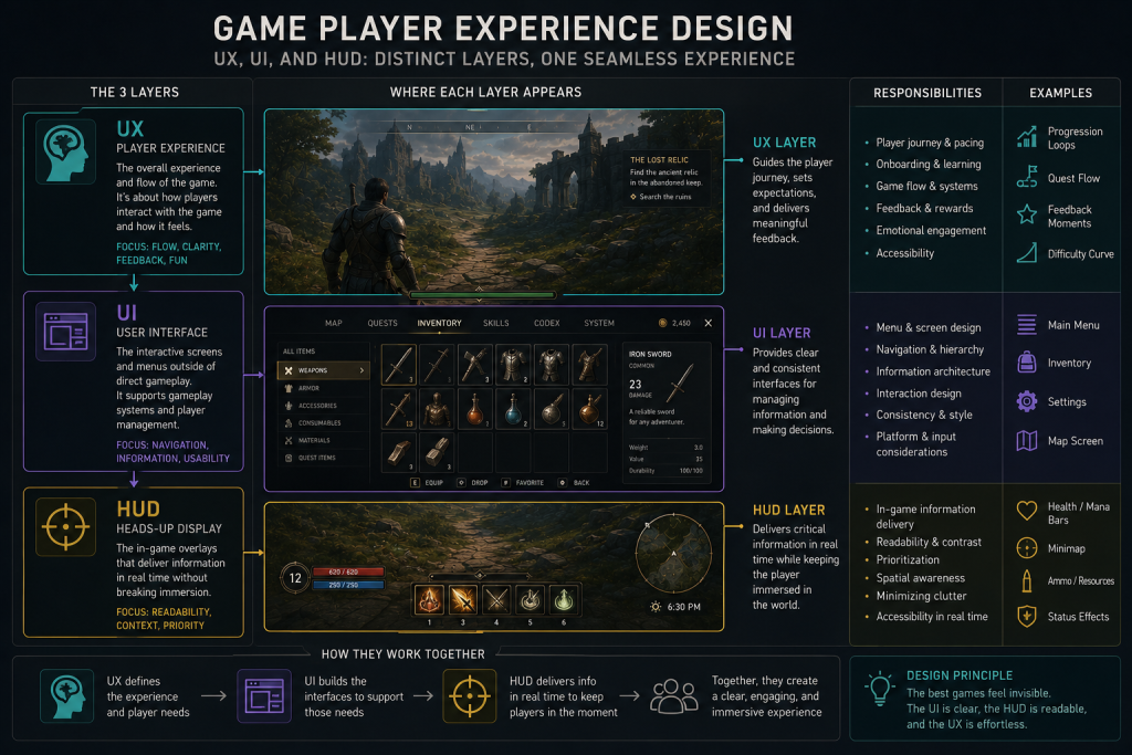
UX, UI, and HUD: what each layer actually owns
Three terms get used interchangeably, and the conflation causes real briefing errors. They are not the same layer, and an art director who keeps them distinct writes better specs.
- UX (user experience) is the felt experience: can the player understand the game, find what they need, and stay in flow? It owns the player journey, onboarding, information architecture, and feedback — most of it invisible when it works.
- UI (user interface) is the visual and interactive layer that delivers UX: the menus, icons, typography, layout, and the art that makes those elements legible and on-brand.
- HUD (heads-up display) is the live, in-gameplay subset of UI: the health, ammo, objectives, and markers a player reads while playing, not while paused.
“Editorial illustration created for visual reference purposes. It does not represent a real project, client work, or official software screenshot unless stated otherwise.”
The practical consequence: you can ship a gorgeous UI that delivers terrible UX (beautiful menus nobody can navigate), and you can ship a plain UI with excellent UX (a spartan HUD that tells the player exactly what they need, exactly when). The art director’s job sits at the seam — making the interface both legible and art-directed, so it serves the player and the visual identity at once. That seam is where most interface problems are born, and where they’re cheapest to fix if you catch them early.
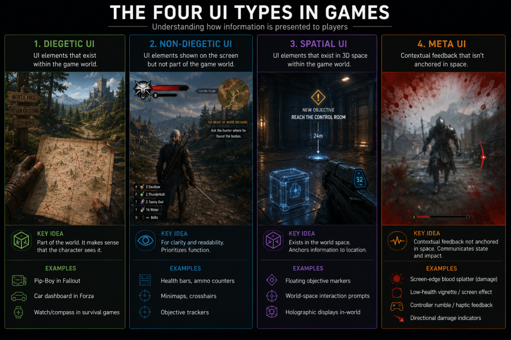
The four interface types every art director should be able to brief
The most useful framework in game UX is the four-type UI taxonomy, and it isn’t marketing vocabulary — it comes from a 2009 master’s thesis by Erik Fagerholt and Magnus Lorentzon at Chalmers University, Beyond the HUD, which is now the industry’s shared language. Knowing which type a given element belongs to is a production decision, because each type carries different art, narrative, and accessibility consequences.
- Diegetic UI lives inside the game world and the characters can perceive it — Dead Space’s health bar on Isaac’s spine is the canonical example. Maximum immersion, hardest to keep readable.
- Non-diegetic UI sits outside the world, for the player only — classic health bars, score counters, menu screens. Most legible, least immersive.
- Spatial UI exists in the 3D space but the characters don’t acknowledge it — enemy outlines, interaction prompts floating on an object, throw arcs.
- Meta UI is contextual feedback that isn’t anchored in space — the screen-edge blood splatter for damage, controller rumble, a vignette when low on health.
“Editorial illustration created for visual reference purposes. It does not represent a real project, client work, or official software screenshot unless stated otherwise.”
The decision of which type carries which information cascades through the whole pipeline: a diegetic health readout means the character model and animation now own a UX function, which changes the art brief, the rigging, and the camera framing. Get the taxonomy wrong in the brief and you discover it three milestones later, when the “immersive” diegetic HUD turns out to be unreadable on a console couch and has to be rebuilt as a non-diegetic overlay. We treat this four-type classification as the first conversation on any UI project — it determines everything that follows. If you want the full breakdown with examples, we wrote a dedicated guide on diegetic vs non-diegetic UI in games.
When a team wants to calibrate its visual target against what shipped games actually do, the best free reference is the Game UI Database, which catalogues over 55,000 UI screenshots from more than 1,300 games, filterable by screen type, genre, and HUD element. For an art director building a UI style guide, it is the fastest way to ground a brief in real precedent rather than opinion.
| UI type | Carries best | Immersion | Readability risk (Red flag) |
| Diegetic | Health, ammo, narrative state | Highest | Breaks under camera distance, dynamic FOV shifts, dark scenes, or fast action |
| Non-diegetic | Critical stats, menus, scores | Lowest | Clutter and overlay overload; flat, off-brand look |
| Spatial | Targeting, interaction prompts | Medium | Depth confusion; competes with combat focus |
| Meta | Damage, low-health, feedback | Medium-high | Easy to miss; over-used vignettes fatigue the player |
If two of these rows are throwing red flags in your build — a diegetic readout nobody can parse, a non-diegetic HUD drowning in markers — that’s not a polish note. It’s a signal the interface architecture was decided without a UX pass, and it will keep generating rework until it’s addressed at the structural level.
Did you know that…?
the interface is statistically the most-viewed art in your game. A player may glance at a hero character for seconds across a session but stares at the HUD for the entire playthrough — which is exactly why treating UI as decoration rather than art direction is such an expensive habit.
The part of UX that never appears on screen: player experience
Everything above is the visible interface. Player experience is the larger discipline that the interface serves — and most of it is invisible when it’s done right. It covers how a player is taught the game (onboarding), how information is revealed over time (progressive disclosure), how much the player has to hold in their head at once (cognitive load), and whether the game tells them their actions worked (feedback).
This is where decades of usability research transfer straight into games. Jakob Nielsen’s ten usability heuristics — visibility of system status, match between system and the real world, error prevention, consistency — were written for software, but Nielsen Norman Group has shown how each one applies to video games. Visibility of system status, for instance, is why a player needs immediate, legible feedback that a hit landed; without it, the game feels broken even when the mechanics are perfect. Error prevention is why a destructive action — selling a rare item, overwriting a save — should be hard to trigger by accident; a single mis-tap that wipes progress doesn’t read as the player’s mistake, it reads as the game’s betrayal. And match between the system and the real world is about honoring the conventions and mental models players already carry, not just drawing recognizable icons — it’s why loot that runs grey → green → blue → purple → orange is read at a glance by anyone who has touched an RPG, and why a gear icon is expected to open settings rather than an inventory. Break a learned convention and the player has to stop and translate mid-session, in exactly the moment you wanted them in flow.
The art director’s stake here is direct: feedback is largely a visual and motion problem. A hit that doesn’t read, an ability that fires without a clear tell, a menu transition that gives no sense of “where am I now” — these are UX failures solved with art and animation, not code. When player experience is weak, players don’t file a bug; they feel a vague friction, lose flow, and drift away. That drift is the most expensive churn there is, because it’s invisible in your telemetry until it’s already happened.
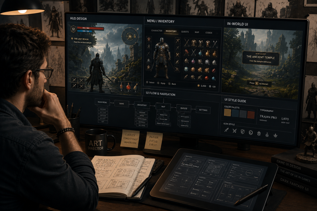
Where the trap hides: UX is the most-seen art in your game
This is the section I’d underline for any art director. The interface is not the layer where you spend the least art attention — it’s the layer players spend the most looking attention on. And yet UI/UX is routinely the last thing briefed, the first thing cut, and the easiest place for style drift to creep in.
UI style drift starts at the third screen if there’s no UI style guide. The main menu looks intentional, the pause menu drifts slightly, the inventory screen was done by someone else under deadline, and by the time you have twenty screens, the interface reads like three different games. For an art director, that’s the same lookdev-consistency problem you fight on characters and environments — except it’s happening on the most-viewed surface in the product, where art-direction continuity matters most. The fix is the same discipline: a UI style guide that locks typography, iconography, spacing, color, and motion before screen production scales, exactly the way a strong concept layer locks the look of the world. The same principles that make a level legible — clear silhouettes, value hierarchy, a controlled palette — are what make a HUD legible, which is why game concept art for player readability and interface design belong in the same conversation, not separate departments.
Treat the interface as the most-seen art in the game and the priorities reorder themselves: readability becomes a brief requirement, not a QA afterthought, and the UI gets the same lookdev rigor as a hero asset because, in screen-time terms, it is the hero asset.
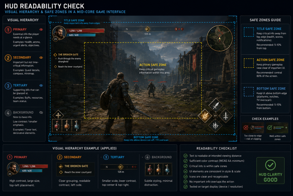
Accessibility and readability are art-direction decisions
Accessibility is often filed under compliance. In a game, it’s an art-direction decision with a UX payoff — and skipping it narrows your audience for no good reason. Colorblind-safe palettes, sufficient contrast, scalable text, and not encoding critical information in color alone are all interface decisions that an art director owns, because they’re decisions about how the visual layer communicates.
Readability is the connective tissue. A HUD has to stay legible against a bright snowfield and a dark cave in the same session; an objective marker has to be findable without dominating the frame. This is the same problem as making an environment design for player navigation read clearly — guiding the eye with light, contrast, and composition so the player knows where to go without a giant arrow shouting at them. Safe zones, contrast ratios, and visual hierarchy aren’t accessibility extras bolted on at the end; they’re the core craft of an interface that works for the widest possible audience on the widest range of displays. The studios that treat them as foundational ship interfaces that feel effortless. The ones that treat them as a final-pass checklist ship interfaces that feel like work.
“Editorial illustration created for visual reference purposes. It does not represent a real project, client work, or official software screenshot unless stated otherwise.”
Five UX mistakes that surface at the first review
These are the failure modes I see most often when a team brings in an interface that looked finished on paper. None of them are exotic, and every one of them is cheaper to catch in a wireframe than in finished art.
- Designing the HUD in a still frame. A layout that scores perfectly in a static mockup falls apart in motion. If the HUD was never tested against a busy combat scene, assume it’s untested.
- No UI style guide before the second screen. Without locked typography, iconography, spacing, and motion rules, the interface drifts asset by asset and reads like three different games by the time it ships.
- Encoding critical information in color alone. It fails for colorblind players and washes out against bright or dark scenes — a readability bug wearing the costume of a style choice.
- Choosing diegetic UI for immersion without a readability budget. Diegetic readouts are gorgeous and routinely unreadable at console viewing distance; the immersion win is real only if legibility survives the living-room test.
- Briefing UI last. When the interface is the final thing scoped and the first thing cut, it gets built on leftover time — on the exact surface players look at most.
The through-line is that each of these is an architecture decision disguised as a polish detail. Caught early, it’s a wireframe note. Caught at review, it’s a re-export of finished UI assets and a round of polish passes nobody planned for.
How game UX gets built: from wireframe to engine state
The process looks deceptively like product design and then diverges at the most important step. It starts the same way — research and reference, wireframes that define structure and flow, then mockups that apply the visual style. The divergence is that a game interface can only be truly validated in engine, in motion, because it depends on engine state: time-based events, controller input, dynamic backgrounds, and the player’s split attention.
That’s why games user research and playtesting aren’t optional polish — they’re how you find out that the perfectly composed HUD becomes noise the moment three enemies spawn. In practice that means more than one kind of test: moderated usability sessions where you watch exactly where a player hesitates, unmoderated playtests at scale to see where players quietly drop off, and validation on in-engine builds rather than clickable prototypes — because a clickable mockup can’t reproduce the time pressure and visual noise that break most interfaces. The honest workflow is iterative: prototype the interface, put it in front of players doing the real task under real pressure, watch where they hesitate, and revise. The teams that test interfaces early and in context catch the expensive problems while they’re still cheap wireframe changes. The teams that wait until the art is final discover the same problems as rework. Choosing a partner who builds this way — engine-aware, test-driven, art-directed — matters enough that we wrote a separate piece on how to choose a game UX/UI design studio for teams weighing the decision.
Our approach at Nasty Rodent
I showed above how interface decisions — the four UI types, readability, style consistency — cascade through the whole pipeline and turn into rework when they’re caught late. At Nasty Rodent, we handle that by starting every UI project with the type framework and a UI style guide before screen production scales, so readability and art-direction continuity are brief requirements rather than QA notes. The result for the art team is an interface that holds up in engine on the first review instead of the third. More on our team and shipped work is in the banner below.
If interface design is on your roadmap, our game UX/UI design service covers HUD, menus, and in-world UI built engine-ready from the first delivery.
UX, UI, and HUD compared at a glance
| Layer | What it is | Owns | Fails when |
| UX | The felt player experience | Journey, onboarding, feedback, flow | Player feels friction but can’t say why |
| UI | The visual/interactive layer | Menus, icons, typography, layout | Looks good, navigates badly (or vice versa) |
| HUD | Live in-gameplay UI subset | Health, ammo, objectives, markers | Unreadable in motion or visually cluttered |
| Player experience | The whole arc of playing | Cognitive load, pacing, mastery | Players churn early without complaint |
How to get UX design in games right
The teams that ship interfaces players never have to think about aren’t the ones with the biggest UI budgets — they’re the ones that treat UX as an architecture decision made early: the four UI types chosen on purpose, a UI style guide that locks readability and art direction before screen production scales, and interfaces validated in engine, in motion, not in a static frame. Treated that way, the interface stops being the layer you fix in QA and becomes the most-viewed art in your game, working for both the player and the visual identity.
If interface design is on your roadmap and you want a senior read before you commit, we can set up a visual style match call with our senior art lead — thirty minutes to see whether our UX/UI team can work inside your style guide, where the readability risks are in your current direction, and what an engine-ready handoff would look like. No budget and no commitment; just bring your style references and a screen or two, and we’ll give you a concrete read.