What Is HUD in Games: Types, Production Pipeline, and Design Principles
-

Written byDenys Zadoienyi
-

Updated on26.06.2026
-

Time to read20 min
- HUD vs UI: where the boundary is and why it matters in production
- The four types of HUD — and what each one costs in the pipeline
- Why 80% of player attention never reaches the HUD
- How HUD type determines pipeline ownership
- What a production-grade HUD spec contains
- Technical matrix: HUD types by production parameter
- HUD design decisions that connect to environment art
- HUD accessibility: what it requires in production
- About Nasty Rodent
The HUD is the layer of the game that players use without noticing it — and that art directors make decisions about for months. Get it right, and the interface disappears into the experience. Get it wrong, and every revision cycle chases the same problem: too much information, in the wrong place, delivered in a way that competes with the game rather than supporting it.
HUD stands for heads-up display. The term comes from military aviation, where pilots needed critical flight data projected onto the windshield so their eyes never had to leave the sky. In games, the principle translates directly: essential information delivered to the player without requiring them to break focus from what is happening in the world.
What the term does not explain is how much a single HUD design decision can cascade through a production. The choice between a health bar floating on the screen and a health indicator embedded in the protagonist’s suit model is not just a visual preference — it determines which team owns the asset, how it is rigged and animated, what its performance budget is, and what happens to it when the game ships on four platforms with different display sizes.
This guide covers what HUD actually means in a production context: the four-type classification that governs how interface elements are built, the attention research that explains why most HUDs fail at scale, the principles that translate design intent into functional screen real estate, and how HUD decisions connect to the art pipeline that has to deliver them.
About the author: Denys Zadoienyi is the founder of Nasty Rodent, a game art outsourcing studio based in Tallinn, Estonia. His team has worked on environment art, character art, and UX/UI production for titles including Squad, Ready Or Not, Starship Troopers: Extermination, Miasma Chronicles, and La Quimera.
HUD vs UI: where the boundary is and why it matters in production
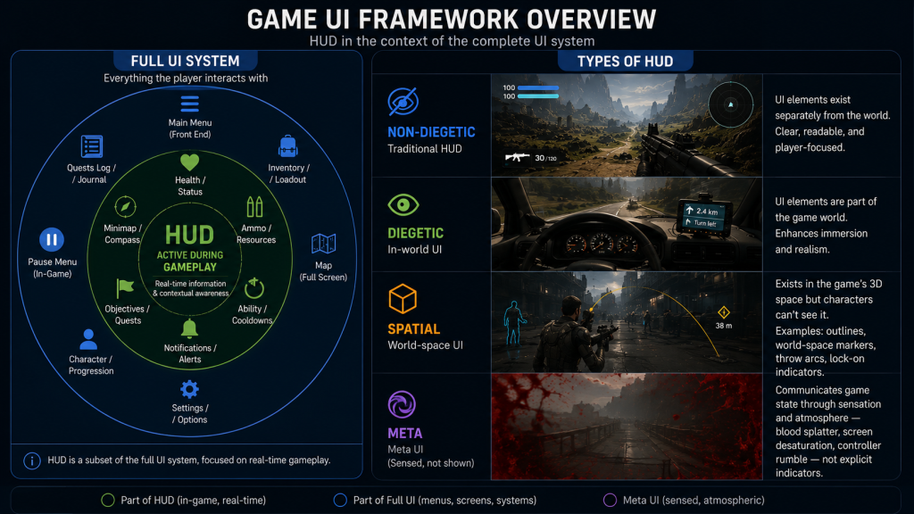
The terms HUD and UI are used interchangeably in most game design conversations, but they describe different scopes — and conflating them creates misaligned expectations at spec time.
UI (user interface) covers every visual system a player interacts with: main menus, pause screens, inventory management, settings, loading screens, shop interfaces, and the in-game overlay visible during active play. It is the complete layer of designed interaction between the player and the game.
HUD is a subset of UI. It is specifically the information layer visible during active gameplay — the elements present on screen while the player is playing, not navigating menus. Health indicators, ammo counters, minimaps, objective markers, stamina bars, crosshairs, and status effect icons are HUD elements. The pause menu is not.
The distinction matters in production because HUD and non-HUD UI elements often follow different review and iteration cycles. Menus frequently follow a different production cadence from HUD elements; HUD elements remain active and visible throughout the session and are tied to gameplay systems that continue to evolve through vertical slice and beyond. An art director speccing both as “UI” without differentiating them will encounter scope disagreements when menu work is treated as done while HUD elements continue generating feedback from playtests.
“Editorial illustration created for visual reference purposes. It does not represent a real project, client work, or official software screenshot unless stated otherwise.”
The practical definition for a production spec: the HUD is the UI designed for active gameplay states — the elements present and functional while the player is in direct control of the game, as distinct from menus, pause screens, and cinematic sequences where interface needs are different.
The four types of HUD — and what each one costs in the pipeline
The classification framework that governs how HUD elements are categorized in professional game design comes from Erik Fagerholt and Magnus Lorentzon’s 2009 Master’s thesis at Chalmers University of Technology: Beyond the HUD — User Interfaces for Increased Player Immersion in FPS Games. EA DICE designer Marcus Andrews later applied this framework to shipped game analysis in his widely cited game UI discoveries piece on Game Developer, which remains the most accessible production-facing treatment of the four-type taxonomy.
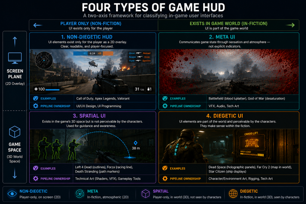
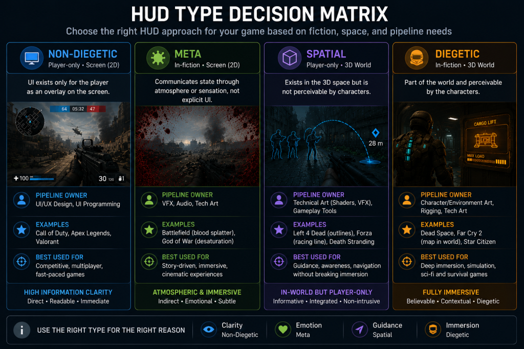
The framework answers two questions simultaneously: does the interface element exist within the game’s fictional world, and where is it displayed — on the screen plane or in the 3D game space? The combination of these two variables produces four categories.
Non-diegetic UI exists outside the game world and is displayed on the screen plane. The game characters cannot see it; it belongs to the player only. This is what most people picture when they imagine a HUD: health bars in corners, ammo counters at the bottom of the screen, objective markers overlaid on the world. Non-diegetic UI is the most information-dense and most producible format — it lives entirely in the 2D UI artist’s pipeline and requires no 3D integration. It is also the type most likely to break immersion when overused.
Diegetic UI exists within the game world and is perceivable by the characters within the fiction. The RIG suit health bar on Isaac Clarke’s spine in Dead Space — the segmented light that shows how many hits he can survive — is a diegetic HUD element. It exists as part of Isaac’s suit within the game’s fiction, rather than as a screen-only overlay. Far Cry 2‘s wrist map is another: the character physically unfolds a paper map during gameplay, a piece of equipment that belongs to the world rather than to the player’s screen. Diegetic elements create the strongest sense of immersion but carry the highest production cost. They are 3D props with rigs, animations, shaders, and LOD requirements. An art director speccing a diegetic health indicator is routing that asset through the character art or environment art pipeline, not the 2D UI pipeline.
Spatial UI exists in the 3D space of the game world but is not perceivable by the characters. It occupies physical space without being fictional. The green glow outlining survivors in Left 4 Dead — visible to the player to identify teammates through walls — is a spatial UI element: it exists in 3D space, it responds to the geometry of the world, but no character in the game can see it. Throw-arc prediction lines in physics games, enemy lock-on indicators that track in 3D, and world-space quest markers belong here. Spatial UI is owned by the technical art pipeline: it is built through shaders, particle systems, or engine-level screen-space effects, not by a 2D artist working in a design tool.
Meta UI creates meaning through representation rather than explicit display. It occupies the screen plane — like non-diegetic UI — but the representation is indirect, atmospheric, or sensory rather than informational. Blood splatter on the screen when the player takes damage in Battlefield; screen desaturation when health is critically low; controller vibration that intensifies with incoming enemy fire. These are meta UI elements: they communicate game state through sensation and mood rather than through a labeled indicator. Meta UI typically involves VFX artists, technical artists, and audio designers, and its production pipeline crosses between departments in ways that 2D UI work does not.
“Editorial illustration created for visual reference purposes. It does not represent a real project, client work, or official software screenshot unless stated otherwise.”
The production consequence of this taxonomy is not just categorical. Each type routes through a different team, requires different tooling, carries different performance budgets, and generates different types of revision feedback. An art director who decides late that a health system should be diegetic — after the 2D UI team has already built a non-diegetic version — is creating double the work and a pipeline conflict that falls outside the original SOW. The four-type decision belongs at pre-production, in the game design document and the art brief, before any production has started.
Did you know that…?
Early arcade games often displayed score and lives directly as part of the main playfield rather than as a separately designed interface layer. Pong (1972) rendered the score as part of the same output as the play area — there was no distinct overlay layer separate from the game image. Space Invaders (1978) introduced the persistent score and life counter as a fixture clearly separate from the play area, an early step toward what would later be formalized as non-diegetic HUD. The aviation term “heads-up display” was eventually adopted as the standard descriptor for game interface overlays, though game design had been building equivalent systems long before the terminology converged.
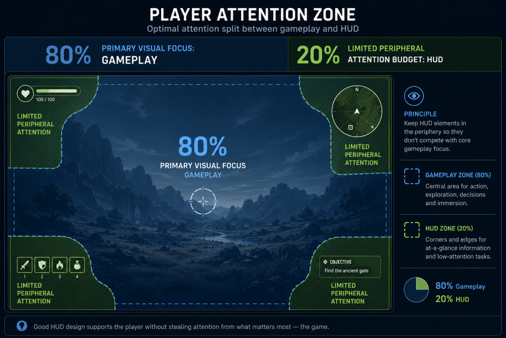
Why 80% of player attention never reaches the HUD
Eye-tracking and UX research in game contexts consistently find that players concentrate the majority of their visual attention on the gameplay area during active play, leaving a limited attention budget for interface elements at the periphery. The implication is not that HUD elements are unimportant — it is that every element competing for that attention budget must earn its place.
“Editorial illustration created for visual reference purposes. It does not represent a real project, client work, or official software screenshot unless stated otherwise.”
The result of misunderstanding this split is the cluttered HUD: an interface where every system has its indicator, every stat has its bar, and the cumulative cognitive load of monitoring all of them becomes a secondary gameplay task in itself. Players who are managing their HUD are not playing the game — they are playing a meta-game of information maintenance that runs in parallel with what the designer intended.
The art director’s responsibility in HUD design is not to eliminate information — players genuinely need to know their health state, their position, their resources, and their objectives. It is to structure that information so it demands the minimum fraction of attention needed for the player to act on it correctly.
Three structural principles govern how this is done in production.
Visual hierarchy. Within the HUD, not all information is equally urgent. Health is more urgent than score. Current objective is more urgent than secondary quest log. Visual hierarchy — the relative weight, size, contrast, and placement of elements — communicates urgency before the player consciously reads any indicator. As Nielsen Norman Group’s research on visual hierarchy documents, the organization of design elements on a screen guides the eye in an intended sequence; this principle applies directly to HUD layout, where the intended sequence is: critical game state, navigation, resource tracking, supplementary information. Designing a HUD without explicit hierarchy means every element competes equally for the player’s limited attention budget, and none of it is processed reliably.
Peripheral readability. HUD elements in the corners and edges of the screen are read in peripheral vision during most of active play. Peripheral vision has lower acuity than foveal vision and is less sensitive to fine detail but more sensitive to motion and contrast. HUD elements designed to be read in peripheral vision need to use contrast differentials and motion cues rather than fine typography or detailed iconography. A health bar that drains from full to empty communicates state through shape change and color shift — both peripheral-readable. A health bar displayed as a three-digit number in a small typeface requires the player to foveate on it to read it, momentarily pulling focus from the gameplay area.
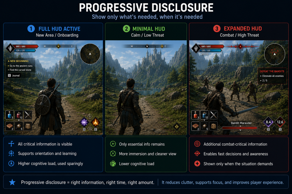
Progressive disclosure. Not all HUD information needs to be visible all the time. Progressive disclosure — showing information only when it is actionable or when its absence would impair player decision-making — is the structural answer to the 80/20 attention split. The Last of Us reduces the HUD to near-zero during exploration and expands it during combat. God of War (2018) suppresses the health bar when it is full and makes it visible only when health drops below a threshold. Fortnite‘s HUD is frequently discussed in game UX circles as an example of contextual information display — designed to show information based on player state rather than displaying all systems simultaneously.
“Editorial illustration created for visual reference purposes. It does not represent a real project, client work, or official software screenshot unless stated otherwise.”
The production implication is that progressive disclosure requires HUD elements to be stateful — they are not static images but systems with display logic triggered by gameplay events. Speccing this correctly in the UI brief means documenting not just what each element looks like but under what conditions it appears, expands, contracts, or disappears.
How HUD type determines pipeline ownership
The production routing implication of the four-type taxonomy is not incidental. It is the reason the classification decision needs to happen at art direction stage, not at implementation stage.
When a studio decides that its primary health indicator will be non-diegetic — a bar or meter displayed on the 2D screen plane — the work belongs to the UI artist pipeline. The deliverable is a vector or raster asset, animated in a UI framework (UMG/Slate in UE5, uGUI or UI Toolkit in Unity), responsive to screen resolution and aspect ratio, and subject to the same accessibility requirements as any 2D interface element.
When the studio decides the health indicator will be diegetic — part of the character model, perceivable within the fiction — the work moves into the character art pipeline. The indicator is a prop with 3D geometry, a material that must respond correctly to in-game lighting, an animation rig driven by the health gameplay variable, an LOD schedule that degrades cleanly at distance, and a character asset optimization workflow that brings it within the performance budget alongside all other character geometry. The visual design team can sketch the concept, but the production execution involves modelers, riggers, technical artists, and programmers who were not in the original UI spec conversation.
Spatial UI sits closer to the technical art pipeline. The character outlines in team-based shooters, the throw-arc prediction curve in physics games, the aura effect on an enemy about to attack — these are screen-space or world-space shader effects, particle systems, or engine-level post-process passes. A 2D UI artist cannot author them; a technical artist working in shader graph or engine-specific VFX tools owns the delivery.
Meta UI crosses into audio and VFX simultaneously. The screen-edge blood effect, the desaturation ramp when health is critical, the heartbeat audio cue that activates below 20% health — these require coordination between the UI lead, the VFX team, the audio designer, and the programmer who triggers the states. Production ownership is ambiguous without explicit documentation.
The practical outcome: an art director speccing a HUD system should produce a component list that identifies, for every element, which of the four types it belongs to, which team owns the production asset, and what the interface between the design intent and the implementation looks like. This is the HUD spec, and its absence is one of the most reliable predictors of revision-heavy UI milestones.
What a production-grade HUD spec contains
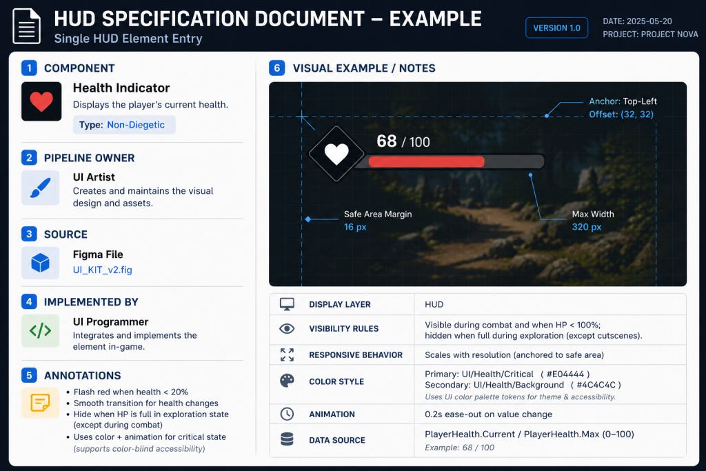
A HUD spec is the document that translates art direction decisions about the interface into production-executable instructions. It is not a mood board and not a wireframe — those are inputs to the spec. The spec is the document the UI artist, the technical artist, and the programmer use to build, integrate, and validate each element.
For each HUD component, a complete spec entry contains:
Element identity and type. Name, four-type classification (non-diegetic / diegetic / spatial / meta), and pipeline owner. A health indicator named “PlayerHealthArc” classified as non-diegetic, owned by UI Art, is a different production commitment than one classified as diegetic, owned by Character Art.
Display logic. Under what conditions is this element visible? Always-on, conditional on game state, triggered by player input, suppressed during cinematics. A minimap that disappears during cutscenes needs that rule documented, or someone will notice it in QA.
Visual specification. Size, position (screen-safe-zone compliant), color system (defined relative to the game’s UI color palette, not as absolute hex values that cannot adapt to theme or accessibility settings), animation states (idle, low-resource warning, depleted), and responsive behavior across aspect ratios.
Accessibility parameters. Color-blind safe alternatives for any element that communicates state through color alone, minimum text size for any typographic element, scalability range if the studio is implementing HUD size customization.
Platform deltas. If the game ships on PC and console, the same element may need different placement to account for TV overscan safe zones. If it ships on mobile, touch target size requirements apply. These are not implementation details — they affect the visual design and need to be in the spec before art production starts.
Integration reference. Which gameplay variable drives this element, who owns that variable on the engineering side, and what the data range is. A health system may expose a PlayerHealth float normalized from 0.0 to 1.0 for material parameters and progress-bar drivers, or an integer tracking 0 to 100 in gameplay code — the spec needs to document which representation the UI is reading, what the visual state at zero looks like (depleted state, animation trigger, sound cue), and whether values above the base maximum are possible for overheal states.
“Editorial illustration created for visual reference purposes. It does not represent a real project, client work, or official software screenshot unless stated otherwise.”
Producing a complete HUD spec before UI art production begins is not overhead — it is the mechanism by which revision rounds are prevented. An element that enters production with an incomplete spec will generate revision feedback from at least three sources: the art director reviewing visual consistency, the QA team finding edge-case display states, and the programmer discovering that the visual behavior doesn’t match the gameplay variable’s actual range.
Technical matrix: HUD types by production parameter
| Dimension | Non-Diegetic | Diegetic | Spatial | Meta |
| Pipeline owner | 2D UI artist | Character / environment art + rigging | Technical art (shader, VFX) | VFX + audio + technical art |
| Production asset type | 2D vector/raster, UI widget | 3D prop with rig and material | Shader effect, particle system, post-process | Screen-space effect, audio system |
| Engine implementation | UI framework (Slate, uGUI, UI Toolkit) | Skeletal mesh, material driver | Material, particle, or screen-space shader | Post-process volume, audio system |
| Performance budget | Low: draw calls in UI pass | Medium-high: 3D geometry + lighting | Medium: shader complexity dependent | Low-medium: post-process dependent |
| LOD requirement | Responsive layout for screen size | Full 3D LOD cascade, same as character geometry | Shader LOD or particle budget | State-triggered, not distance-dependent |
| Immersion potential | Lower: exists outside the fiction | Highest: part of the game world | High: world-space presence without fiction break | High: sensory/atmospheric |
| Accessibility complexity | Moderate: color and size adjustments | High: requires 3D design alternatives | High: shader-based, hard to adjust per user | Moderate: intensity/frequency scaling |
| Revision cost | Low: 2D changes fast | High: 3D pipeline changes expensive | Medium: shader iteration is technical | Medium: cross-department coordination |
| Recommended for | Information-heavy genres; competitive; strategy | Immersion-critical; single narrative; cinematic | Action; spatial feedback; player state | Damage response; environmental state; sensory feedback |
“Editorial illustration created for visual reference purposes. It does not represent a real project, client work, or official software screenshot unless stated otherwise.”
HUD design decisions that connect to environment art
HUD is not designed in isolation from the world it overlays. The relationship between the HUD layer and the environment art beneath it is a readability dependency that has to be managed across both teams.
The most direct version of this is contrast. A white ammo counter readable against a dark urban environment becomes invisible when the same level transitions to a snow-covered outdoor section. The HUD design team either builds adaptive contrast into the element (a dark outline, a semi-transparent background, a glow that adjusts relative to the scene’s luminance) or the environment art team manages the luminance zones of the game world with HUD legibility as an explicit constraint.
In a well-organized production, this is a documented requirement: the UI art team specifies the luminance range within which each HUD element is guaranteed readable, and the environment art team adds that range to the gameplay readability in environments checklist applied during final art pass. It is not a late-stage fix caught in QA — it is a constraint that shapes both pipelines from the beginning.
Diegetic HUD elements create a more complex dependency. A diegetic health indicator on a character’s suit is a 3D asset whose visibility depends on the character being on screen, at a readable distance, and in a lighting state where the material reads correctly. The art director speccing a diegetic HUD element for a first-person game — where the player’s hands and weapon are always visible — is making a lighting and camera dependency decision as much as a visual design decision. That element needs to read under every lighting condition in every level, which means the environment lighting team and the UI team have a shared readability requirement that needs to be tested together.
The visual design pipeline for any game with diegetic or spatial HUD elements should explicitly include cross-team readability reviews: a stage where HUD elements are evaluated against actual in-game lighting conditions, not in isolated UI mockups. This is not standard in studios whose UI team operates entirely in 2D design tools — but it is necessary for any HUD type that lives in the 3D world.
HUD accessibility: what it requires in production
Accessibility in HUD design is not a post-launch patch category. It is a production requirement that, when treated as late-stage, creates expensive retrofit work.
The three most common accessibility failure modes in HUD design are: color-only state communication, minimum size violations, and missing customization options.
Color-only state communication occurs when an element conveys information exclusively through hue — the health bar turns red when critical, the status icon is green when active and gray when inactive. For players with color vision deficiencies — approximately 8% of male players and 0.5% of female players — these elements are indistinguishable at their critical states. The production fix is to pair color communication with a secondary channel: shape, motion, pattern, or label. A health bar that shifts from full to a pulsing animation at the critical threshold communicates the same information without requiring color discrimination.
Minimum size violations in HUD text are common on console, where the UI was designed at 1080p and the player is sitting at couch distance. Fixed point-size rules are unreliable across platforms; the real test is legibility at target resolution, viewing distance, and minimum supported screen size for each platform. A size that reads clearly on a monitor at arm’s length may be illegible on a television across a room at the same nominal point size.
Customization — the ability for players to resize HUD elements, reposition them, or toggle them — has moved from a premium accessibility feature to an expectation in competitive and mid-core games. Final Fantasy XIV and Baldur’s Gate 3 both offer full HUD editor functionality. Designing for customization changes the spec: elements that may be repositioned need to be built as modular components with defined anchor behavior, not as fixed-position assets with hardcoded screen coordinates. This is a decision that affects how the UI widget is architected, and it needs to be in the spec before engineering implementation begins.
About Nasty Rodent
At Nasty Rodent, we work on UX/UI production for mid-core and AAA game titles — from initial HUD type decisions through to final asset delivery and integration support. Our UX/UI production services cover the full pipeline: wireframing and spec documentation, 2D UI art, diegetic UI prop design in coordination with character and environment art teams, and cross-platform adaptation.
The four-type classification described in this article is where every HUD engagement begins — because the pipeline routing decision determines everything that follows. For studios working through this decision in pre-production, our piece on the four-type UI taxonomy in production covers the decision framework in depth with production cases.
Our clients include Offworld Industries, The Bearded Ladies Consulting, Reburn, Whimsy Games, Galaxy 4 Games, and Benner Games. If you are planning a HUD system and need a production partner who understands how interface type decisions connect to the broader art pipeline — or need to evaluate whether your current approach will scale — you can start here: choosing a game UX/UI studio.