Finding the Friction Points a Game UX Audit Is Supposed to Catch
-

Written byDenys Zadoienyi
-

Updated on15.09.2026
-

Time to read14 min


- Why “check the UI” isn’t a UX audit
- What counts as a friction point (and what doesn’t)
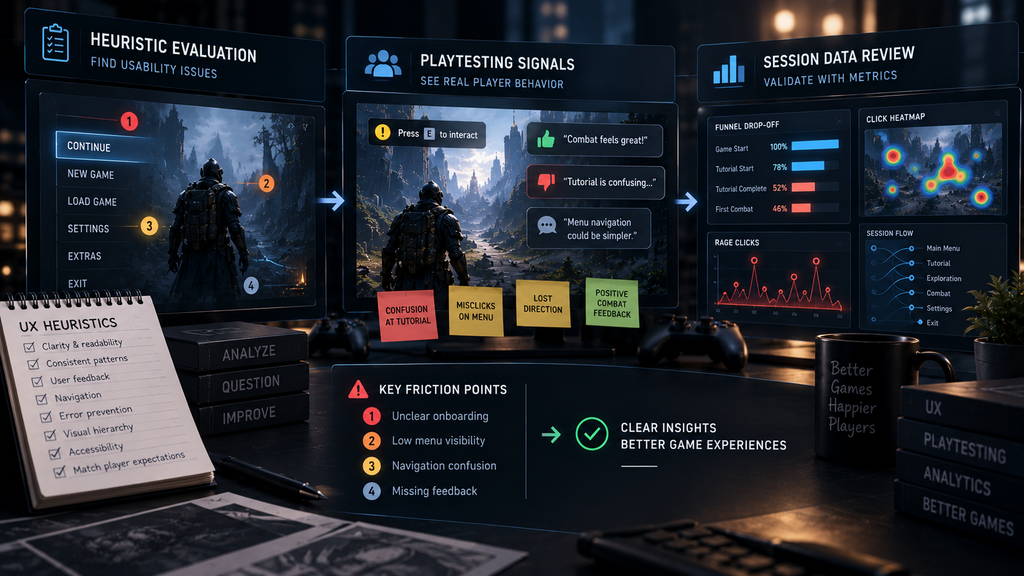
- Three methods that actually surface friction points
- Symptom vs. root cause: the diagnostic habit most audits skip
- What a real audit deliverable actually contains
- Can your team run this audit itself?
- What a useful audit deliverable should look like in practice
- Heuristic evaluation vs. playtesting vs. telemetry, at a glance
- Turn “something feels off” into a fixable list
“Editorial illustration created for visual reference purposes. It does not represent a real project, client work, or official software screenshot unless stated otherwise.”
A game UX audit is a structured review of a shipped game or a playable build that identifies specific friction points – moments where the interface or interaction design creates confusion, wasted effort, or frustration – and traces each one back to a root cause an art or UX team can actually act on. It is not a style opinion pass, and its output is not a list of preferences. A real audit produces findings a producer can prioritize and a team can fix.
Most teams that ask for “a UX review” get a document full of subjective reactions: this button feels small, this menu feels cluttered, this doesn’t feel modern. None of that is wrong, exactly, and none of it is actionable either – “feels cluttered” doesn’t tell an artist what to change, and it doesn’t tell a producer whether it’s worth a sprint. A UX audit that’s actually worth commissioning looks different: it names a specific friction point, ties it to where in the interaction it occurs, explains why it happens, and rates how much it costs the player experience. That difference – between an opinion and a diagnosis – is the entire value of the exercise.
Why “check the UI” isn’t a UX audit
A common failure in UX audits is treating the interface itself as the problem, when it may only be the surface where an underlying issue becomes visible. A confusing settings screen might be a visual hierarchy problem, or it might be that the underlying information architecture never resolved what belongs together – no amount of restyling fixes the second kind of problem, and a reviewer who never asks which one they’re looking at risks recommending a fix that addresses the symptom rather than the cause.
This matters because audits tend to be especially valuable around a specific kind of moment: a milestone review, a beta or soft launch, or any point where playtests or product data suggest a problem the team can’t yet explain. At that point, a vague “the UX needs work” verdict is worse than useless – it confirms what everyone already suspected without giving anyone something to act on. The job of the audit is to convert “something feels off” into a specific, ranked list of what’s actually broken and why.
What counts as a friction point (and what doesn’t)
A friction point is a specific moment in the player’s interaction with the interface where their intent and the game’s response don’t line up cleanly – where the player has to stop, re-read, guess, retry, or give up on something the design should have made obvious. Not every rough edge qualifies. A screen that isn’t visually polished yet but functions exactly as players expect is a production-timeline issue, not a friction point. A screen that looks finished but consistently produces hesitation, misclicks, or abandonment is a friction point regardless of how good it looks.
Friction points cluster into a few recognizable categories, and knowing which category a finding belongs to changes what the fix looks like:
- Cognitive friction – the player has to think harder than the moment warrants to understand what’s happening or what to do next. This is where flow state and cognitive load – covered in more depth in our breakdown of player psychology in game UX – become the actual diagnostic lens for an audit, not just background theory. A HUD element competing for attention during a high-focus moment is cognitive friction with a name.
- Navigational friction – the player can’t find the path to what they want, or the path exists but isn’t where their mental model expects it.
- Feedback friction – an action was taken but the interface doesn’t confirm it clearly, quickly, or proportionally enough for the player to trust that it registered.
- Accessibility friction – a portion of the audience is excluded or disadvantaged by a design choice that wasn’t built with alternatives in mind, a category covered in detail in our guide to accessibility in game design.
An audit that only looks for one of these categories will systematically miss the others – a reviewer focused purely on visual hierarchy will catch navigational friction and walk past feedback friction entirely, because they’re looking for a different signature. These four aren’t an exhaustive academic taxonomy – input and control friction, timing, onboarding, and platform-convention mismatches are all real categories too – they’re simply a practical starting set for organizing what an audit turns up.
Three methods that actually surface friction points
No single method surfaces every kind of friction. Combining methods broadens the evidence base, but the right approach depends on the audit question, the available build, player access, and existing instrumentation.
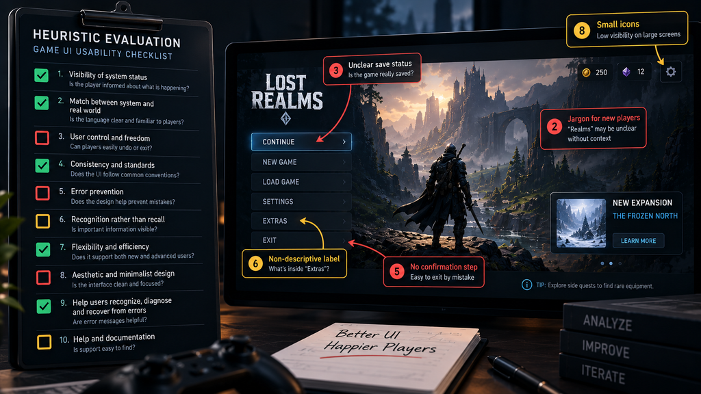
Heuristic evaluation applies a known set of usability principles against the interface systematically, screen by screen. Jakob Nielsen’s ten usability heuristics – visibility of system status, consistency and standards, error prevention, recognition rather than recall, and the rest – translate well into game UX, provided the reviewer adapts them to the fact that games aren’t productivity software: a game is allowed to withhold information deliberately for pacing or tension, where a banking app never should. Nielsen’s list is a useful baseline, not the only valid one – game-specific conventions, platform guidelines, and a studio’s own interaction principles often need to be layered on top for a full pass. A heuristic pass is fast and cheap, and it systematically surfaces departures from known usability principles and from a game’s own internal conventions.
“Editorial illustration created for visual reference purposes. It does not represent a real project, client work, or official software screenshot unless stated otherwise.”
Structured playtesting puts real players in front of the build and observes where they hesitate, backtrack, or ask a question the interface should have answered. The value here isn’t the players’ opinions afterward – it’s watching the moment friction happens in real time, before the player has had a chance to rationalize it into a comment like “it was fine, just needed to figure it out.” A UX audit built only on post-session self-report loses an important part of playtesting’s value: direct observation of what players actually did, before they explained or rationalized it afterward.
Session data and telemetry review, where it’s available, surfaces friction at scale that a handful of playtest sessions can’t: a screen with an unusually high abandonment rate, a menu path a large share of players never discover, a setting almost nobody changes – which gives the team a specific behavior to investigate, not yet an explanation for it. Telemetry tells you where to look; it rarely tells you why on its own, which is why it works best paired with heuristic evaluation or playtesting on the specific screens it flags.
Production note. These three methods answer different questions: heuristic evaluation surfaces departures from known usability principles and internal conventions, playtesting surfaces behavior a static review can’t predict, and telemetry surfaces scale and helps with prioritization. Combining methods widens the evidence base because each one reveals something the others can’t – but the right mix depends on the audit question, the build’s access, player availability, and existing instrumentation, not a fixed rule about how many methods a “real” audit needs.
Symptom vs. root cause: the diagnostic habit most audits skip
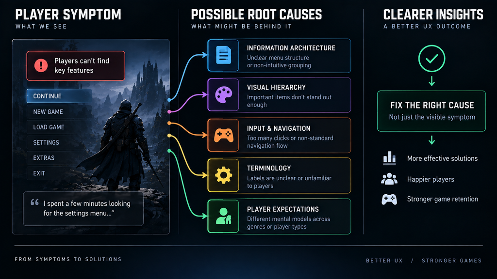
One of the easiest ways to produce a weak audit is to stop at the first plausible explanation. “Players don’t understand the crafting menu” is an observation, not a diagnosis – the actual cause could be an unclear icon system, a navigational path that doesn’t match the player’s mental model, information architecture that groups the wrong things together, or simply that the tutorial never explained the underlying system in the first place. Each of those root causes points to a completely different fix, made by a different discipline, at a completely different cost.
“Editorial illustration created for visual reference purposes. It does not represent a real project, client work, or official software screenshot unless stated otherwise.”
A useful habit here is to keep asking “why” past the first answer a reviewer reaches for. Players abandon the crafting menu – why? They can’t find the ingredients they need – why? The icons don’t visually distinguish material types – why? Nobody defined a visual language for material categories before art production started. That’s four levels down from the original observation – but each step down that chain is a hypothesis, not a fact, until it’s checked against actual observation, playtest footage, or telemetry. A validated cause at that fourth level tells a producer what to schedule and who owns it; an unvalidated guess at the fourth level is just a more specific-sounding guess.
| Failure pattern | What it looks like in the audit | Why it produces a bad fix |
| Stopping at the first explanation | “Menu feels confusing” reported as the finding itself | Nobody knows what to actually change |
| Treating every finding as a visual problem | Restyling recommended for a navigational or information-architecture issue | The redesign ships and the friction point persists |
| No severity ranking | Twenty findings with no indication of which matter | Team fixes the easiest issues, not the costliest ones |
| No reproduction steps | “Players get lost in the inventory” with no specific path described | Engineering and art can’t locate what to fix |
| Method blind spot | Audit built entirely on one reviewer’s heuristic pass | Behavioral and scale-based friction goes undetected |
What a real audit deliverable actually contains
A findings entry that’s actually usable names the friction point, records what was actually observed, states where it occurs precisely enough that someone can reproduce it, identifies which category it falls into, rates its severity, and recommends a specific next step – not a redesign brief, just a direction. The example below illustrates the pattern a findings entry follows; it’s a composite built to show the format, not a transcript from a specific engagement.
Finding: Players frequently fail to notice that a match-3 booster has been earned and is available to use.
Evidence: Observed across multiple playtest sessions – players proceed to the next level without opening the booster tray, then rediscover it several levels later.
Where / reproduction path: Complete a level that awards a booster → observe the results screen → return-to-map transition.
Category: Feedback friction.
Severity: High – the earned reward is easy to miss during a flow that repeats every session.
Business relevance: The same gap also affects discoverability of a monetized mechanic.
Likely root cause (hypothesis pending validation): The booster-earned notification appears for a fixed, short duration during a screen transition the player is already visually occupied with (results tally), competing for attention at the worst possible moment.
Recommended direction: Move the notification to a moment when the player’s attention is idle – map screen arrival, not mid-transition – or persist it as a badge rather than a transient toast.
That structure – finding, evidence, location, category, severity, cause, direction – is what separates a deliverable a team can act on from a document that reads well and changes nothing. A full audit is a ranked list of entries like this, not a paragraph of general impressions.
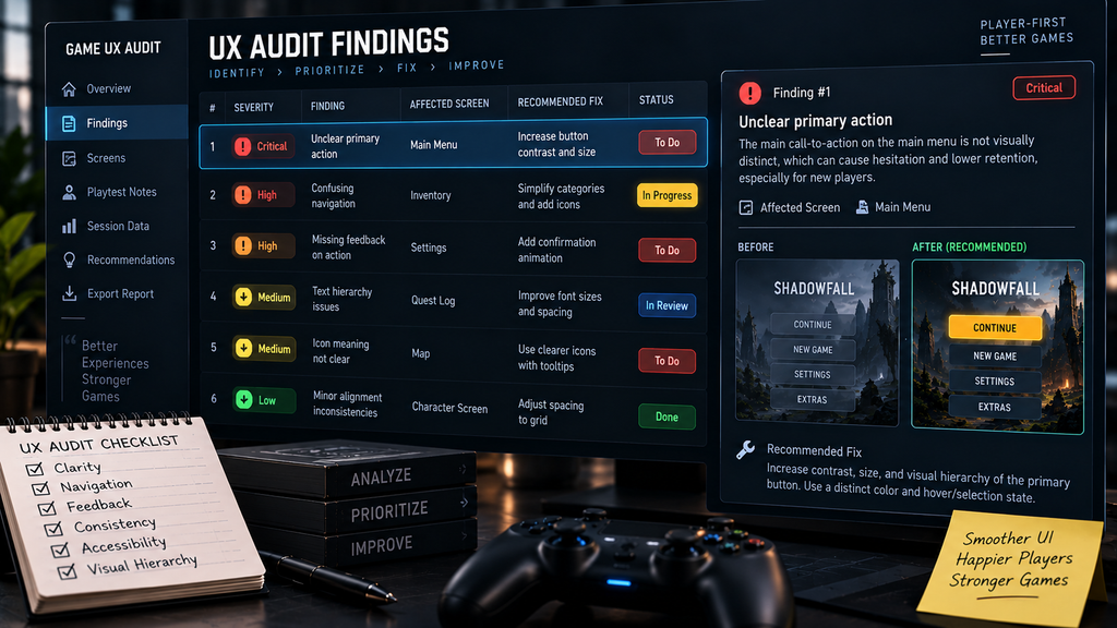
“Editorial illustration created for visual reference purposes. It does not represent a real project, client work, or official software screenshot unless stated otherwise.”

Can your team run this audit itself?
Some of this is genuinely DIY-able. A designer who knows the ten usability heuristics can run a lightweight heuristic pass internally, particularly when the scope is small and clearly bounded – a handful of core screens rather than a full live-service title. The honest version of this workflow looks like: block off dedicated time separate from production work, go screen by screen against the heuristic list, and write down anything that violates one, without stopping to fix it yet.
Where in-house audits typically fall short isn’t the method – it’s the blind spot every team has for its own product. A designer who built the crafting menu already knows what it’s supposed to do, which makes it much harder for them to experience the interface with the assumptions of a first-time player. Structured playtesting with genuinely unfamiliar players is much harder to fake internally than a heuristic pass, because it requires people who don’t already know the answer.
What an internal audit tends to cost that doesn’t show up on a schedule:
| Hidden cost | What it looks like |
| Team time pulled from production | The person qualified to run the audit is usually also needed elsewhere |
| Confirmation bias | Familiarity with the build makes real friction points invisible to the people who built it |
| Rework from late discovery | Findings surfacing near a milestone gate cost more to fix than the same finding caught earlier |
| Recruiting genuinely unfamiliar testers | Finding and briefing outside playtesters takes real coordination time most teams underestimate |
An outside review becomes more useful as a few things grow: screen count, the number of interconnected flows, platforms, and input methods; whether the team suspects a systemic issue (players consistently disengaging at a specific point) rather than isolated rough edges, since systemic issues usually need the symptom-to-root-cause process described above rather than a quick pass; and whether the audit needs to inform a go/no-go milestone decision, where an outside, less familiar reviewer is likely to catch what internal familiarity is filtering out. The common thread across all three is that a single reviewer can no longer evaluate the build without leaning heavily on knowledge they already have of how it’s supposed to work. Whichever way that decision lands, it’s the same resourcing question covered in our note on UI/UX co-development versus outsourcing – an audit doesn’t have to mean handing over the whole UX function.
Quick self-test. An internal audit is more viable when the team has someone trained in usability evaluation, can observe players who are genuinely unfamiliar with the build, has access to evidence appropriate to the question – unfamiliar players, existing analytics, or both – has time before the next milestone to act on findings rather than just collect them, and is investigating a bounded problem rather than a suspected systemic one. The more of those conditions are missing, the more an independent review is likely to surface that an internal pass would miss.
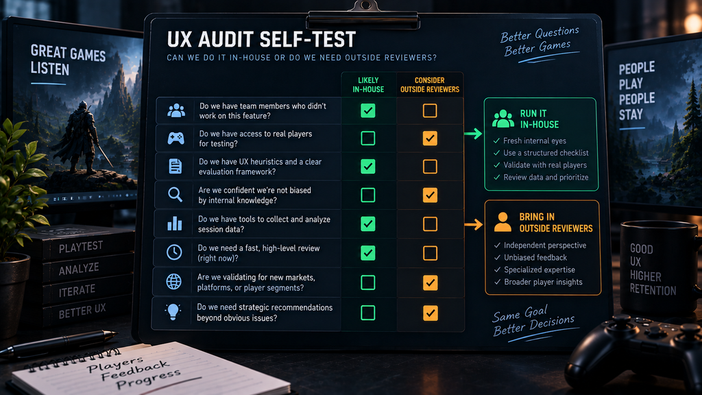
“Editorial illustration created for visual reference purposes. It does not represent a real project, client work, or official software screenshot unless stated otherwise.”
What a useful audit deliverable should look like in practice
A practical audit follows the same structure described above regardless of who runs it: evidence gathered from whichever review methods fit the build and the question being asked, findings organized by category and severity, and each issue traced past the first visible symptom before a recommended direction gets written down. What separates a useful deliverable from a document that just reads well is that last step – a direction a team can act on, not a style critique dressed up as usability work.
If an audit surfaces findings your team needs help acting on – a menu that needs restructuring, a feedback system that needs redesigning – the next decision is who does that work and how. Our checklist for choosing a game UX/UI studio covers what to verify before handing that off, whether the audit team and the fix team end up being the same partner or not.
Heuristic evaluation vs. playtesting vs. telemetry, at a glance
| Heuristic evaluation | Structured playtesting | Telemetry review | |
| Best at | Systematic review against known usability principles and interaction conventions | Behavior a static review can’t predict | Scale and prioritization |
| Needs | One or more reviewers familiar with the framework, plus access to the build | Unfamiliar players, observation time | Existing analytics instrumentation |
| Typical effort | Relatively lightweight for a bounded scope | Moderate – depends on recruiting and sessions | Fast once data exists |
| Blind spot | Won’t catch behavior it didn’t anticipate | Small sample size, may miss rare paths | Tells you where, rarely tells you why |
Takeaway: the three methods surface different failure types – combining them widens the evidence base, but the right mix depends on the audit question, build access, and available player data, not a fixed rule about how many methods count as credible.
Turn “something feels off” into a fixable list
A UX audit earns its cost by replacing a vague sense that something’s wrong with a ranked, specific list of what’s actually broken, why, and what to do about each one. Many findings don’t require a full redesign – they need the actual friction point identified precisely enough that the team can fix the underlying issue instead of redesigning around a vague feeling.
If your team suspects there’s friction costing you players and can’t pin down exactly where, that’s precisely the gap an outside audit is built to close.
Order a UX audit for your game – 5 business days delivery. Send your build to sales@nastyrodent.com.