What a Mood Board Actually Does in Game Production
-

Written byDenys Zadoienyi
-

Updated on16.09.2026
-

Time to read13 min

- Why a folder of references isn’t a mood board
- From wide pool to narrow set: the actual process
- What a mood board should communicate (and what it shouldn’t)
- Where the reference pool actually comes from
- Mood board, art bible, and color script aren’t the same document
- Turning a mood board into a concept-art brief
- Where mood board use commonly breaks down
- How mood boards work on our projects
- Mood board vs. art bible vs. color script, at a glance
- A mood board’s job is to make a decision, not postpone one
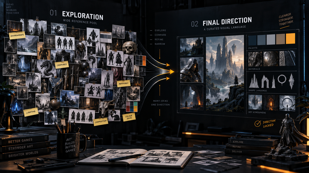
“Editorial illustration created for visual reference purposes. It does not represent a real project, client work, or official software screenshot unless stated otherwise.”
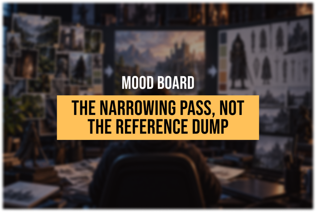
A mood board in game production is a curated set of visual references, narrowed down from a much wider pool, that helps establish or refine a visual direction – tone, palette logic, material quality, shape language – before or during early concept exploration. Its value isn’t in the images themselves; it’s in the narrowing. A large, unfiltered set of references with no selection logic behind it is a reference dump, not a mood board, and the difference matters more than it sounds like it should, because a reference dump hands the interpretive work to whoever looks at it next instead of doing that work up front.
Most people who’ve worked near game art have seen both versions. One studio’s “mood board” is a shared folder with a large, unsorted mix of screenshots and concept paintings pulled from a dozen different games, no notes, no grouping, no explanation of why any particular image is there. Another studio’s mood board is a deliberately curated set, each image selected for a specific reason that’s written next to it, and a concept artist can look at it and quickly understand exactly what direction they’re being asked to explore. Both are called mood boards. Only one of them does what a mood board is supposed to do.
Why a folder of references isn’t a mood board
The instinct behind a reference dump is understandable – when a project is early and the direction is still fuzzy, gathering everything that feels relevant seems like the safe move. Nothing gets excluded, so nothing gets accidentally ruled out too early. The problem is that a large, unfiltered pool of references doesn’t communicate direction; it communicates the absence of a decision. If the goal of a mood board is to give a concept artist, an art director, or an outsource partner a shared visual target, then an unfiltered pool asks them to build that target themselves out of a large set of inconsistent signals.
A wide pool is a legitimate starting point – the mistake is stopping there. The actual work of a mood board happens in what gets cut. Narrowing a broad reference pool into a focused selection isn’t a loss of options; it’s the point where vague inspiration turns into a decision someone can act on. A mood board that hasn’t been through that narrowing pass yet is a research folder, and research folders are a fine thing to have – they just aren’t the deliverable that hands off to concept art.
From wide pool to narrow set: the actual process
“Editorial illustration created for visual reference purposes. It does not represent a real project, client work, or official software screenshot unless stated otherwise.”
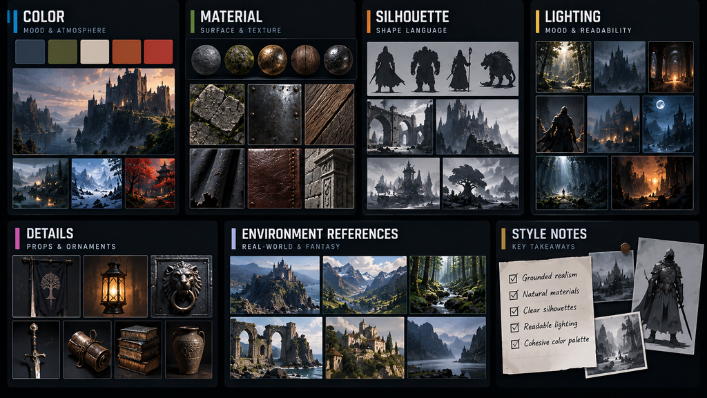
Building a usable mood board starts wide and gets deliberately smaller, and the narrowing has a logic to it rather than happening by gut feeling alone.
Gathering broadly, but by category. A useful starting pool isn’t just “anything that looks cool” – it’s organized from the start around the specific questions the project needs answered: what does the color palette feel like, what materials define this world, what silhouette language do the characters share, what quality of light sets the mood. Gathering references against these categories, rather than into one undifferentiated pile, makes the narrowing pass much faster, because comparing a handful of lighting references against each other is a different, easier task than sorting lighting references out of a large mixed pool.
Cutting for consistency, not just quality. The narrowing pass isn’t about keeping the “best” images – a beautiful reference that pulls in a different direction from everything else selected is a liability, not a bonus. The question at this stage isn’t “is this a good image” but “does this image agree with the other images we’re keeping.” A mood board where every reference reinforces the same handful of decisions is more useful than one that includes several strong but contradictory ideas.
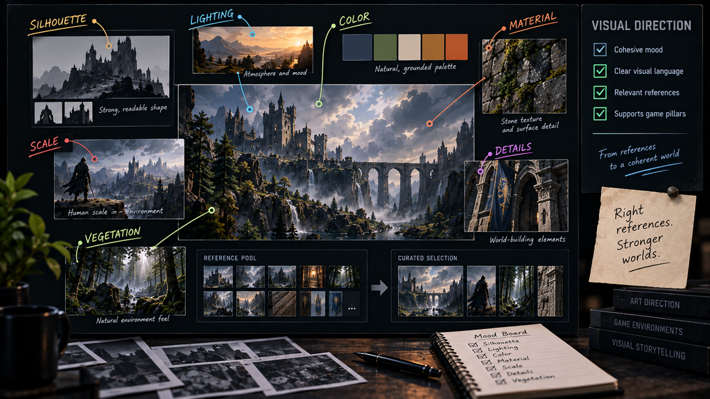
Annotating what could be read more than one way. References that could be interpreted in more than one way should be annotated with the specific quality they’re meant to communicate. “This one for the rim-lighting quality, not the color” prevents a concept artist from reading a reference more broadly than intended and importing elements nobody meant to borrow – a color palette that came along for the ride when the image was only selected for its lighting, or a genre tone that wasn’t the point. A reference chosen for one obvious, unambiguous quality may not need a note at all; the annotation earns its place where ambiguity actually exists.
“Editorial illustration created for visual reference purposes. It does not represent a real project, client work, or official software screenshot unless stated otherwise.”
Stopping at a size someone can actually hold in mind. There’s no fixed number that’s correct for every project, but the practical test is whether someone reviewing the board can look at all of it in one sitting and describe the direction in a few sentences afterward. A board that still leaves the direction ambiguous after a full review is still too wide, regardless of how long that review took.

What a mood board should communicate (and what it shouldn’t)
A common misuse of a mood board is treating it as a set of literal copy targets rather than a set of extracted principles. A reference image included for its material quality – how light catches a particular kind of weathered metal – is not an instruction to reproduce that exact object. It’s a demonstration of a quality the new work should share. References from existing commercial work should be used with care and with attention to source and how the board will be shared – the production goal is to extract a principle, not to reproduce distinctive protected artwork or designs. When that distinction gets lost, a mood board stops directing original work and starts producing derivative work, which slows a project down regardless of any legal question.
A mood board earns its usefulness by isolating the specific variable each reference demonstrates: temperature and palette range, material logic (how surfaces read as worn, new, organic, or manufactured), shape language (angular versus rounded, compact versus elongated), and lighting quality (hard and directional versus soft and diffuse). When a reference is included for several of these qualities at once, those qualities should be made explicit so the artist doesn’t have to guess which parts of the image are authoritative.
A useful mood board also records what direction to avoid, not only what to move toward. A note like “stylized, but not toy-like” or “weathered metal, but not post-apocalyptic rust overload” rules out a specific misreading that a positive reference alone wouldn’t catch – it’s easy to select an image for its texture and have a viewer absorb its overall genre tone instead. Negative references, even just a short list of anti-targets alongside the board, close off that ambiguity directly instead of hoping the positive references alone are specific enough to rule it out.
Where the reference pool actually comes from
The quality of a mood board’s starting pool matters as much as the narrowing pass that follows it, because narrowing a weak pool just produces a smaller weak pool. A few sources tend to do more work than a generic image search:
- Real-world photography for material and lighting truth – weathered metal, fabric behavior, how light actually falls on a surface at a given time of day. Concept art can stylize freely, but stylization that starts from an accurate observation reads as intentional; stylization that starts from a vague impression reads as arbitrary.
- Existing games and film, used carefully. These are the fastest way to communicate tone and genre expectation, but they’re also the references most likely to get copied too literally if they aren’t annotated for the one quality they’re meant to demonstrate.
- Adjacent disciplines – architecture, industrial design, fashion, natural history illustration – often supply shape language and material logic that reads as fresher than references pulled from other games, precisely because the audience hasn’t already associated that visual vocabulary with a competing title.
- The project’s own established work, once any exists. A mood board built in isolation from a game’s existing characters or environments risks proposing a direction the project has already moved past.
None of these sources substitute for the narrowing pass – a wide pool built from good sources is still just a wide pool until someone cuts it down to a direction. But a narrowing pass applied to a shallow, generic pool produces a shallow, generic direction, no matter how disciplined the process around it is.
Mood board, art bible, and color script aren’t the same document
“Editorial illustration created for visual reference purposes. It does not represent a real project, client work, or official software screenshot unless stated otherwise.”
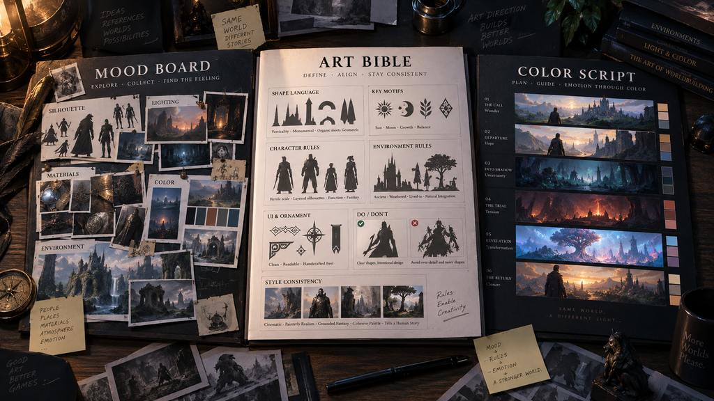
These three terms get used loosely, and on a project without a shared vocabulary, that looseness causes real confusion about what’s been decided and what’s still open. A mood board is typically the loosest of the three – a narrowed reference set that establishes or refines direction, often early, but just as reasonably created later for a new biome, faction, or content family. An art bible is a broader, longer-lived document that usually absorbs a mood board’s conclusions alongside a style guide, category references, and the do’s-and-don’ts that keep a large team consistent across a multi-year production. A color script is narrower and more technical again – a sequence of palette frames mapping how color shifts across a game’s zones or narrative arc, and it can be developed in parallel with visual development rather than strictly after it, as covered in our breakdown of color theory for game art.
These are related documents that answer different production questions, at different levels of technical specificity, for different audiences – not a fixed pipeline every project runs through in the same order. On one project a mood board precedes a style bible that doesn’t exist yet; on another, an art bible is already established and a new mood board gets built just to direct a new region or character family within it.
Turning a mood board into a concept-art brief
“Editorial illustration created for visual reference purposes. It does not represent a real project, client work, or official software screenshot unless stated otherwise.”
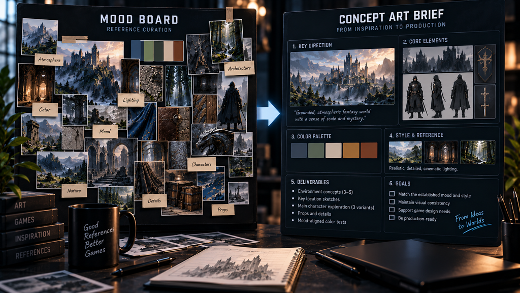
A mood board that stays a mood board and never becomes anything more specific eventually stalls production, because a character, prop, or environment still has to be translated from “this direction” into an actual design. Sometimes that translation is a handoff to a separate concept artist; just as often, the concept artist is the person who helped build the mood board in the first place and carries its conclusions forward themselves. Either way, the work goes further when the mood board’s conclusions get folded into the same kind of specification that governs the rest of concept work – narrative and role context, technical constraints, and a clear deliverable target, the same categories that make any concept art brief production-ready rather than a vague creative prompt.
For character-specific work in particular, the mood board’s shape-language and material conclusions become inputs the concept artist carries all the way through to the handoff sheet that eventually reaches the 3D team – the turnaround views, material callouts, and silhouette specification covered in our walkthrough of the character concept art pipeline. A mood board that never gets translated into that level of specificity tends to produce concept work that looks appropriately “in the mood” without actually being buildable.
Where mood board use commonly breaks down
| Failure pattern | What it looks like | Why it costs time later |
| Reference dump, no narrowing | A shared folder with hundreds of unsorted images | Every viewer interprets direction differently |
| No annotation | References included with no note on why | A quality nobody intended gets copied along with the one that mattered |
| Treated as literal copy targets | Concept work that reproduces reference images too closely | Derivative results, and potential IP risk if sources are commercial games |
| Never revisited | The same board still referenced long after the project has moved on, unchanged | Direction drifts from what the board originally captured without anyone noticing |
| No single owner | Multiple people add and remove images without a review pass | The board reflects everyone’s taste and nobody’s decision |
How mood boards work on our projects
Wild Rage, developed with Whimsy Games, is a relevant example of a project where Nasty Rodent owned the broader art direction across concept art, characters, weapons, props, environments, and UI/UX. The published case documents a briefing and reference-gathering step early in the process, where moodboards and visual references are reviewed to align expectations before concept production begins. The public material doesn’t document the exact size of the initial reference pool, the number of curation passes, or the final mood-board structure, so those specifics aren’t part of this example.
Bubble Quest of Vikings, developed with Whaleapp, is another project where reference gathering and moodboard review are part of the studio’s documented early-production approach, ahead of confirmed work across concept design, characters, environments, and UI. As with Wild Rage, the specific curation process and reference counts for that project aren’t public.
If your team is at the stage of turning a mood board’s direction into actual concept work, our concept art services pick up exactly where the mood board leaves off – narrowing further from direction into specific, production-ready designs.
Mood board vs. art bible vs. color script, at a glance
| Mood board | Art bible | Color script | |
| Stage | Often early, but can recur for new content, biomes, or factions | Pre-production, then ongoing reference | Can be built alongside visual development and referenced through production |
| Scope | Tone, palette feel, material and shape direction | Full style guide, category references, do’s-and-don’ts | Palette progression across scenes, zones, acts, or narrative beats |
| Audience | Concept artists, art director | Whole art team, outsource partners | Art director, environment and lighting teams |
| Lifespan | Useful while its reference context stays relevant | Long – referenced across the full production | Long where a project maintains one, referenced at milestones |
A mood board’s job is to make a decision, not postpone one
The value of a mood board isn’t the references themselves – it’s the narrowing pass that turns a wide, inconsistent pool of inspiration into a direction specific enough for someone else to act on. A board that skips that pass and stays wide is still useful as research, but it isn’t yet doing a mood board’s actual job.
If your project has a mood board in place and needs it translated into production-ready concept work, that’s exactly the handoff our concept art team works on every day.
Explore our concept art portfolio →