Wireframe to Production-Ready Files: The Full Game UI Design Process
-

Written byDenys Zadoienyi
-

Updated on14.09.2026
-

Time to read15 min

- Why “wireframe to final files” is not one step disguised as three
- Stage 1: information architecture, before a single screen is drawn
- Stage 2: the wireframe’s job
- Stage 3: validating interaction logic before visual production
- Stage 4: visual design without re-opening structural questions
- Stage 5: what a production handoff actually resolves
- Stage 6: validating the UI in-engine
- Design-complete, implementation-ready, and engine-integrated are not the same milestone
- Where the pipeline actually breaks
- How we run this pipeline at Nasty Rodent
- Wireframe vs. visual design vs. production handoff, at a glance
- Keep the handoff clean, not just the screens
“Editorial illustration created for visual reference purposes. It does not represent a real project, client work, or official software screenshot unless stated otherwise.”
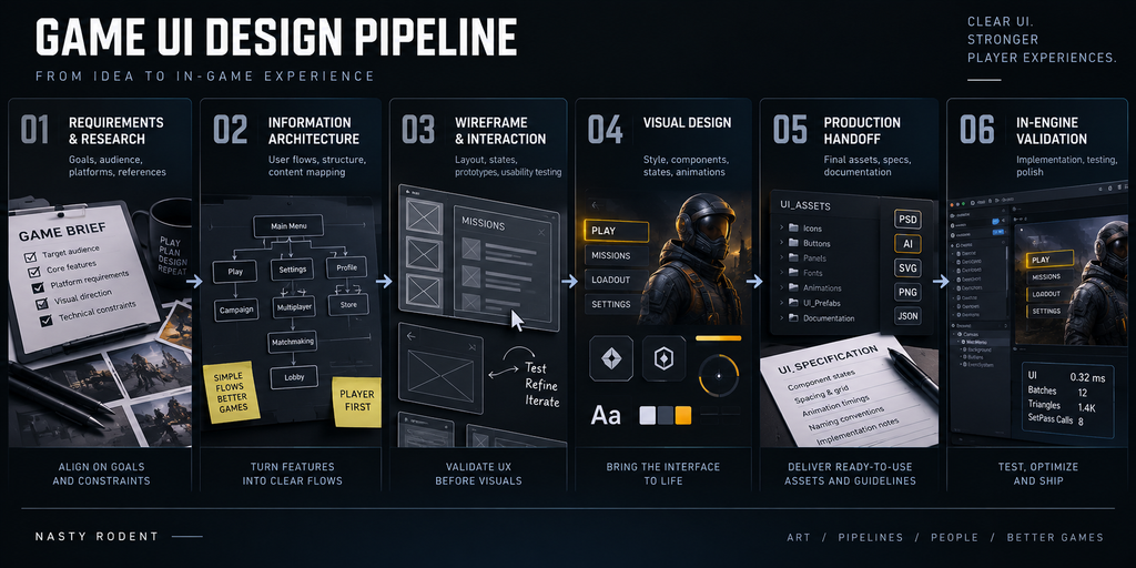
The game UI design process is the sequence that turns an interface requirement into something a team can actually build – it moves from a wireframe (structure and flow, no visual polish) through visual design (the final look and component system) to a production handoff: files and specifications an implementation team can translate into the target engine without having to reconstruct decisions nobody made. Each stage resolves a different kind of uncertainty, and some of the most expensive mistakes in UI production happen when a decision that belonged to an earlier stage gets deferred into a later one.
Two teams brief the same UI work: a settings screen, an inventory grid, a HUD. Both get a design file back that looks finished. One team hands it to engineering and the screen goes into the build with a short round of clarifying questions. The other enters a prolonged back-and-forth, discovering that nobody agreed on the empty-inventory layout, that a “UI element” actually requires a different implementation path than the design assumed, and that the exported assets don’t match what the engine expects. The visual polish was comparable. The process behind it was not.
Why “wireframe to final files” is not one step disguised as three
Most UI briefs describe the process as a straight line: wireframe, then visuals, then delivery. Treated that way, it becomes a single deliverable stretched over three meetings – the wireframe is a rough sketch of the final screen, the visual pass is the “real” work, and the handoff is just an export. Each of these framings is a small mistake that compounds.
A wireframe that already implies a visual style stops being a structural tool – reviewers argue about color instead of about whether the flow makes sense, and the actual structural gaps get signed off unexamined because nobody was looking for them. A visual pass that starts before interaction behavior has settled means the art director is polishing a hierarchy that changes again before launch. And a “production-ready” label that just means “the file looks complete” – rather than organized, specified, and validated against how the engine will actually use it – produces a handoff that looks done and isn’t usable yet.
The fix is not more meetings. It’s treating each stage as answering one question the next stage depends on, and not letting the questions blur together.
Stage 1: information architecture, before a single screen is drawn
Before wireframing starts, the flow itself needs to exist as a map – which screen leads to which, what triggers each transition, where a player backs out. Skipping this and wireframing screen by screen is how teams end up with a settings menu that’s several taps deeper than it should be, or two entry points into the same inventory that behave slightly differently because they were designed on different days.
This is the same discipline covered in more depth in our guide to game menu navigation – the UI Map is built and reviewed before any wireframe, specifically so the wireframing stage is spent solving layout and hierarchy, not re-litigating which screen a button should open. Building that map early is almost always cheaper than discovering a structural navigation problem once visual work or implementation is already underway.
Architecture also shapes what an element’s final implementation will look like. An interface element that lives inside the game’s fiction – something a character can see or interact with – carries different production implications than one that only the player sees as a screen overlay. A diegetic element might be a physical object with its own mesh, but it can just as easily be a texture on an existing surface, a render target, or a world-space widget composited into the scene – the point is that its implementation path is different from a conventional 2D asset, not that it always means modeling a new mesh. That distinction, covered in our breakdown of diegetic and non-diegetic UI, needs to surface at the architecture stage, before anyone designs an element as a standard screen-space asset and discovers later that its real implementation has very different constraints.
Stage 2: the wireframe’s job
“Editorial illustration created for visual reference purposes. It does not represent a real project, client work, or official software screenshot unless stated otherwise.”
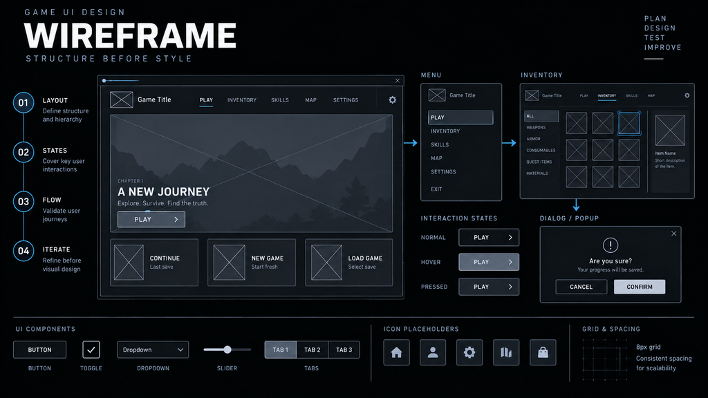
A wireframe’s job is to answer structural questions cheaply, before visual design makes every answer expensive to change. That means establishing layout and hierarchy – what’s most important on this screen, and does the eye land there first – and identifying the meaningful states and edge cases that could change that layout, hierarchy, or interaction model.
Not every state carries the same weight, and treating them as one undifferentiated list is itself a common source of confusion. Interaction states (focus, pressed, selected, disabled) describe how a component responds to input. Content and data states (empty, loading, error) describe what happens when the underlying data isn’t in its ideal shape. Layout edge cases (overflow, maximum content, unusually long localized strings) describe what happens when the amount of content stretches the design. A settings screen may barely touch the second category; an inventory or a store screen usually can’t avoid it. There’s no universal checklist that applies equally to every screen type – the relevant set has to be worked out from what the screen does, where its data comes from, and how the player interacts with it, the same logic we apply when estimating UI scope by screen rather than by a flat template.
Wireframing doesn’t require drawing every one of those states and edge cases as a separate frame. For a screen with several data-driven variants, it’s usually enough to wireframe the representative structure and document the states that would change it, then let component variants or annotations carry the rest. What matters is that the meaningful cases were identified at this stage, in a form both design and implementation stakeholders have reviewed and agreed on – not that every permutation exists as a drawn frame.
Production note. Teams briefing this stage sometimes use a reference library like the Game UI Database for inspiration on how comparable screens have handled a given layout problem – it’s useful as a pattern reference, not as a specification of which states a screen type is required to have. The actual requirement always comes from the screen’s own mechanics and data, not from what similar games happened to ship.
Stage 3: validating interaction logic before visual production
Between the wireframe and the visual pass sits a step that’s easy to skip and expensive to skip: confirming that the interaction logic itself actually works, independent of how it will eventually look. Back-button behavior, modal and overlay hierarchy (what closes what, and in which order), focus movement through a grid or a list, transition direction, and conditional flows (what happens when a required field is empty, when a purchase fails) are all decisions that belong here, not discovered during visual design or, worse, during implementation.
This doesn’t require a full clickable hi-fi prototype for every project – a low-fidelity click-through, a documented state diagram, or a walkthrough with engineering can resolve the same questions for a smaller UI scope. What has to happen, regardless of fidelity, is that someone actually exercises the flow rather than reviewing static frames, because static wireframes are good at hiding exactly the kind of behavioral gap – an unreachable back state, an ambiguous focus jump – that a walkthrough surfaces immediately.
Stage 4: visual design without re-opening structural questions
“Editorial illustration created for visual reference purposes. It does not represent a real project, client work, or official software screenshot unless stated otherwise.”
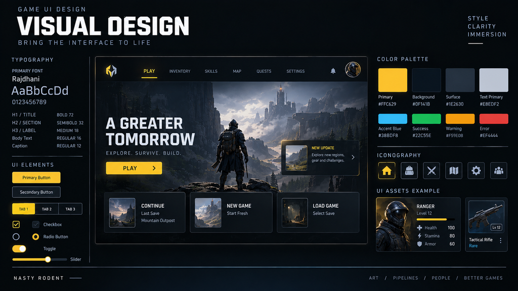
Visual design is where color, typography, iconography, and component styling get applied – and it should be the stage where structural and behavioral questions are already closed, not reopened. When a wireframe and its interaction logic are genuinely settled, visual design moves fast: the art director is styling a known hierarchy, not discovering mid-pass that a screen needs a state nobody planned for.
Interface classification decided in Stage 1 becomes concrete here. A non-diegetic element goes through a standard UI visual pipeline: a design tool, component libraries, export specs. An element that lives inside the game’s fiction may route through a different combination of 2D design, materials, meshes, or engine-side compositing, depending on exactly how it’s implemented – and assigning that ownership late, after visual work has already assumed a standard 2D asset, is one of the more expensive misclassifications in UI production.
Visual design should also produce a system, not a set of one-off screens. The goal isn’t to turn every screen into a single monolithic component – it’s to identify the reusable controls and patterns, expose their predictable variations (a button’s states, a card’s sizes) as component properties or variants, and compose screens from that system. That distinction between a component, its variants, and the screens built from it is what keeps forty screens visually consistent, and keeps a late brand or icon change from becoming forty separate edits instead of one.
Stage 5: what a production handoff actually resolves
“Editorial illustration created for visual reference purposes. It does not represent a real project, client work, or official software screenshot unless stated otherwise.”
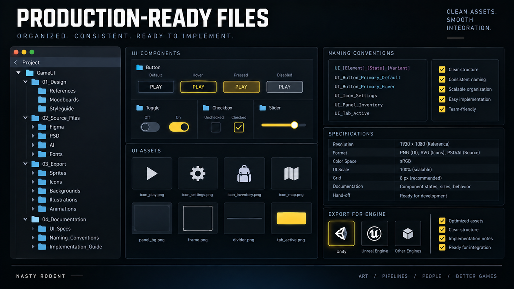
This is the stage most briefs describe in one sentence, and one of the stages where schedule risk becomes most visible. A handoff being “production-ready” isn’t a visual judgment – a screen can look finished and still not be ready to implement. In practice, four areas are especially important, though a full handoff package can extend well beyond them depending on the project – localization behavior, safe-area rules, motion specs, and source-file access are common additions.
File organization. Components and layers are named and structured by a convention the receiving team agreed to in advance, not by whatever label the design tool generated during the design pass. A file full of generic, unstructured names forces the receiving team to infer structure and intent repeatedly, on every screen.
Meaningful state and edge-case coverage. Every state and edge case identified back in Stage 2 is represented in a form the implementation team can reproduce unambiguously – that might mean a dedicated exported asset, but just as often it means a component variant, a documented layout example, or an interaction specification describing a conditional content state. The requirement is that the behavior is unambiguous, not that a separate screen exists for every state.
Export specifications matched to the implementation pipeline. Format, scalable regions such as 9-slice assets where they apply, compression assumptions, and any required resolution or source variants should be agreed with the receiving team directly. What “correct” looks like depends on the engine, the target platforms, and how that team’s UI system actually consumes assets – there’s no universal export preset that fits every pipeline.
Implementation specifications, not just visuals. Spacing values, type sizes, and interaction behavior need to be documented somewhere the implementation team can reference – that might live inside the design file itself, in dev-mode-style component documentation, in a design system, or in a separate handoff document. What matters is that a single, agreed source of truth exists, not the specific tool it lives in.
A handoff that’s missing any of these areas can still look, on the surface, like a finished design file. It isn’t yet a handoff an implementation team can build from without guessing.
Stage 6: validating the UI in-engine
A production-ready handoff is the end of the design stage – it isn’t automatically the end of UI production. Design tools can’t fully validate how a screen behaves in the actual gameplay context: real device aspect ratios and safe areas, real (not placeholder) localized text at its longest length, controller and keyboard focus navigation working the way the spec described, readability against a moving or brightly lit scene behind a HUD element, animation timing that reads correctly at the target frame rate, and layout that doesn’t clip or overflow once real content replaces the design mockup’s placeholder text.
None of these are things a static file can prove. They surface once the screen is actually assembled and driven inside the engine, which is why treating the production handoff as the finish line – rather than the start of an in-engine validation pass – is where a design that tested well on paper turns into a rework cycle during integration.

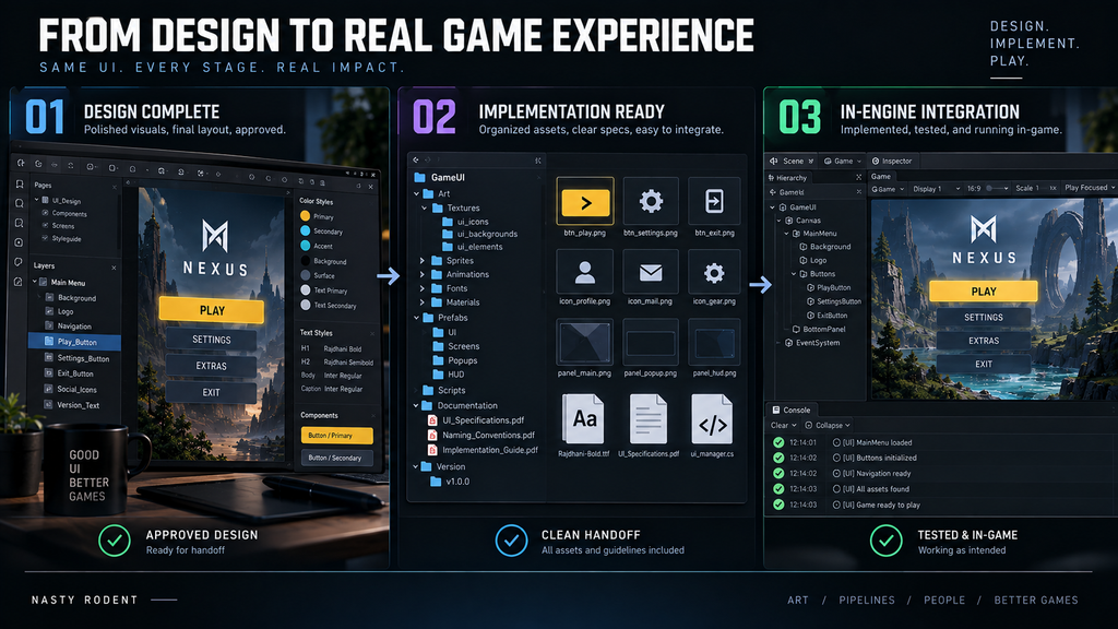
Design-complete, implementation-ready, and engine-integrated are not the same milestone
| Level | What it means |
| Design-complete | The visual direction and UX flow are approved, but files may not yet be organized or specified for handoff |
| Implementation-ready | States, components, assets, and behavior are specified clearly enough that a team can implement without reconstructing decisions |
| Engine-integrated | The UI has actually been assembled in the target engine and validated against real content, input, and platform constraints |
“Editorial illustration created for visual reference purposes. It does not represent a real project, client work, or official software screenshot unless stated otherwise.”
A file can be design-complete without being implementation-ready, and implementation-ready without yet being engine-integrated. Treating all three as one milestone – “the UI is done” – is where the schedule risk in Stage 5 and Stage 6 usually gets underestimated.
Where the pipeline actually breaks
| Stage transition | The failure | How it shows up downstream |
| Architecture → Wireframe | No UI Map before layout starts | Screens designed in isolation, inconsistent flow discovered late |
| Wireframe → Interaction validation | Flow reviewed only as static frames | Back-behavior or focus gaps surface during implementation, not before |
| Wireframe → Visual | Diegetic/non-diegetic ownership assumed instead of confirmed | An element assumed to be a standard 2D asset turns out to need a different implementation path |
| Visual → Handoff | Inconsistent component reuse | Forty screens instead of one system, late changes multiply |
| Handoff → Engine | Naming and structure not agreed in advance | Implementation team infers intent from unstructured files, screen by screen |
| Handoff → Engine | Export specs don’t match the receiving pipeline | Assets re-exported mid-integration, at the least convenient point in the schedule |
| Handoff → In-engine validation | Skipped as a formal step | Safe-area, localization, or readability issues surface after the UI is considered “done” |
Most of these failures share a root cause: a decision that belonged to an earlier stage got deferred into a later one, where it costs more to make and is harder to catch in review.
How we run this pipeline at Nasty Rodent
Two of our casual mobile engagements illustrate different shapes this pipeline can take. Wave Master, developed by Banner Games, is a useful example of a UI-focused engagement – Nasty Rodent worked on the project’s UX/UI design and supporting graphic assets, with the interface as a central part of the production scope. The published case doesn’t document the exact screen count, state matrix, or division of implementation responsibilities, so we don’t extend those specifics beyond what’s public. Bubble Quest of Vikings, created for Whaleapp, represents a different engagement shape: UI/UX was delivered alongside concept art, characters, environment, and animation as part of a full art-production engagement – which means the interface had to stay visually and operationally aligned with adjacent art disciplines, not treated as an isolated set of screens.
The principle that carries across both engagement shapes: a state or an interaction question that isn’t resolved by Stage 2 or Stage 3 doesn’t get invented later, and a file isn’t called production-ready just because it looks finished. If your team is weighing how to resource this kind of pipeline – an embedded partner versus a fully outsourced production run – our note on UI/UX co-development versus outsourcing covers what that decision actually depends on. And if you’re evaluating who runs this process for you in the first place, our checklist for choosing a game UX/UI studio covers what to verify before the first milestone.
Wireframe vs. visual design vs. production handoff, at a glance
| Wireframe | Visual design | Production handoff | |
| Answers | Structure, hierarchy, states | Look, feel, component system | Can an implementation team build this without guessing |
| Fidelity | Low – grayscale, boxes | High – final color, type, icons | High, plus organization and specifications |
| Changes here | Cheapest to make | More disruptive – styling may need to be revisited | Usually means re-exporting or re-specifying assets |
| Missing this stage causes | Wrong flow discovered late | Inconsistent screens, visual drift | A file that looks done but isn’t implementation-ready |
| Owned by | UX designer, informed by production | Art director / UI designer | UI designer, working directly with the implementation team |
Takeaway: the later a structural or behavioral gap is discovered, the more work – across design, asset preparation, implementation, and QA – may need to be revisited to close it.
Keep the handoff clean, not just the screens
The screens are rarely the problem. A UI design process breaks down at the transitions – between architecture and wireframe, between wireframe and interaction validation, between visual design and the files an implementation team receives, and between that handoff and what actually holds up once the UI is running in the engine. Each transition has one job: resolve its question completely enough that the next stage doesn’t have to re-ask it.
If your current pipeline keeps losing time at the handoff to engineering rather than at the design work itself, that’s usually a Stage 5 or Stage 6 problem, not a visual one – and it’s exactly the stage we can audit first.
Need a UI/UX production pipeline audit? Book a 30-minute discovery call →