How to Choose a Game UX/UI Design Studio: 5 Technical Checks Before Signing
-

Written byDenys Zadoienyi
-

Updated on20.05.2026
-

Time to read17 min

- Introduction
- What “game UX/UI design” really covers in 2026
- Check 1 — Shipped portfolio depth: real games, not mockups
- Check 2 — Diegetic and non-diegetic UI craft: do they understand the taxonomy
- Check 3 — Visual language consistency with the rest of your art direction
- Check 4 — Accessibility readiness: the 2025–2026 reality
- Check 5 — Engine integration and the tech-art bridge
- The hidden cost of getting this wrong
- When DIY UX/UI works — and when outsourcing makes sense
- How to run the selection process without burning weeks
- Bottom line: the five checks are the actual filter
- About Nasty Rodent
Introduction
Most game studios discover the cost of a bad UX/UI vendor decision at milestone two. The mockups looked beautiful in the pitch deck. The Figma files arrived on time. Then the implementation started — and the interface broke under real gameplay state. Localization stretched buttons until the layout collapsed. Accessibility audit failed the publisher’s certification gate. The lookdev didn’t match the rest of the art direction. By the time these issues compound, the timeline to fix them is the same as starting over with a different vendor.
The hard part is that you can’t tell most of this from a sales call. Every game UX/UI design studio’s marketing page looks roughly the same: experienced team, AAA portfolio, end-to-end services, flexible engagement. The difference between a vendor who can ship and one who can’t lives in technical details that don’t appear on landing pages.
This guide walks through five checks that consistently surface the difference. They’re written for two readers in the same room: the art director who owns the visual target, and the outsource decision-maker who owns the vendor selection process. Both need to validate the same things — from different angles. The checks below cover what to ask, what artifacts to request, and what the answers actually reveal.
What “game UX/UI design” really covers in 2026
Game UX/UI design is the discipline of designing the layer between the player’s intention and the game’s response — menus, HUD, modals, in-world signage, onboarding flows, settings screens, and the visual and audio feedback that makes those elements legible mid-action. It draws on four established interface types — diegetic, non-diegetic, spatial, and meta — each carrying different production and accessibility implications. A reference catalogue with over 55,000 screenshots across 1,300+ shipped games is maintained at Game UI Database, and any senior game UX/UI designer should be fluent in this taxonomy.
What separates game UX/UI from general product design is its dependency on engine state. A menu in a productivity app responds to user input on a known viewport. A menu in a game responds to engine state, time-based events, controller input across multiple device classes, real-time text-to-speech for menu narration, and localization tables that change layout mid-frame. Designers who have only built app or web UX don’t carry this mental model — and you’ll find that out at the integration stage if not before.
This is why the right partner for game UX/UI carries shipped-game depth, not generalist UX credentials. Our UX/UI services sit alongside our 3D and concept art work specifically because we treat interface as part of the same production pipeline that delivers the rest of the game’s art — not as a separable Figma exercise.
Check 1 — Shipped portfolio depth: real games, not mockups
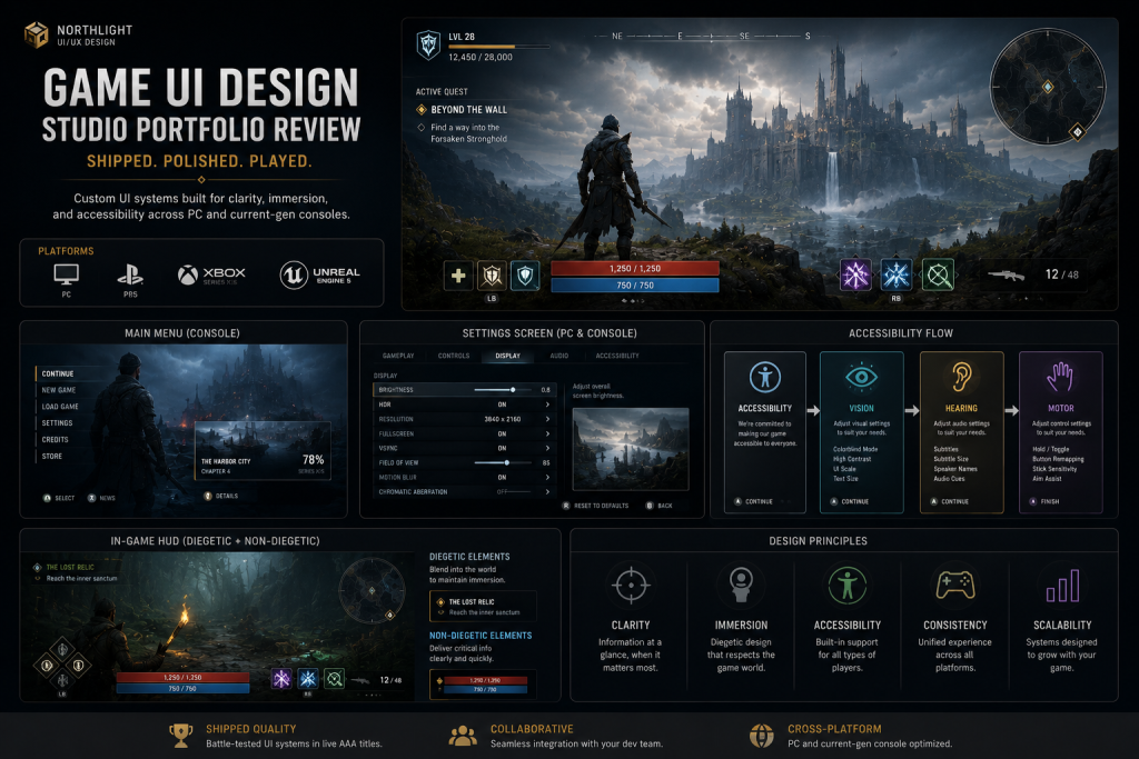
Every studio’s portfolio page shows pretty interfaces. Few of them show interfaces that actually shipped, in playable games, on the platforms your project targets. This is the single fastest filter.
“Editorial illustration created for visual reference purposes. It does not represent a real project, client work, or official software screenshot unless stated otherwise.”
What to ask. Three specific examples: (1) a shipped game with a HUD design they own, (2) a shipped game with a complete menu system they own, (3) a shipped game with a settings/accessibility flow they own. For each, the answer should include the game name, the platform, the year of ship, the studio’s role, and ideally a link or video reference.
What the answer reveals. A vendor with portfolio depth will produce these immediately and with detail — naming the title, walking through what they owned versus what the in-house team handled, and being honest about what shipped versus what they prototyped. A vendor without depth will pivot to mockups, design exercises, or “concept work” that was never integrated. Both have a place in a portfolio — but you need to see what was actually shipped to evaluate technical capability, not what looked good in Figma.
Platform specificity matters. Mobile UI and console UI are different disciplines. Touch targets are sized in fingers; controller-driven menus are navigated in directional space. A studio with deep mobile experience and no console experience isn’t equivalent capacity for a PC/console title. Ask which platform the shipped work targeted. If your project is multi-platform, confirm shipped experience on each platform separately.
This is also where you start evaluating whether the work matches your visual target. A vendor whose portfolio leans toward casual mobile interfaces probably won’t deliver AAA-tier cinematic UI in the first pass. The recent shipped work in our portfolio is the right type of reference to ask any vendor for — concrete titles, platform context, role clarity.
Check 2 — Diegetic and non-diegetic UI craft: do they understand the taxonomy
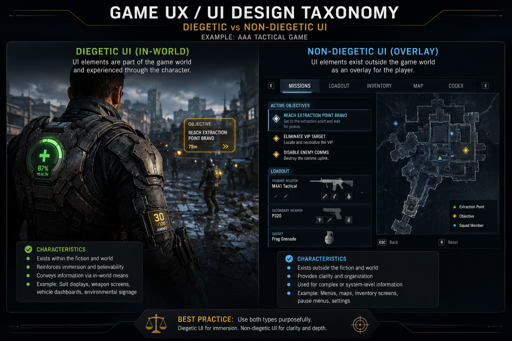
Game UI separates into four established categories: diegetic UI lives inside the game world (Dead Space’s RIG suit health bar on Isaac’s back, Metro 2033’s wrist watch as radiation indicator), non-diegetic UI sits outside the game world for the player only (health bars, menu screens, score counters), spatial UI exists in the 3D space but the characters can’t see it (enemy outlines, throw-prediction arcs), and meta UI is contextual to the game without being represented in space (screen blur for damage, controller rumble as feedback). A vendor who can’t fluently discuss the four categories during a pitch call is a vendor without grounded game UX experience.
“Editorial illustration created for visual reference purposes. It does not represent a real project, client work, or official software screenshot unless stated otherwise.”
What to ask. Give them a sample mechanic from your game — for example, “the player has limited oxygen in a deep-sea exploration sequence” — and ask how they’d design feedback. A strong vendor will sketch three or four options across the categories: diegetic (a wrist gauge on the diving suit), non-diegetic (a corner meter), spatial (color tinting the world at low oxygen), meta (heartbeat audio and screen edge effect). Then they’ll discuss trade-offs — diegetic preserves immersion but limits accessibility, non-diegetic is universally readable but breaks the diving fantasy, and so on.
What this reveals. Whether the vendor can think about UI as a system that serves both gameplay and atmosphere. A weak vendor will default to non-diegetic (“a meter in the corner”) because that’s what most app UX work looks like. A strong vendor will weigh the immersion-versus-accessibility trade-off explicitly. For mid-core and AAA projects with strong art direction, this conversation matters from day one of pre-production. Your concept art and visual development work should align with how the UI lives in that world — and the vendor needs to think in those terms.
Practical artifact to request. Ask for a 30-minute audit of one of your existing UI mockups (a paid micro-engagement). A vendor will either return notes that demonstrate this thinking immediately, or they won’t.
Check 3 — Visual language consistency with the rest of your art direction
UI is the most-seen art in your game. Players spend more screen-time looking at the HUD than at any single hero asset. If the UI’s color palette, typography, iconography, and animation feel don’t sit inside the same art direction as the rest of the game, players notice — usually as a vague feeling that the game looks “off,” not as a specific complaint.
What to ask. Send the vendor a brief from your art bible — color palette, typography rules, key art examples, mood references — and ask them to deliver three different style frames for a single menu screen. Each should interpret the same brief differently. The exercise is paid and short (one to two weeks), and it reveals more than any portfolio review.
What this reveals. Whether the vendor’s senior UI artists can absorb an external art direction and produce work that genuinely fits, versus pulling toward a house style regardless of brief. Studios with strong house identity sometimes can’t let go of it — which produces beautiful work that doesn’t match your project. Studios with weak senior leadership produce style frames that look generic. You want a vendor who can shift register: cyberpunk-grime for one project, painterly-fantasy for the next, brutalist-sci-fi for a third.
Why this matters for AAA-tier production. When UI doesn’t speak the same visual language as your hero assets, the integration stage becomes a continuous fight — character art direction asks for one thing, UI delivery brings another, and the technical art bridge becomes the place where mismatches surface as bugs. We see this most often in projects where the UI vendor and the character pipeline are run in isolation rather than as one art direction. Your selection process should test for visual-language flexibility before this becomes a milestone problem.
Check 4 — Accessibility readiness: the 2025–2026 reality
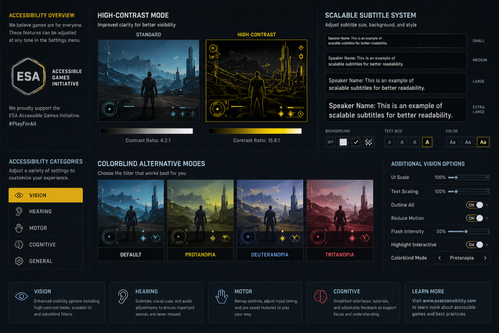
Accessibility moved from optional to required in 2025. At GDC 2025, the Entertainment Software Association launched the Accessible Games Initiative with 24 standardized tags — clear text, large and clear subtitles, narrated menus, stick inversion, save anytime, colour alternatives, and more — co-developed with founding members EA, Google, Microsoft, Nintendo, and Ubisoft. The GDC State of the Game Industry 2025 report shows 71% of developers commit to accessible design. A AAA publisher’s certification pipeline in 2026 will check for accessibility features that didn’t exist as standard requirements two years ago.
“Editorial illustration created for visual reference purposes. It does not represent a real project, client work, or official software screenshot unless stated otherwise.”
What to ask. Specifically: which Game Accessibility Guidelines tier (Basic, Intermediate, or Advanced) has the vendor implemented across shipped titles? The full standards reference is published at Game Accessibility Guidelines, and any senior game UX designer should know the framework. Then ask how they handle the five highest-impact features in modern AAA: high-contrast mode (proven in Tekken 8, Prince of Persia: The Lost Crown, Silent Hill 2, Star Wars: Jedi Survivor), subtitle systems with backgrounds and customizable size (subtitles are actively enabled by approximately 60% of players, kept on by 95% once defaulted on), full control remapping, menu narration via text-to-speech, and colorblind alternatives.
What this reveals. A vendor without accessibility depth treats it as a settings-screen afterthought — a list of toggles bolted onto a menu near release. A vendor with depth designs accessibility into the system from wireframe one: high-contrast variants of every screen, font size scaling that doesn’t break layouts, color choices that test against deuteranopia/protanopia/tritanopia simulators, and tab/focus order that works with screen reader narration. This is system-level work, not a checklist applied at the end.
Why this is non-negotiable in 2026. Publishers and platform holders are increasingly treating accessibility as a release gate, not a nice-to-have. A vendor whose work doesn’t pass an accessibility audit creates an extra integration cycle right before cert — exactly the worst time to discover a system-level rebuild is needed. This is the check most likely to expose a vendor who looked strong on portfolio aesthetics but is structurally weak underneath.

Check 5 — Engine integration and the tech-art bridge
UI delivered as Figma files is the start of work, not the end. The handoff from design to in-engine implementation is where projects most often slip, and where the difference between a UX/UI vendor and a UX/UI design-and-integration vendor becomes structural.
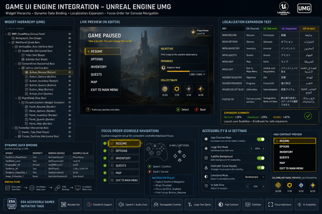
What to ask. Which engines do they deliver into — Unity UI Toolkit, Unreal Engine UMG, custom in-house engines? Have they shipped UI that integrates with engine state (variable text length from localization, dynamic data binding, real-time menu narration, controller swap detection)? Who on their team handles the tech-art bridge — the role that translates designer intent into engine-ready assets with correct anchor points, scaling rules, focus order, and animation hookups?
“Editorial illustration created for visual reference purposes. It does not represent a real project, client work, or official software screenshot unless stated otherwise.”
What this reveals. Whether your handoff will be clean or whether it will become a continuous back-and-forth where your in-house engineers translate design decisions into engine reality, surfacing problems the vendor should have caught. A strong vendor either delivers in-engine themselves or hands off documentation precise enough that your engineers don’t have to make design decisions. A weak vendor produces beautiful Figma exports and then leaves the layout system, focus order, and accessibility tab flow for someone else to figure out.
Localization is the canary. Ask specifically about how their layouts handle text expansion — German text runs roughly 30 percent longer than English, right-to-left languages flip layout direction entirely, and CJK languages change vertical rhythm. A vendor who builds in fluid layouts with text expansion test cases is doing production-grade work. A vendor who builds in fixed-pixel layouts that look perfect in English will hand you a localization crisis in the third milestone.
Pre-engine validation. A useful pattern for studios still evaluating engine commitment: outsource pre-production UX work (wireframes, flow maps, accessibility audit of existing systems) to a vendor who can work engine-agnostic, then commit to production engineering once the engine is locked. We discuss this pattern in more depth on the blog, and it’s particularly relevant for studios whose engine choice isn’t final at the UX vendor selection stage.
Vendor switches mid-project are among the most expensive operational failures in game production, and UX/UI is where they hit hardest. The reason: UI lives at the intersection of every other system — gameplay, narrative, accessibility, localization, audio — so a UI vendor handoff at month four pulls every other team into rework. Hero assets get re-shot because the UI overlay changed. Subtitle systems get rebuilt because the previous vendor’s layout assumptions broke. Tutorial flows get re-recorded because button prompt naming shifted. None of this is the new vendor’s fault; it’s structural cost the studio pays for the original selection mistake.
The five checks above are designed to surface those issues before signing — when the only cost is the time you put into evaluation. After signing, the cost compounds with each milestone.
When DIY UX/UI works — and when outsourcing makes sense
Plenty of studios run UX/UI in-house and ship great games doing it. The decision isn’t ideological; it’s about capacity and specialization. Note: the structured breakdown below describes patterns we see across mid-core and AAA studio conversations; specific cost and time figures should be treated as Hypothesis-level industry observations rather than studio-guaranteed numbers.
In-house UX/UI works when: you have at least one senior game UX designer with shipped AAA experience on staff, a tech artist who can own the in-engine integration, and stable scope. Long-running live-service games particularly benefit from in-house ownership — the institutional memory matters, and the cadence of small updates is hard to outsource cleanly.
Outsourcing works when: you need specialist depth your team doesn’t carry (cinematic UI, deep accessibility, console-specific patterns), you need additional capacity during a milestone-heavy push, or you’re a smaller team where dedicating a senior FTE to UX permanently doesn’t fit your structure.
A typical DIY-to-us pattern. A mid-core studio with two strong UI generalists tries to scale up for a new project requiring AAA-tier accessibility compliance. The team builds Tier 1 (Basic) of the Game Accessibility Guidelines comfortably. Tier 2 (Intermediate) stalls — subtitle backgrounds, scalable text, color alternatives. By month three the studio realizes they need either a senior hire (3–6 months recruitment + ramp-up) or a specialized vendor (4–8 weeks to first delivery). The outsource path collapses the timeline if the vendor has actual shipped accessibility experience. The same pattern applies for cinematic UI work where in-house artists are competent but not specialized.
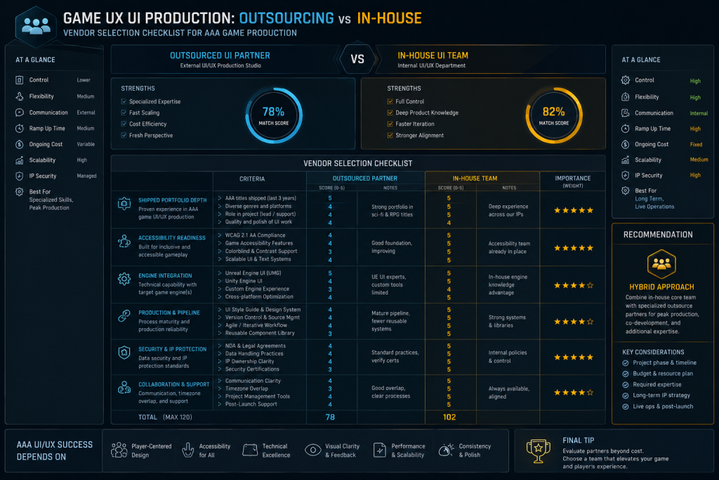
“Editorial illustration created for visual reference purposes. It does not represent a real project, client work, or official software screenshot unless stated otherwise.”
Self-test before committing to outsourcing. Run through these questions with your tech art lead and producer:
- Do we have one or more senior game UX designers with shipped AAA experience on staff?
- Do we have a tech artist who can own in-engine UI integration day-to-day?
- Does our scope stay stable for the next 6–12 months, or does it shift between milestones?
- Have we passed (or know we’ll need to pass) Game Accessibility Guidelines Intermediate tier?
- Is our target visual quality bar at AAA cinematic UI, or polished functional UI?
- Do we have capacity for the recruitment cycle to fill any senior gap (typically 3–6 months)?
- Is our project a live-service title requiring ongoing UI iteration?
- Is our engine choice (Unity UI Toolkit / Unreal UMG / custom) locked, or still being decided?
If you answer “yes” to questions 1, 2, 3, 6, and 7, in-house ownership is likely your better path. If you answer “no” or “uncertain” to 1, 2, or 4, and “yes” to 5 or “uncertain” to 8, outsourcing or hybrid is the more realistic route.
How to run the selection process without burning weeks
Most studios spend too long on vendor selection, then under-evaluate the actual production fit. A tighter process:
Week 1. Send the same brief to three to five vendors. Ask for portfolio walkthrough calls (45 minutes each), specific shipped-game references, and engine integration capabilities. This filters to two or three.
Week 2. Run paid micro-engagements with the remaining two or three vendors. Either a UI audit of an existing screen, or three style frames against your art bible. Pay fair rates — a vendor doing free pitches isn’t showing you production-grade work. Total cost is modest; the information value is high.
Week 3. Vendor selection decision with your art director, outsource decision-maker, and tech art lead in the same room. The selection meeting reviews: shipped portfolio depth, paid-exercise output, accessibility readiness, engine integration fit, and (importantly) whether their communication rhythm during the micro-engagement matched what your team can sustain.
Week 4 onward. Production starts with a clearly defined first milestone — typically a small but representative deliverable that exercises the same handoff the full project will require. If the first milestone is clean, the production-scale engagement begins from a position of validated trust. If it’s not clean, you’ve learned this for the cost of one milestone, not the cost of a project.
Bottom line: the five checks are the actual filter
The marketing pages of game UX/UI design studios look interchangeable. The five checks above are designed to surface the actual differences:
- Shipped portfolio depth filters out vendors whose work hasn’t reached players.
- Diegetic/non-diegetic craft filters out generalist UX without game-systems thinking.
- Visual language flexibility filters out vendors who can’t fit your art direction.
- Accessibility readiness filters out vendors who’ll fail your 2026 cert pipeline.
- Engine integration depth filters out vendors whose handoff creates downstream rework.
A vendor who clears all five is the vendor worth running a paid micro-engagement with. Anything less, and you’re paying the cost difference in milestone-level rework later. The selection process is short; the project is long. Spending more on the selection is the cheaper version of this decision.
About Nasty Rodent
Nasty Rodent is a full-cycle game art studio where UX/UI is treated as a core system, not just decoration. With over a decade of production experience for industry leaders like Saber Interactive and Remedy Entertainment, we deliver interfaces that balance stunning aesthetics with flawless technical performance. From initial wireframing to final engine integration, our team of 40+ experts ensures your UI is production-ready from day one. Our UX/UI service sits alongside concept art, 3D characters, environments, props, vehicles, and weapons — so the interface you ship lives inside the same art direction as the rest of the game’s art, not as a separate Figma deliverable. If you’re at the selection stage for your next project’s UI partner, the conversation usually starts with the five checks above — and our team is happy to walk through specifics rather than hand over a generic deck.