AAA Game Menu Navigation: A UE5 and Unity Production Guide
-

Written byDenys Zadoienyi
-

Updated on08.07.2026
-

Time to read16 min

- Why a menu is a system, not a set of screens
- Navigation architecture: the UI Map before the visuals
- Menu types and visual hierarchy
- Input and focus: one menu, three ways to drive it
- UE5 menu systems: UMG, Common UI and input routing
- Unity menu systems: uGUI, UI Toolkit and the EventSystem
- Accessibility and feedback belong to the visual system
- The AAA realities: localization, performance and platform rules
- Technical pitfalls: where menu systems break in-engine
- Keeping the menu visual system consistent across a AAA production
- Menu navigation patterns, compared
- Turn a menu system into a competitive edge
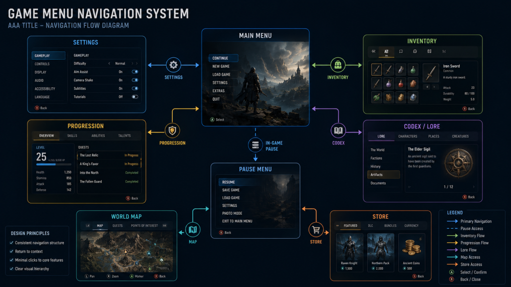
Game menu navigation is the part of a title players touch before they touch anything else – the main menu is the first interactive screen most players control, and the flow from there through settings, inventory, loadout and progression is the first proof that the whole thing is built with care. And it is exactly where a AAA production quietly leaks polish: menus that each look fine in isolation but don’t share a visual system, a focus cursor that jumps unpredictably on a gamepad, a settings screen three layers deeper than it should be. If you own the visual target for a project, the menu is where your art direction is judged first and forgiven least.
“Editorial illustration created for visual reference purposes. It does not represent a real project, client work, or official software screenshot unless stated otherwise.”
Definition. Game menu navigation is the system that moves players through a game’s screens – main, pause, settings, inventory, progression – as a coherent flow rather than a set of pages. It combines an information architecture (which screen leads where), input and focus behaviour across devices, and a consistent visual system, so players move without friction and without relearning the interface on every screen.
The fastest way to end up with an incoherent front end is to brief menus as a list of screens: “main menu, settings, inventory, map.” Each gets designed, each looks good in a mockup, and then they’re assembled and nothing agrees – the back button is bottom-left on one screen and top-right on another, tabs behave differently in two places, the type scale drifts. Players don’t articulate this; they just feel that the interface is harder to use than it should be, and reviews call it “clunky.”
Underneath every menu sits a taxonomy worth getting right early, because it decides how the interface relates to the game world. Elements can be non-diegetic (a menu the player sees but characters can’t), diegetic (living inside the fiction), spatial, or meta – the four-type UI framework that determines how a screen is built, lit and animated. Deciding that up front is what keeps a menu system from turning into a late-stage art rewrite.
For an art director, that incoherence isn’t an abstract usability score – it’s menu style drift showing up on the most-seen screens in the game, and it surfaces at the worst time: a review where the front end reads as less finished than the gameplay it fronts. Fixing it late means reopening screens that were already signed off – art-side rework measured in review passes, not minutes. For a producer in the same meeting, the same problem is UI rework landing on a milestone that had no budget for it. Both trace back to the same cause: navigation, input and the visual system were never designed as one.
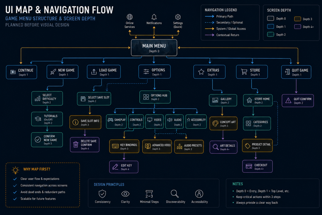
Good game menu navigation starts before a single screen is styled, with a navigation architecture – often called a UI Map or information architecture. It’s a flowchart of every menu and screen and the paths between them: which option leads where, what input each transition needs, where the player can back out. Mapping this first lets the team see the whole flow, count how many screens a player must cross to complete a common action, and catch dead ends and rat’s-nests of cross-links before they’re built in art.
“Editorial illustration created for visual reference purposes. It does not represent a real project, client work, or official software screenshot unless stated otherwise.”
Two principles keep the map sane. Keep the most important actions shallow – reachable from a central location in as few steps as possible – and push complexity deeper. And give players a consistent mental model: if the map looks like a tangle of shortcuts and re-entry points, the finished UI will feel like one. On our projects, the UI Map is also the artefact that aligns the UX lead, engineering and the art director on one plan, so the visual work starts against a settled structure instead of a moving one.
Menu types and visual hierarchy
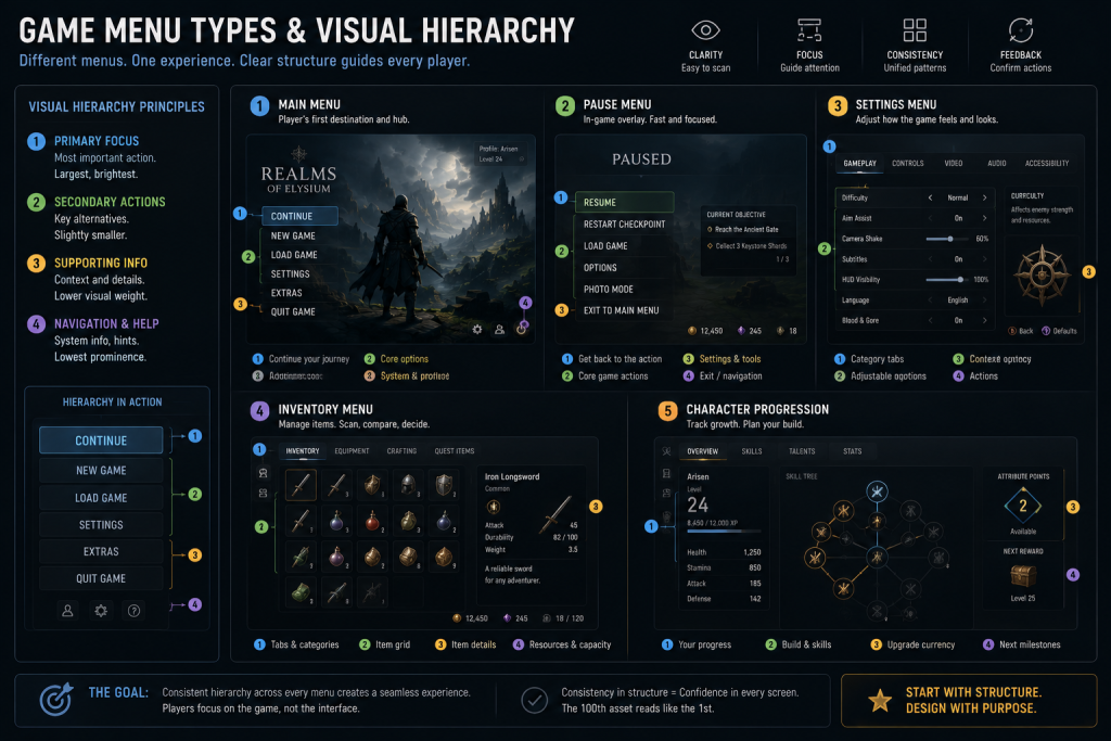
Most AAA games share a recognisable set of menu types – title and main menu, pause, settings, inventory and loadout, character and progression, plus modals and overlays – and each has conventions players already expect. A useful reference during briefing is the Game UI Database – not a standard to copy, but a large library of interface screens from shipped games, searchable by screen type and menu style. It’s a fast way to align a team on the conventions for a settings screen or a radial menu before anyone opens Figma.
“Editorial illustration created for visual reference purposes. It does not represent a real project, client work, or official software screenshot unless stated otherwise.”
Within each screen, visual hierarchy does the navigational heavy lifting: grouping related options, highlighting the primary action, and using size, spacing and contrast to guide the eye. Nielsen Norman Group’s usability heuristics map almost directly onto menu work – aesthetic-and-minimalist design (don’t crowd the screen), consistency and standards (the same control means the same thing everywhere), and recognition rather than recall (show options, don’t make players remember them). Applied to a AAA game menu design, that’s the difference between a menu players read instantly and one they have to decode.
Production note. Menu conventions are strong enough that breaking them is a design decision, not a default. Players carry a mental model from every other game they’ve played; a main menu that puts Continue where New Game usually sits doesn’t feel fresh, it feels broken. Spend the novelty budget on identity and motion, not on relocating the back button.
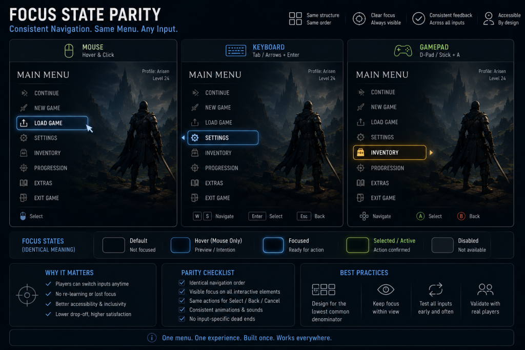
A AAA menu has to work consistently across mouse, keyboard and gamepad – not identically. The interaction model changes with the device (pointer and hover on a mouse, discrete focus on a gamepad or keyboard), but the player’s mental model, hierarchy and feedback should stay stable – and this is where game UI navigation most often breaks. The core concept is focus: which element is currently selected. On mouse it follows the pointer; on gamepad and keyboard it moves discretely with the D-pad, stick or arrow keys, and the player needs to see, at a glance, exactly what is focused right now.
“Editorial illustration created for visual reference purposes. It does not represent a real project, client work, or official software screenshot unless stated otherwise.”
Two failures dominate. First, focus parity: the highlighted state on a gamepad should read the same as a mouse hover, or players lose their place every time they switch input. Second, focus movement itself – in a simple vertical list, up/down is obvious, but in a grid, a paged inventory or a screen with multiple columns, focus has to be told where to go in each direction or it skips unpredictably and gets stuck.
Gamepad menus also lean on conventions players already hold: a consistent confirm/cancel mapping – one face button to select, another to back out – used identically on every screen, so game menu navigation never forces players to relearn the controls. Analog input needs its own care: a small actuation threshold on the stick keeps jitter from nudging the selection, and a discrete move should take a deliberate push rather than firing on every frame the stick is deflected. These details are invisible when they’re right and maddening when they’re wrong.
Designing the focus flow is part of navigation design, not an engineering afterthought, and the visual treatment of the focused state is squarely an art-direction decision: it has to be the most legible thing on the screen.
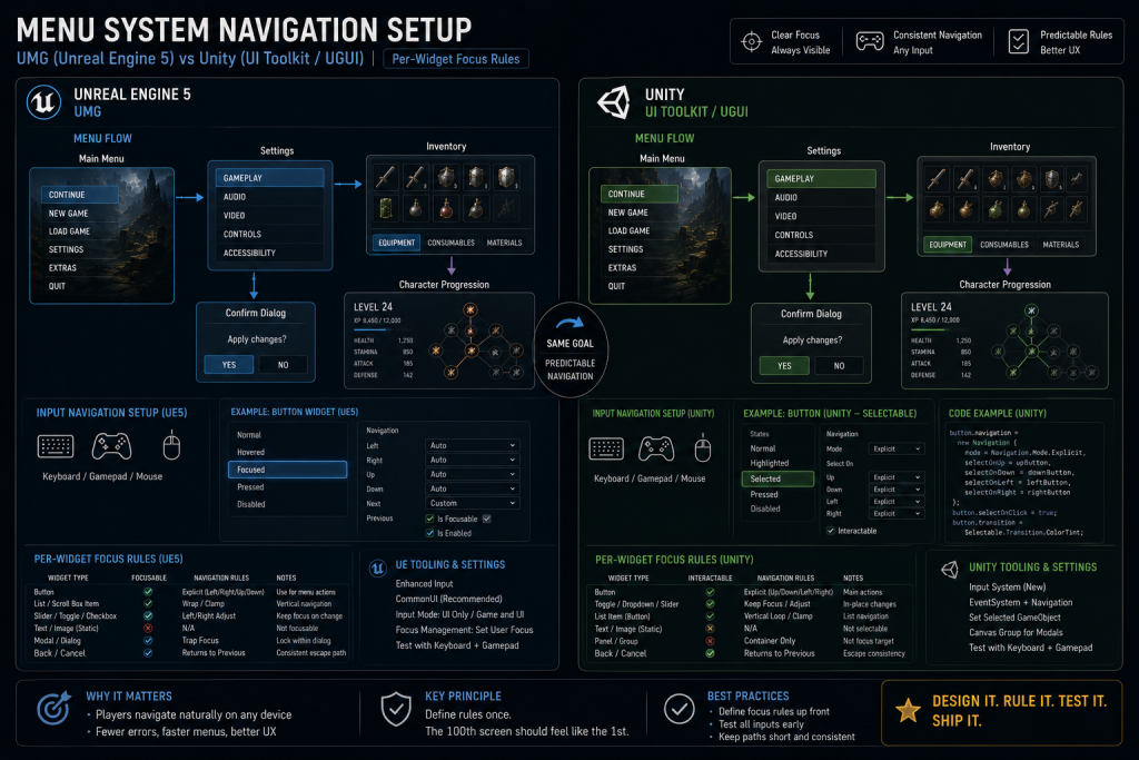
The design only holds up if the engine cooperates, and a UE5 menu system really has two layers. UMG is the authoring layer: each widget can define explicit Up/Down/Left/Right focus rules in the Designer, so pressing a direction moves focus exactly where intended instead of relying on default guesses that fail on grids and multi-column screens. A common input pitfall sits underneath it – by default, unless the action’s triggers are configured, a held D-pad or stick can advance focus more than once per press and overshoot a selection. The fix is to separate initial press from repeat delay and repeat rate rather than letting raw input drive focus every frame, and to keep UI inputs in their own Input Mapping Context so menu navigation never bleeds into gameplay.

For anything past a single-layer interface, UMG alone usually isn’t the whole architecture. Epic’s Common UI plugin – the framework originally built for Fortnite’s interface – adds the production layer AAA teams lean on: input routing that gives only the top visible layer interactivity, activatable widget stacks that return focus cleanly when a modal or submenu is dismissed, console-specific button glyphs that, once controller data is set up, swap between Xbox and PlayStation prompts, and cardinal navigation management for gamepads. The right framing isn’t “UMG versus Common UI” – UMG is where widgets are authored, Common UI is the framework that helps enforce focus, layering and platform behaviour across them. It isn’t required for every menu (a single-layer, PC-only interface may not need it), but for a layered, multi-platform menu system it’s often the stronger foundation.
Unity handles the same navigation problem through the EventSystem and Selectable navigation, where each interactive element defines its navigation targets and the system tracks the current selection – the same discipline as UMG, different tooling. The larger decision is which UI stack to build on, and it’s a genuine choice, not a migration. uGUI is the GameObject-based system: mature, production-proven, with deep Animator and Timeline integration, custom-shader and masking support, and a vast ecosystem – its main weakness is that Canvas rebuilds make performance hard to predict as the UI grows. UI Toolkit is the newer retained-mode system built on a visual tree with UXML/USS style separation and data binding. Unity currently recommends uGUI for runtime UI and treats UI Toolkit as the alternative – though it positions UI Toolkit as the longer-term direction – and UI Toolkit scales better for data-heavy, multi-resolution menus like inventories, skill trees and stat screens, while its animation and some rendering tooling still trail uGUI. The two coexist happily – a common pattern is uGUI for an animated HUD and UI Toolkit for data-driven menus – and the right pick depends on your animation needs, target resolutions, existing UI content and Unity version, not on which is newer.
Whichever engine and stack you choose, the constants hold: define focus targets explicitly, separate UI input from gameplay input, and make the focused state visually unmistakable on every device. This is the layer of AAA game UI design where a beautiful mockup either becomes a real, drivable interface or falls apart in playtest.
“Editorial illustration created for visual reference purposes. It does not represent a real project, client work, or official software screenshot unless stated otherwise.”
Accessibility and feedback belong to the visual system
Accessibility is not a compliance layer bolted on at the end – for menus, it is good navigation design. Scalable UI and text, remappable controls, sufficient colour contrast, and not relying on colour alone to signal state are what make a menu usable for the widest audience, and every one of them is a visual-system decision an art director signs off. NN/g’s heuristics of user control and freedom (a clearly marked way to back out of any screen) and error prevention (confirm before a destructive action like overwriting a save) apply directly.
Feedback closes the loop. Every navigation action should produce an immediate, legible response – the focus cursor moving with a sound, a menu transition that communicates direction, a subtle animation confirming a selection registered. This is where motion and audio polish stop being decoration and become part of how the menu reads. A menu that responds instantly and clearly feels trustworthy; one that swallows inputs or animates ambiguously feels broken, no matter how good the static composition looks.
The AAA realities: localization, performance and platform rules
A AAA game menu design carries constraints a portfolio mockup never shows, and each one reshapes game menu navigation. Localization is the first: a label that is one word in English can run far longer in German or Finnish, so layouts have to flex rather than pixel-fit English strings, and the visual system must survive text that changes length mid-screen – truncation and overflow are among the most common menu bugs found late. Performance is the second: menus are judged on instant response, and a main menu that stutters on open reads as a broken game before a level ever loads, which is exactly NN/g’s visibility-of-system-status principle applied at the first button press. Third, every console platform brings submission requirements and platform guidelines – around cases like controller state, suspend and resume, user switching, safe-area margins and button prompts – that the menu system has to satisfy; the exact rules vary by platform, but menus are often where they surface first. None of these are edge cases; they are where a menu that looked finished discovers it isn’t.
When the interface has to keep evolving alongside gameplay through all of this, what decides the outcome is a UI team that can adapt layouts in lockstep with iterating gameplay instead of lagging a milestone behind – which is what the co-development versus outsourcing choice for a UI team ultimately comes down to.
Menus rarely fail on the mockup; they fail on the performance review and at platform submission. A handful of recurring pitfalls account for most of it:
| Area | The failure | How it shows up on review |
| Focus management | No default or restored focus | Gamepad users get stuck after closing a modal |
| Input routing | UI and gameplay both consume input | The character moves while the menu is open |
| UE widgets | Background layers left active keep ticking | Menu cost climbs from screens that were never deactivated |
| Unity Canvas | Large Canvas rebuilds on small changes | The menu stutters on update despite simple visuals |
| Overdraw | Stacked transparency in animated screens | GPU cost spikes on the front end |
| Localization | Text expansion never tested | Longer languages truncate or break the layout |
| Platform prompts | Button icons hardcoded | Xbox, PlayStation and PC prompts mismatch |
Most of these are designed out, not patched in: Common UI’s input routing and activatable widgets address focus and input leaks directly, a disciplined UI Map limits how many layers stack, and testing the longest localized strings early prevents the layout surprises that otherwise surface at submission.
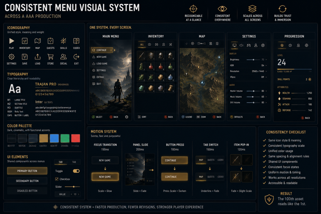
Here is where the art director’s ownership becomes decisive, and where menu systems most often unravel at scale. A game has dozens of screens, built over months, often by more than one designer – and without a locked visual system they drift. The defence is a UI style guide that treats the interface like any other art bible: a defined type scale sized for readability, an iconography set with consistent metaphors, a colour and contrast system, spacing and grid rules, and a motion language for transitions and focus. Every screen is authored against it, so the hundredth menu reads like the first.
“Editorial illustration created for visual reference purposes. It does not represent a real project, client work, or official software screenshot unless stated otherwise.”
That system also governs how in-world art appears inside menus. Character and progression screens lean on real assets – the same discipline behind our 3D characters for character menus and progression screens is what keeps a hero looking on-model in the menu as in gameplay, and 3D props for menu and inventory presentation is what keeps inventory items reading cleanly at small sizes. The menu visual system and the 3D pipeline aren’t separate problems; a consistent front end depends on the art–UI handoff being tight in both directions.
The failure we build against is the one described above – navigation, input and art treated as three briefs instead of one system. At Nasty Rodent we design menu systems from the UI Map through the visual language and into engine validation, so the flow, the focus behaviour and the art hold together across Unity and Unreal. That’s the core of Nasty Rodent’s game UI/UX design, and it sits alongside our 3D and concept work precisely because we treat interface as part of the same production pipeline, not a separate Figma exercise. If you’re weighing how to resource this, our note on choosing a game UX/UI partner covers what to look for. More on the studio and team is in the banner below.
| Pattern | How players move | Best for | Watch out for |
| Vertical list | Up/down, one axis | Main menus, settings, simple choices | Long lists needing scroll + focus tracking |
| Grid / tile | Up/down/left/right | Level select, character select, stores | Focus rules on wrap and edges |
| Tabbed | Shoulder buttons switch sections | Inventory, character, deep menus | Consistent tab order and back behaviour |
| Radial / wheel | Stick direction, held | In-game quick-select (weapons, emotes) | Precision on stick; not for dense options |
Takeaway: the pattern should follow the content and the primary input – most navigation pain comes from forcing dense options into a list, or a grid without explicit focus rules on its edges.
The menu is your game’s first impression and its most-used interface, and it holds together only when navigation, input and the visual system are designed as one. Lock the UI Map before the visuals, design focus parity across every input, validate it in-engine, and hold every screen to one UI style guide – and the front end stops being the part reviewers call clunky and starts being the part that signals quality.
If you want a read on a specific menu system, send us your current menu references or build and we’ll review the flow, focus behaviour and visual target – then flag the main UX and production risks before implementation scales, and outline what a consistent UI style guide would need to cover. Reach us at business@nastyrodent.com.