Inside Onboarding and FTUE Design for Mid-Core and AAA Production
-

Written byDenys Zadoienyi
-

Updated on15.07.2026
-

Time to read18 min

- FTUE vs Onboarding: Where the Terms Actually Diverge
- What FTUE Actually Has to Deliver in the First Session
- Progressive Disclosure and the Push-vs-Pull Revelation Problem
- Diegetic and Non-Diegetic Onboarding Prompts
- How HUD Introduction Sequences Connect to Onboarding
- FTUE Best Practices Adapted for Mid-Core and AAA Production
- AAA Onboarding vs F2P/Mobile Onboarding: Why the Playbooks Diverge
- Testing FTUE in Engine, Not in a Deck
- FTUE Design Deliverables a Production Team Actually Needs
- Our Approach at Nasty Rodent
- Onboarding, FTUE, and Tutorial Compared at a Glance
- How to Get Onboarding and FTUE Design Right
Onboarding and FTUE design decide whether a player finishes their first session or quits before the tutorial ends. For many mid-core and AAA titles, the first ten minutes set the player’s expectations long before the game’s full system depth has a chance to prove itself — which puts real weight on a window most production schedules treat as an afterthought. Most of what’s written about this discipline comes from the free-to-play and mobile world, where the vocabulary is retention curves and monetization loops. That framing is useful, but it skips the part an art director actually has to solve: how onboarding gets built, tested, and shipped inside a production pipeline that also has to deliver a hero asset, a HUD system, and a locked art style before vertical slice.
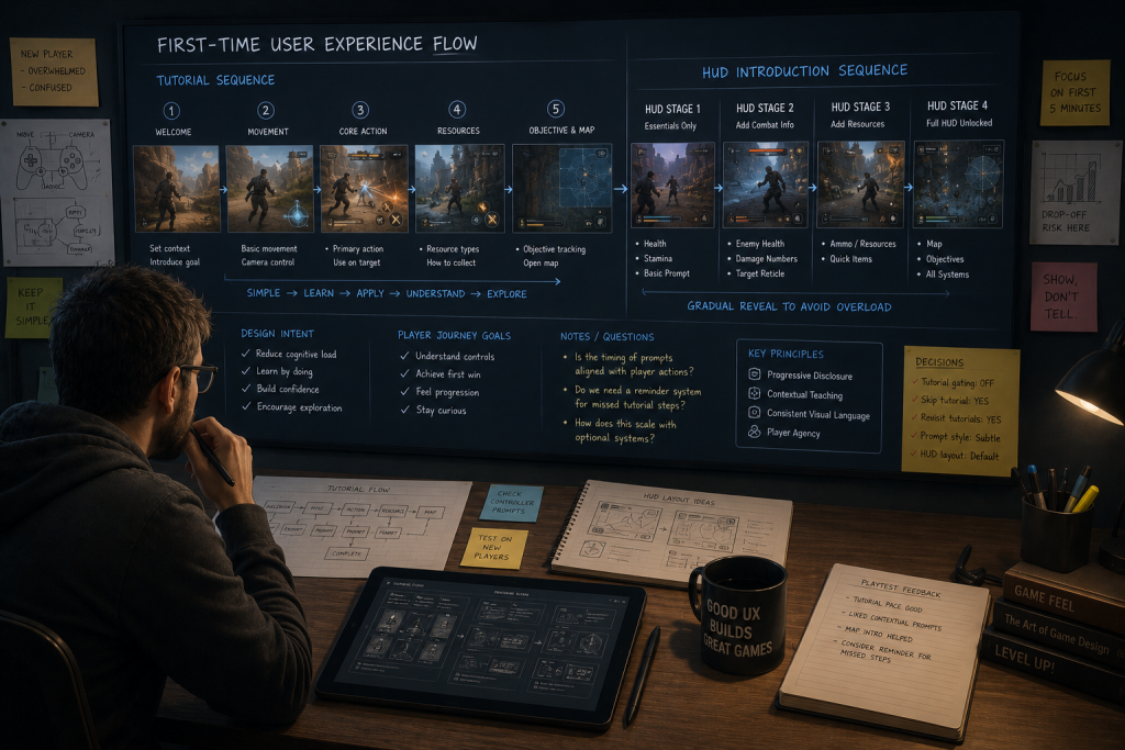
“Editorial illustration created for visual reference purposes. It does not represent a real project, client work, or official software screenshot unless stated otherwise.”
This guide treats onboarding and FTUE design as a production discipline, not a retention-metrics exercise. It covers where the two terms actually diverge, how progressive disclosure works as a design mechanism rather than a buzzword, how diegetic and non-diegetic choices route onboarding through different art pipelines, and what AAA and mid-core teams do differently from the mobile playbook that dominates most FTUE writing.
FTUE vs Onboarding: Where the Terms Actually Diverge
The two terms get used interchangeably, and that interchangeability causes real briefing errors — the same problem that shows up when teams conflate UX, UI, and HUD without distinguishing what each layer owns.
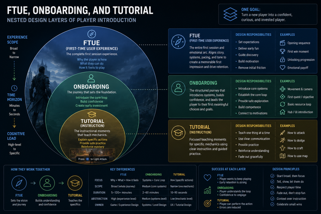
FTUE (First-Time User Experience) is the broader arc: everything a player experiences from launch to the point where they’ve formed a working mental model of the game — the install, the first menu, the first mechanic, the first meaningful choice, and every beat in between. It’s a session-length window, typically the first ten to sixty minutes, and it includes moments that have nothing to do with explicit instruction: load times, first impressions of art direction, the pacing of the opening beat.
Onboarding is the deliberate, designed subset of FTUE — the specific systems built to teach the player what they need to know. Tooltips, guided objectives, a scripted first encounter, a tutorial level: these are onboarding. Onboarding is a component of FTUE; FTUE is not a synonym for onboarding, and it’s not a synonym for “tutorial” either.
Tutorial is narrower still — usually a specific sequence or mode explicitly framed as instruction, often skippable, often the thing players complain about wanting to skip. A tutorial is one possible onboarding implementation, not the whole discipline.
“Editorial illustration created for visual reference purposes. It does not represent a real project, client work, or official software screenshot unless stated otherwise.”
The nesting matters at brief-writing time. A producer who asks for “a better tutorial” when the actual problem is FTUE-level (players bouncing at the main menu before they ever reach onboarding) will get a team polishing the wrong layer. A design brief that says “improve onboarding” without specifying whether that means adding guided objectives, redesigning the diegetic HUD introduction, or shortening time-to-first-meaningful-choice is a brief that three different disciplines will each interpret differently. If you want the full picture of where UX, UI, and player experience sit relative to each other before drilling into onboarding specifically, our broader UX design guide covers that layer separation in depth — onboarding gets a brief mention there, but this piece is where the production detail lives.
What FTUE Actually Has to Deliver in the First Session
Every FTUE, regardless of genre or platform, has to accomplish four things inside a compressed window, and the order matters:
- Establish the promise. The player chose this game over the dozens of others available. FTUE’s first job is confirming that choice was correct — showing the core fantasy, the art direction, the mechanic that made the trailer worth watching — before asking for anything in return.
- Teach the minimum viable rule set. Not every system. The smallest set of mechanics that lets the player make a real decision. A strategy game doesn’t need supply-chain depth in minute two; it needs enough to place one unit and see a consequence.
- Deliver a legible first win. A player who can’t tell whether their first action succeeded doesn’t build confidence — they build confusion. This is a visibility-of-system-status problem, and it’s solved with feedback design (animation, sound, UI state change), not with more text.
- Set the pacing contract. How fast will new systems arrive? A player who gets three overlapping tutorials in five minutes calibrates to “this game will keep interrupting me” — and either disengages from the systems or abandons the session.
Where mid-core and AAA production differs sharply from the mobile FTUE literature is in what “minimum viable rule set” means. A match-3 mobile game’s minimum rule set is genuinely minimal — match three, get a reward. An open-world AAA title’s minimum rule set for the first ten minutes still has to gesture at systems the player won’t touch for hours: a crafting icon glimpsed once, a skill tree silhouette shown and closed. The mobile FTUE playbook optimizes for immediate simplicity; the AAA playbook has to balance immediate simplicity against seeding a promise of depth, because depth is often the thing the player was sold on.
Progressive Disclosure and the Push-vs-Pull Revelation Problem
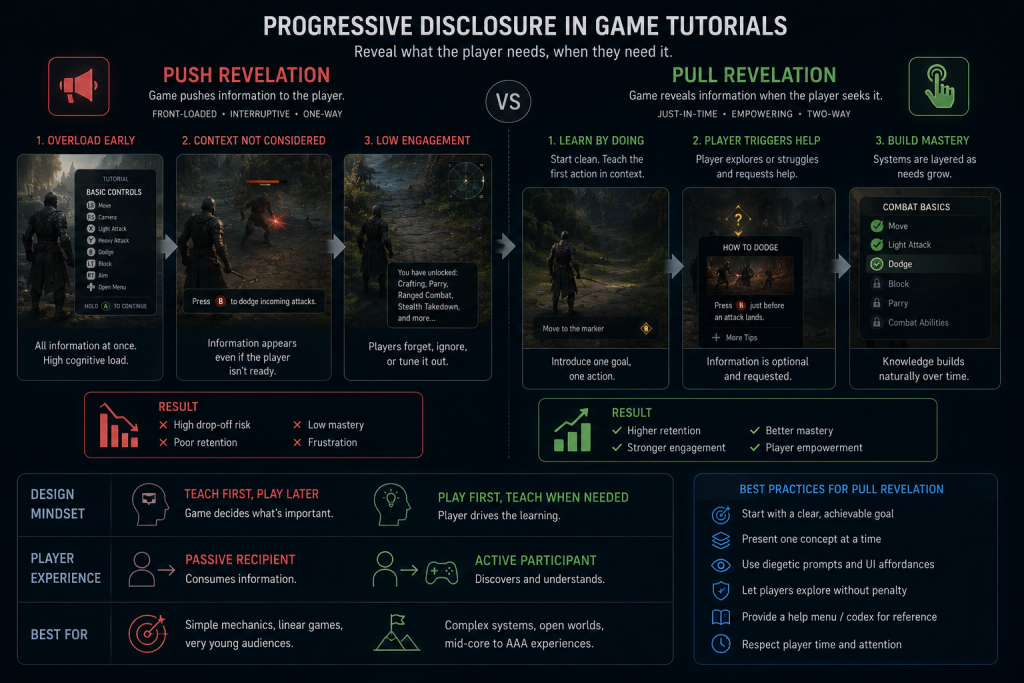
The mechanism that makes onboarding work — or fail — is progressive disclosure: showing information only when it’s actionable, rather than front-loading everything a player might eventually need. The distinction that matters in practice is between two ways of delivering that information.
For production planning, it helps to split disclosure into two practical modes. These aren’t formal industry categories the way diegetic and non-diegetic UI are — they’re working production labels for deciding when and why a prompt should appear. Push revelation interrupts the player to show them something, whether or not they asked for it — a modal tutorial, a forced pop-up, a scripted stop that takes control away from the player to deliver an instruction. Pull revelation surfaces help only when a signal indicates the player would benefit from it right now — a contextual tooltip that appears the first time a new mechanic becomes relevant, a coach mark tied to player state rather than to elapsed time.
“Editorial illustration created for visual reference purposes. It does not represent a real project, client work, or official software screenshot unless stated otherwise.”
Nielsen Norman Group’s research on onboarding tutorials versus contextual help, written for application UX broadly, applies directly to game onboarding: push-style interruptions get skipped often, get remembered poorly once dismissed, and don’t reliably move the needle on how well a user actually performs the task afterward — largely because the information arrives before the player has any reason to retain it. The game-specific wrinkle is that push revelation in a game doesn’t just interrupt attention — it interrupts agency, which is the thing most games are selling in the first place. A forced tutorial stop in an action game contradicts the core promise before the player has experienced it once.
The production implication: a pull-revelation-first onboarding system costs more to build than a scripted push sequence, because it requires state-tracking — the game has to know what the player has and hasn’t done, and trigger the right prompt at the right moment rather than on a fixed timeline. That’s a design and engineering cost worth planning for at pre-production, not discovering at the first internal playtest when the scripted tutorial gets universally skipped by testers on their second run.
Diegetic and Non-Diegetic Onboarding Prompts
Onboarding prompts route through the same four-type taxonomy that governs the rest of a game’s interface — and the type decision here has the same production consequences it has everywhere else in UI.
A non-diegetic onboarding prompt — a floating tooltip, a UI callout box, an on-screen arrow — is the fastest to build and iterate. It lives in the 2D UI pipeline, requires no character or environment integration, and reads clearly regardless of what’s happening in the world. It’s also the most common choice, and for many systems the correct one: nobody needs a diegetic explanation of how the pause menu works.
A diegetic onboarding prompt is part of the world itself — an NPC who physically demonstrates a mechanic, an in-world sign, a mentor character whose dialogue teaches a system without a UI overlay ever appearing. Diegetic onboarding preserves immersion at the exact moment a game is trying to establish its fictional promise, which is why narrative-heavy titles lean toward it for early beats even when it costs more to produce. The production cost mirrors what we cover in our breakdown of diegetic versus non-diegetic UI: a diegetic tutorial moment is a character-art or environment-art deliverable with rigging and animation dependencies, not a UI-artist task with a two-day turnaround.
Most shipped mid-core and AAA titles hybridize deliberately: diegetic framing for the opening beat that establishes tone (a mentor figure, an environmental cue), non-diegetic overlays for anything that needs to stay legible under pressure once the player is past the opening hour. The mistake we see most often at the brief stage is treating this as a single studio-wide decision rather than a per-moment one — the same error that shows up in HUD-type planning, where teams commit to “diegetic” or “non-diegetic” as a philosophy instead of classifying each element on its own merits.
How HUD Introduction Sequences Connect to Onboarding
The HUD is one of the last things most FTUE plans account for explicitly, and it’s one of the first things that fails a first-session playtest. A HUD that appears fully populated the instant a player gains control — health, ammo, minimap, objective tracker, resource counters, all at once — front-loads exactly the information overload that progressive disclosure exists to prevent.

Production-grade FTUE design treats the HUD’s arrival as a scripted sequence, not a static state. Health appears when health becomes relevant — the first hit taken, not the main menu. The minimap appears when navigation becomes a real decision, not before the player has taken a single step. This is the same suppress-until-needed pattern documented in our HUD design guide: elements that stay hidden until their information becomes actionable, rather than displaying constantly regardless of relevance.
The pipeline consequence is that HUD introduction timing needs to be in the onboarding spec, not left as an implementation detail for whoever builds the HUD system. If the HUD team builds every element as always-visible by default and the onboarding team assumes elements will appear contextually, that mismatch surfaces at the first in-engine playtest as a HUD that either overwhelms new players or fails to explain itself — and by then it’s a cross-team rework, not a wireframe note.
FTUE Best Practices Adapted for Mid-Core and AAA Production
Most published FTUE best-practices lists are written for free-to-play mobile teams optimizing D1 retention curves. The underlying principles transfer, but the execution changes when the target is a mid-core or AAA production with longer sessions, higher art fidelity, and a different monetization relationship with the player.
- Lead with the fantasy, not the interface. Mobile FTUE optimizes for “get the player tapping in three seconds.” AAA FTUE optimizes for “get the player feeling the core fantasy before asking them to learn anything” — a beat of cinematic framing or environmental establishing shot earns its place here in ways it wouldn’t in a hyper-casual game.
- Gate systems by relevance, not by a fixed script. A skill tree tutorial that fires because the player hit the ten-minute mark, regardless of whether they’ve engaged with combat yet, is a push-revelation failure. Gate it to the first combat encounter instead.
- Test the HUD’s arrival, not just its final state. A HUD that reads perfectly once fully populated can still fail if every element appears simultaneously at second one. Playtest the introduction sequence as its own artifact.
- Reserve diegetic moments for tone-setting beats, not utility explanations. Save the diegetic budget — the character art and animation cost — for the moments that establish fiction, and let non-diegetic UI carry the purely functional information.
- Design the skip path with the same rigor as the tutorial itself. Experienced players who skip onboarding still need the systems to make sense mid-session if they never saw the guided version. A skip button that dumps a returning or genre-experienced player into a HUD with zero context is its own churn source.
The through-line for an art director: onboarding isn’t a design-only deliverable that gets handed to art for polish at the end. Every one of these principles has an art-direction and pipeline dependency — HUD arrival sequencing, diegetic character work, environmental staging for the opening fantasy beat — and each one is cheaper to plan for in pre-production than to retrofit after a first-session playtest flags it.
AAA Onboarding vs F2P/Mobile Onboarding: Why the Playbooks Diverge
The bulk of FTUE writing online comes from a retention-metrics tradition — D1/D7 retention, tutorial completion funnels, monetization-loop design — because that’s where FTUE first got formalized as a discipline, in free-to-play mobile. That tradition produces real, transferable principles: progressive disclosure, the paradox of the active user (players want to play, not study a manual), the value of a legible first win. But three assumptions baked into that literature don’t hold for mid-core and AAA production:
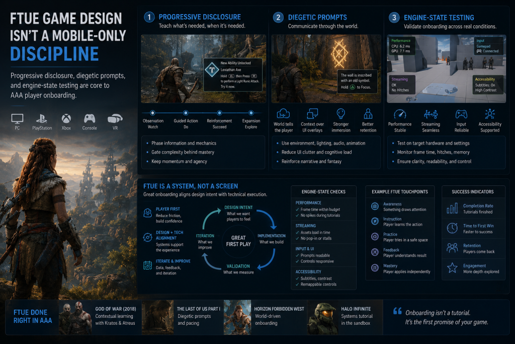
“Editorial illustration created for visual reference purposes. It does not represent a real project, client work, or official software screenshot unless stated otherwise.”
Session length changes the budget. A mobile FTUE has seconds to earn attention before a player closes the app. An AAA or mid-core title often starts with a higher baseline of player intent — a purchase, subscription access, franchise interest, or a deliberate install — even accounting for how many players now arrive through Game Pass, PS Plus, free weekends, or demos rather than a straight purchase. That higher baseline changes the tolerance for a slower, more atmospheric opening beat. This doesn’t mean AAA onboarding can be slow for its own sake; it means the pacing contract is different, not absent.
Art fidelity raises the cost of iteration. A mobile or F2P team can often test lightweight onboarding variants more frequently when the interface and content changes are cheap enough to reproduce and the liveops infrastructure supports it. A diegetic onboarding beat in an AAA title, by contrast, carries character rigging, mocap, and environmental staging dependencies — it rarely gets five iterations; more often one or two, validated through structured playtesting rather than live A/B splits, which means the design has to be closer to right before it enters production.
The monetization relationship is different, which changes what onboarding is optimizing for. F2P onboarding is frequently structured around introducing the economy — currencies, sinks, the first soft-monetization touchpoint. A premium mid-core or AAA title’s onboarding has no equivalent obligation, and importing that structure (an early “open loop” built around unlockables rather than mechanics) can feel transparently transactional in a game the player already paid for.
For visual reference, the Game UI Database lets teams compare shipped onboarding and tutorial screens by genre and screen type — useful for grounding a visual brief in what AAA and mid-core titles have actually shipped, though it’s a screenshot reference, not a substitute for playtesting your own FTUE.
Testing FTUE in Engine, Not in a Deck
The same principle that governs HUD validation applies to onboarding: it can only be properly tested in engine, in motion, against real player attention — not in a Figma flow or a design document. A wireframe of a tutorial sequence can look perfectly paced on paper and still fail the moment engine state (loading transitions, camera behavior, controller input latency) intrudes on the timing the design assumed.
That means onboarding validation needs the same playtesting discipline as any other UX system: moderated sessions where you watch exactly where a new player hesitates or ignores a prompt, unmoderated tests at scale to catch drop-off points a small internal group won’t reproduce, and validation on the actual build rather than a clickable prototype. The teams that catch onboarding problems at this stage are revising a wireframe or a scripting sequence. The teams that catch them after art lock are re-cutting finished cinematic beats and re-recording mocap — the same expensive-late-fix pattern that shows up whenever UX gets validated too late in a pipeline.
This is also where vendor selection becomes relevant for studios that don’t carry dedicated UX playtesting capacity in-house. Onboarding design that never gets tested against real player behavior — only reviewed internally by people who already know the game — routinely ships with pacing problems nobody caught, because the internal team can’t unsee what they already understand. If your team is evaluating outside UX partners for this kind of work, our checklist for choosing a game UX/UI studio covers what separates a vendor who validates onboarding in engine from one who hands over a polished deck and calls it done.
FTUE Design Deliverables a Production Team Actually Needs
Onboarding and FTUE work is easy to under-scope at the brief stage, because it looks like a design task until it hits production and turns out to touch art, engineering, and QA at once. A spec that’s actually production-ready usually includes:
- First-session player journey map — the full arc from launch to first meaningful decision, not just the tutorial steps
- Onboarding flow map — which systems get taught, in what order, and what triggers each one
- Tutorial beat sheet — the specific scripted or contextual moments that carry instruction
- HUD introduction sequence — when each element appears, tied to player state rather than elapsed time
- Prompt trigger rules — the conditions that fire a push or pull revelation, documented so engineering can build the state-tracking behind it
- Diegetic/non-diegetic prompt matrix — which teaching moments route through character or environment art, and which stay in the 2D UI pipeline
- Menu and navigation onboarding flow — how a player learns the game’s information architecture outside of active gameplay
- Accessibility and readability notes — color-independent cues, text size, and pacing allowances for the same onboarding moments
- Telemetry event map — what player behavior gets tracked during FTUE, and which events flag a drop-off risk
- Playtest issue log — a living record of where testers hesitated, skipped, or misread a prompt, carried forward across iterations
Missing pieces here are what turn a clean onboarding design into a milestone-review surprise — a HUD sequence with no trigger rules, a diegetic beat nobody scoped for rigging time, a tutorial flow with no accessibility pass. Documenting all ten before production starts is what keeps onboarding from becoming the thing every other team discovers late.
Our Approach at Nasty Rodent
We treat onboarding and FTUE design as a pipeline problem from the first pre-production conversation, not as a design document handed to art once the mechanics are locked. That means classifying every onboarding moment — diegetic or non-diegetic, push or pull — before screen production scales, so the HUD team, the character art team, and the UI team are building toward the same sequencing spec instead of discovering conflicts at integration.
Across our work for mid-core and AAA-adjacent teams — including Offworld Industries, The Bearded Ladies Consulting, Reburn, Whimsy Games, Galaxy 4 Games, and Benner Games — we’ve seen the same pattern hold: onboarding systems need to survive the same lookdev rigor as a hero asset, because for a new player, the first HUD they see and the first mentor character they meet often function like one. A tutorial sequence with a style drift between its diegetic framing and the rest of the world’s art direction reads as unfinished before the player has reached the first real level.
If your team is planning onboarding and FTUE work for an upcoming production, our game UX/UI production partner work covers the full sequence — from progressive disclosure planning through diegetic prompt design and in-engine playtesting support.
Onboarding, FTUE, and Tutorial Compared at a Glance
| Term | Scope | Owns | Fails when |
| FTUE | The full first-session arc | First impression, pacing, mental model formation | Player disengages before ever reaching a designed teaching moment |
| Onboarding | The deliberate teaching systems inside FTUE | Tooltips, guided objectives, progressive disclosure | Interrupts more than it informs, or arrives out of context |
| Tutorial | A specific instructional sequence or mode | A scripted, often skippable teaching moment | Feels mandatory, repetitive, or disconnected from actual play |
How to Get Onboarding and FTUE Design Right
The teams that ship a first session players actually finish aren’t optimizing a single tutorial screen — they’re treating onboarding and FTUE design as a system that spans writing, art direction, HUD sequencing, and engine-state testing, planned together before production scales. Get the FTUE-vs-onboarding distinction right at the brief stage, classify each prompt as diegetic or non-diegetic on its own merits, sequence the HUD’s arrival deliberately, and validate all of it in engine rather than on paper — and the first ten minutes stop being the place players quietly leave.
If your team is scoping onboarding and FTUE work for an upcoming mid-core or AAA title and wants a second read on where the pacing risks sit in your current design, we can set up a short call with our senior UX lead — bring your current flow or a rough outline, and we’ll give you a concrete read on what we’d flag before it reaches a playtest.