Game Art Bible & Style Guide: Why AAA Studios Need Them
-

Written byDenys Zadoienyi
-

Updated on09.07.2026
-

Time to read15 min

- Art Bible vs Style Guide: Where the Terms Actually Overlap
- Why AAA Productions Can’t Skip This Documentation
- What a Production-Grade Art Bible Should Include
- How an Art Bible Moves Through the Production Pipeline
- Weak Art Bible vs Production-Grade Art Bible
- Where the Art Bible Meets Technical Art and Engine Constraints
- How the Art Bible Holds Up Once Outsourcing Enters the Pipeline
- Where Art Bibles Break Down in Practice
- Building Consistency Without the Overhead
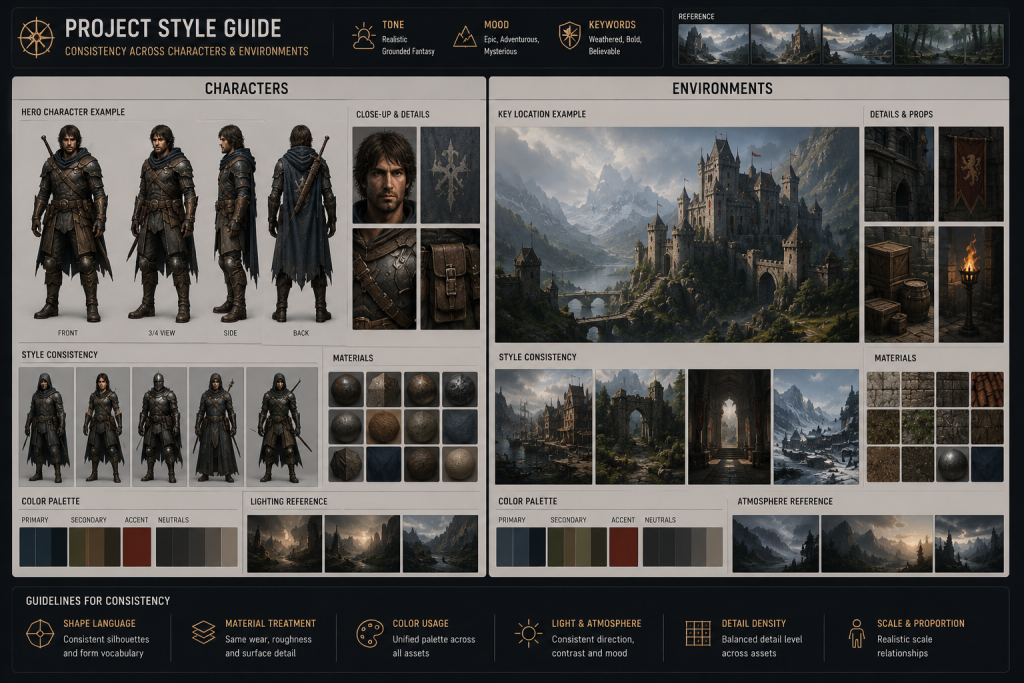
A game art bible is the reference document an art director writes to lock down a project’s visual language before production scales past the point where verbal instructions can hold it together. It defines proportions, color logic, silhouette rules, material treatment, and lighting intent, and it exists so that every artist touching the project, whether they sit three desks away or three time zones away, builds toward the same visual target. The term overlaps heavily with “style guide,” and on smaller productions the two words often describe the same document.
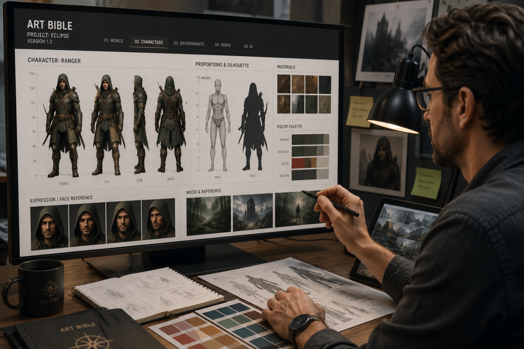
“Editorial illustration created for visual reference purposes. It does not represent a real project, client work, or official software screenshot unless stated otherwise.”
The distinction matters more once a production adds departments, milestones, and outside vendors than it does at the concept stage, which is exactly where most of the writing about art bibles online stops short. What follows goes past the definition into what the document actually needs to contain, how it moves through a real production pipeline, where a written art bible still fails, and what changes once external teams enter the picture.
Art Bible vs Style Guide: Where the Terms Actually Overlap
In practice, most studios use “art bible” and “style guide” interchangeably, and the confusion is reasonable, because the boundary between them is soft rather than fixed. Where a distinction does show up, it tends to run like this: a style guide is the visual rulebook – palette, line weight, proportion ratios, material logic, the things an artist checks against while building an asset. An art bible is the broader container that usually includes the style guide plus supporting material: mood references, narrative and world context, camera language, and sometimes a running asset list.
“Editorial illustration created for visual reference purposes. It does not represent a real project, client work, or official software screenshot unless stated otherwise.”
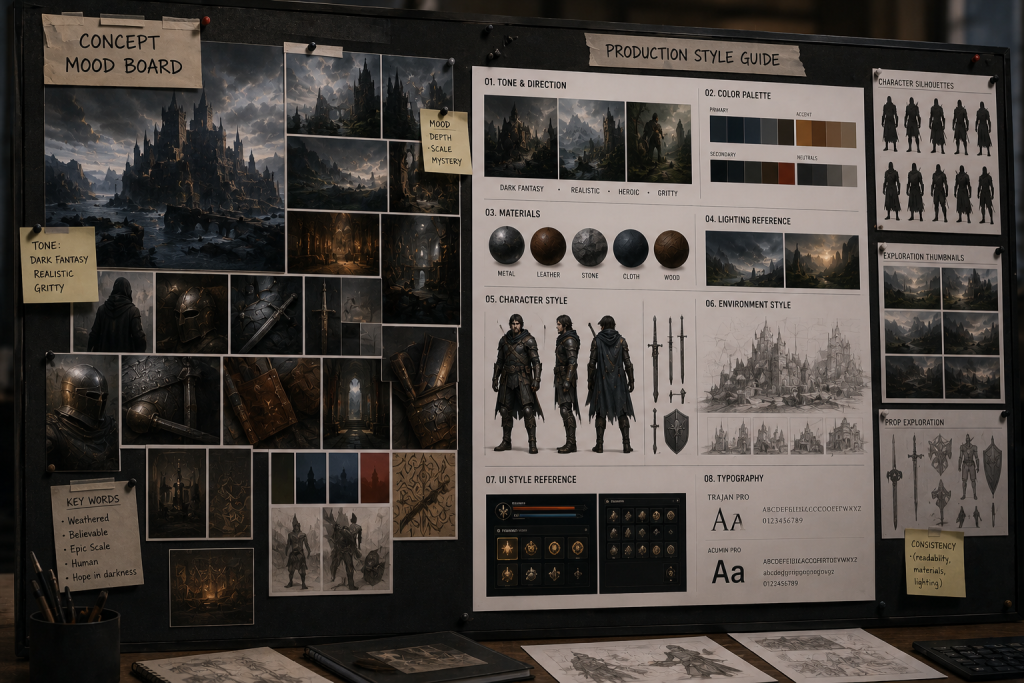
On a small team, one person writes both in the same document and nobody worries about the label. On a AAA production with a character department, an environment department, and a UI team each needing their own reference, the art bible often splits into sub-documents – a character art bible, an environment art bible, occasionally a UI-specific style guide – while the parent document holds the shared visual logic that ties them together. Neither structure is more correct than the other. What matters is whether the document actually answers the question every artist eventually asks: does this fit the world we’re building, or doesn’t it.
“Editorial illustration created for visual reference purposes. It does not represent a real project, client work, or official software screenshot unless stated otherwise.”
Why AAA Productions Can’t Skip This Documentation
The pain an art bible solves is almost invisible at small scale and becomes one of the biggest drivers of rework at AAA scale. A two-person indie team can carry the visual target in their heads and correct drift in a five-minute conversation. A AAA production running a character department, an environment department, a UI team, and one or more outsourcing partners in parallel cannot rely on shared memory the same way. Every artist who joins after the visual language was set in someone’s head, rather than on a page, is working from a slightly different mental model of what “on-style” means – and at AAA scale, that gap shows up across hundreds of assets rather than a handful.
Scale changes the shape of the problem in specific ways. A production that runs across several platforms needs the art bible to account for how the same material and lighting logic holds up on a different performance budget, not just how it looks in a single target build. A production with a live content pipeline – new characters, seasons, or maps shipping after launch – needs the document to stay accurate months or years after the original art director made the founding decisions, often with a different team maintaining it. And a production heading toward a publisher milestone or a vertical slice review is, in effect, being asked to prove the visual direction is under control; a documented art bible is one of the clearer ways to show that, compared to a verbal pitch about “the vision.”
The failure pattern that follows from skipping this documentation is predictable enough to name in advance. A hero asset ships looking exactly right. The second wave of assets, built by different artists under time pressure, drifts a little on proportion or a little on material treatment. Nobody catches it asset by asset, because each individual piece still looks reasonable in isolation – the eye adjusts. It surfaces all at once during a full-scene review, when the world suddenly reads as visually incoherent, and by then the fix is a revision pass across dozens of assets rather than a five-minute course correction.
What a Production-Grade Art Bible Should Include
The content varies by project, but AAA-grade documents converge on a similar backbone. Six categories tend to do most of the work.
Visual Pillars
A short, opinionated statement of what the game should feel like visually, usually anchored to two or three reference touchpoints rather than a mood board of fifty images nobody will scan. The pillars exist to settle arguments quickly: when a new artist asks “should this read as grounded or heightened,” the pillars are the answer, not a Slack thread.
Shape Language and Silhouette Rules
Round, angular, and square shapes read differently to a player before a single detail is added – round reads friendly, angular reads aggressive, square reads stable. A production-grade art bible states which shape families belong to which character or faction, and how far the silhouette can be pushed before it reads as a different design language entirely.
Color, Lighting, and Material Logic
Not a palette dump, but rules: which colors carry narrative weight, how material families are expected to behave under the target lighting, where saturation is allowed to spike and where it isn’t. This is also where the document has to connect to how materials will actually render in-engine, which is covered in more detail further down.
Category Reference Sheets
Characters, environments, props, and UI each get their own reference pass, because a rule that works for character silhouettes rarely transfers cleanly to environment composition or interface iconography. A character proportion chart and an environment scale chart are solving different problems, even when they’re built from the same visual pillars.
Do’s and Don’ts, Shown Not Described
A side-by-side image showing an on-style version next to an off-style version communicates a rule faster than a paragraph of description ever will. This is the section artists actually flip to during review, and it’s usually the thinnest section in weaker documents.
Ownership and Versioning
Someone has to own updates to the document as the visual direction sharpens during production, and the document needs a visible version history so a vendor or new hire knows they’re looking at the current standard rather than an early draft. Without this, the art bible and the actual current style quietly diverge, and nobody notices until a review flags the gap.
What separates a document artists actually use from a binder that gets opened once and forgotten is restraint across all six categories, not exhaustive detail in one of them. A concise, well-organized art bible with strong visual examples outperforms an exhaustive one that buries the two or three rules that matter under pages nobody has time to read mid-production. Ron Ashtiani’s ArtStation Learning series on art direction is a useful reference here, precisely because it treats visual direction as something that has to be developed and then communicated to other people, not just decided once by one person. That’s the same underlying problem an art bible exists to solve.

How an Art Bible Moves Through the Production Pipeline
“Editorial illustration created for visual reference purposes. It does not represent a real project, client work, or official software screenshot unless stated otherwise.”
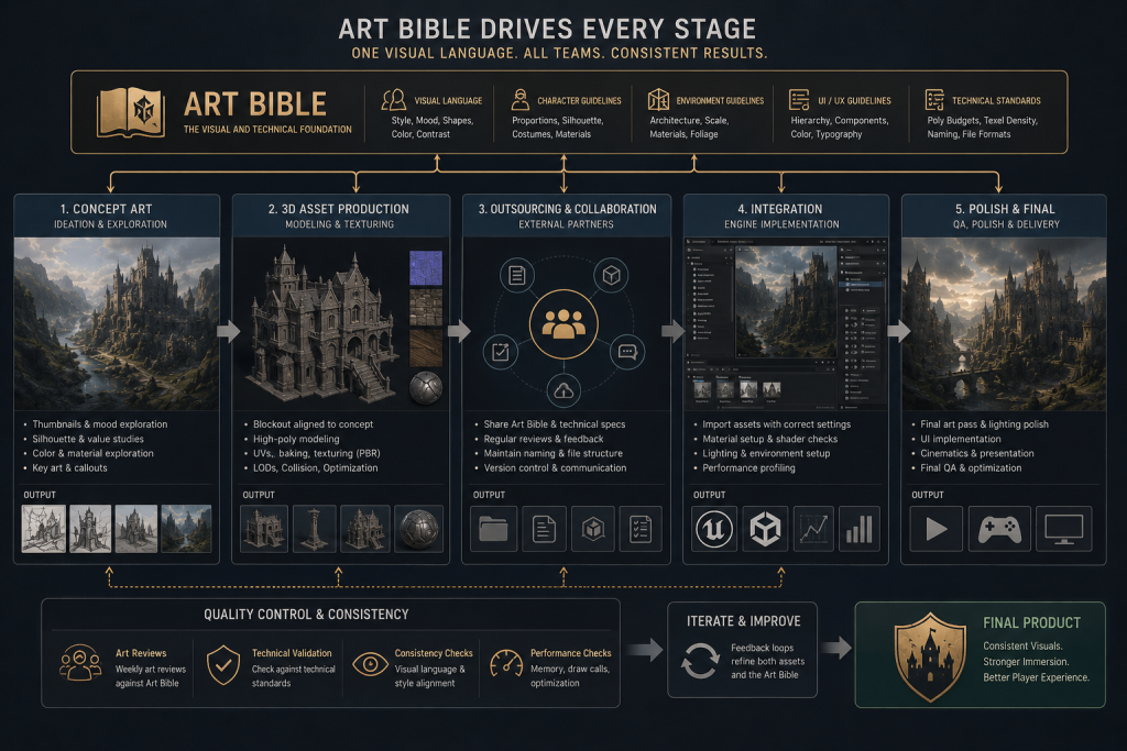
An art bible isn’t a pre-production deliverable that gets filed away once concept art begins. It governs a different decision at every stage of the pipeline, and it fails differently depending on where it gets ignored.
| Stage | What the art bible controls | Typical failure if it’s missing or ignored |
| Pre-production | Visual pillars, reference direction, tone | The style stays verbal and gets reinterpreted by every new hire |
| Concept art | Silhouettes, shape language, color logic | Concepts explore visually different games rather than one game |
| 3D blockout | Proportions, scale, asset readability | 3D assets drift from the approved concept during translation |
| Texturing and lookdev | Material rules, roughness ranges, lighting intent | Surfaces from different departments feel like different worlds |
| Environment assembly | Composition density, palette consistency | Levels don’t read as one coherent place, even with on-style props |
| Outsourcing handoff | Vendor interpretation, benchmark assets, approval criteria | Rework loops and style drift on delivered batches |
The pattern worth noticing across every row: the art bible doesn’t do the work itself at any stage – it gives the person reviewing the work a fixed reference instead of a memory of what things were supposed to look like. That’s a small difference on paper and a large one six months into production, once the person who originally set the direction isn’t the one reviewing every asset anymore.
Weak Art Bible vs Production-Grade Art Bible
Not every written document earns its keep. The gap between a document that gets used and one that gets ignored is usually structural, not a matter of how much effort went into it.
| Weak art bible | Production-grade art bible |
| A mood board dump with no stated rules | Curated references paired with explicit, written rules |
| Direction given as adjectives (“make it gritty”) | Direction given as defined material, color, and silhouette logic |
| Long descriptive paragraphs | Visual do’s-and-don’ts examples an artist can check against in seconds |
| No named owner | Owned by a specific art director or lead, with update responsibility |
| Written once, never revised | Updated as approved benchmark assets change the actual standard |
| Kept separate from the review process | Used directly as the checklist during asset review |
| No notes for outside teams | Includes vendor-ready benchmark assets and acceptance criteria |
Our own breakdown of stylized character production at AAA scale makes the same point from the production side: the protection against style drift isn’t a sixty-page art bible, it’s the discipline of running the same review against it at every milestone without exception. A thin document that’s actually checked beats a thick one that isn’t.
Where the Art Bible Meets Technical Art and Engine Constraints
An art bible that lives only in 2D reference sheets misses half of what keeps a AAA project visually consistent, because the rules it sets have to survive translation into engine-rendered materials, lighting, and performance budgets. A color and material rule that looks correct in a concept painting can read completely differently once it’s rebuilt as a physically based material under real-time lighting – which is exactly why the material logic section of the art bible needs to connect to how the engine actually renders things, not just how a reference image looks.
This lines up with a point Marmoset makes directly in its guide to physically based rendering for game artists: consistent base material values remove the guesswork for individual artists and make it far easier, from an art direction standpoint, to keep content built by a whole team looking correct under every lighting condition the engine throws at it. A style guide that specifies “worn metal” without also anchoring what that means in PBR terms – roughness range, reflectivity, how it should read under the target engine’s lighting model – leaves every artist to interpret the phrase independently, which is the same drift problem the art bible was supposed to prevent, just moved one layer deeper into production.
The same logic extends to silhouette and readability rules once they hit a real engine: a silhouette that reads clearly in a flat concept sketch can lose clarity at gameplay distance once LOD reduction, fog, or dynamic lighting are in play, which is part of why lookdev exists as a dedicated stage between concept approval and full production – a point covered in more depth in our breakdown of the lookdev workflow for AAA game art.
How the Art Bible Holds Up Once Outsourcing Enters the Pipeline
This is where the document earns its cost. An internal team that sat through every pre-production discussion carries a lot of unwritten context. An outsourced studio joining mid-production carries none of it, and the art bible is the only thing standing between “we briefed them properly” and a multi-week revision loop because the vendor’s interpretation of “stylized” didn’t match the studio’s own.
At the character level, a single hero asset frequently sets the visual bar that every subsequent character in the cast gets measured against. Without a written reference, that standard turns into “measured against whatever the reviewer remembers the hero asset looking like,” which gets noticeably less stable once a project runs for a year and the reviewers themselves change.
The same logic applies at the environment level, where a scene has to read as one coherent place regardless of how many artists or vendors touched pieces of it. A level built by three different environment artists against three slightly different mental models of “the style” rarely announces the problem asset by asset – it shows up as a world that doesn’t feel like it belongs to itself once everything is assembled.
It also changes the outsourcing conversation itself. A studio that can hand a vendor a genuinely usable art bible – benchmark assets, explicit acceptance criteria, a named point of contact for interpretation questions – is asking a fundamentally different question of that vendor than a studio still figuring out its visual direction in real time. The first is briefing a production partner against an established style guide; the second is often better served by early-stage concept exploration before any style guide exists to hand over. Confusing the two is a common source of mismatched expectations on both sides of an engagement, and it’s usually visible in the brief before a single asset gets delivered.
Where Art Bibles Break Down in Practice
A written art bible is not a guarantee against drift; it’s a tool that only works if a few conditions hold. The most common failure isn’t a missing document – it’s a document nobody actually checks against once production speeds up. A style guide that lives in a shared drive but never gets pulled up during asset review is functionally the same as not having one.
The second common failure is treating the art bible as a one-time deliverable rather than a living reference. Early production decisions get revisited constantly as a game’s visual direction sharpens, and a style guide that isn’t updated to reflect those revisions quietly becomes a document that contradicts the actual, current visual target. New artists briefed against the old version and artists briefed verbally against the current direction start producing genuinely different work without either side realizing why.
The references that feed into an art bible go through a similar narrowing process during pre-production, even outside AAA-scale production. In one 80 Level environment art breakdown, an artist described organizing early reference gathering into distinct groups by purpose – mood and atmosphere on one side, patterns and prop references on the other – before narrowing that broad set down to the handful of images that actually defined the direction. The specific project there was a personal environment piece rather than a AAA pipeline, but the underlying discipline is the same one an art bible is supposed to formalize at scale: gathering broadly, then committing to a small, defined reference set before production begins in earnest.
Building Consistency Without the Overhead
None of this requires a large internal documentation team. Most AAA productions get real value from an art bible that’s tight enough to be read in one sitting and specific enough to settle an argument about whether an asset is on-style. The return on that investment shows up months later, at the point where a production is running dozens of artists across internal and outsourced teams simultaneously, and the alternative to a shared reference document is relitigating the visual direction on every asset review.
If your team is approaching the point where verbal alignment stops scaling – a new department coming online, an outsourcing partner joining mid-production, or a visual direction that’s shifted enough that the original brief no longer matches what’s actually shipping – that’s usually the right moment to get the direction onto a page rather than wait for the first major revision cycle to force the conversation. At Nasty Rodent, that work spans concept art and visual development, 3D character and environment production, and the outsourcing-readiness question of what a vendor actually needs in hand before a batch of assets goes out the door – visual pillars, category references, do’s-and-don’ts sheets, benchmark assets, and review criteria that concept, 3D, and outsource teams can all build against without reinterpreting the brief from scratch.