Accessibility in Game Design: Building Colorblind, Subtitle, and Remapping Systems That Hold Up
-

Written byDenys Zadoienyi
-

Updated on28.07.2026
-

Time to read12 min

- Why “Built In” and “Bolted On” Produce Different Results
- Colorblind Design: Beyond “Add a Filter”
- Subtitle Systems: More Than “Text at the Bottom”
- Input Remapping: Data Structure Before UI
- Where This Intersects the Rest of the UI System
- Building It In vs. Evaluating a Vendor’s Accessibility Depth
- How Nasty Rodent Approaches Accessibility in UI Production
Accessibility in game design is usually described as a list of settings-menu toggles. That description undersells what actually separates a good accessibility implementation from a fragile one: whether colorblind modes, subtitle systems, and input remapping were designed into the UI architecture from the start, or patched onto systems that were never built to support them. The difference shows up immediately in production – one approach is stable and testable, the other accumulates compromises with every new feature the team ships.
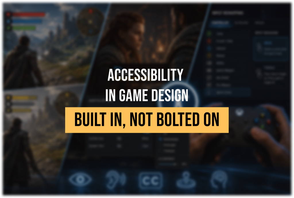
“Editorial illustration created for visual reference purposes. It does not represent a real project, client work, or official software screenshot unless stated otherwise.”
This guide focuses on three production-heavy accessibility systems – colorblind design, subtitle systems, and input remapping – and the architectural decisions that determine whether each one remains stable as production scope expands. Each crosses multiple pipelines (UI, cutscene, control scheme) and becomes significantly more expensive to retrofit once the surrounding systems are locked, which makes them a useful test of how deep a studio’s accessibility practice actually goes.
Accessibility in game design is the practice of reducing barriers that can prevent players with visual, auditory, motor, cognitive, or other access needs from perceiving information, providing input, or understanding a game’s systems. That’s a broader scope than the three systems covered here – it also spans screen readers, difficulty options, cognitive-load design, and more; this guide focuses specifically on color, subtitles, and input because of how early they need to be decided.
Why “Built In” and “Bolted On” Produce Different Results
The distinction matters because of where in the pipeline each approach places the cost. When color, subtitle, and input systems are designed into the UI architecture from the beginning – HUD element colors chosen for contrast by default, button bindings stored as a remappable data structure rather than hardcoded, subtitle timing built into the cutscene pipeline itself – the resulting features are stable and can be tested like any other system. When they’re added after the core systems are finalized, compromises accumulate: a colorblind palette that conflicts with a particle effect system that was never designed with it in mind, remapping that breaks a minigame built around fixed input assumptions, subtitles forced into a UI canvas that wasn’t built to hold them.
Recent shipped and showcased titles make the difference concrete. Assassin’s Creed Black Flag Resynced ships colorblind presets that extend beyond UI elements into gameplay-critical VFX like special-attack glows, a “Largest” subtitle size increment, speaker-direction and speaker-emotion indicators in subtitles, and a persistent customizable camera dot added specifically to reduce motion sickness during naval combat. In an official Ubisoft interview about the game’s accessibility work, the development team described having “a very solid framework based on iterations and improvements made across recent releases” – the breadth of options here is consistent with that framework being reused and extended rather than built from scratch for this title. By contrast, in the indie and mid-core space, games detailed at the 2026 Access-Ability Summer Showcase – including Colorbound, a puzzle-platformer whose core mechanic is literally shifting colors – shipped a full trio of colorblind modes (protanopia, deuteranopia, tritanopia) with dedicated one-handed control presets. For a game whose core mechanic depends on shifting colors, this kind of support has to be considered at the level of the core mechanic itself, not added later as a settings-menu option.

Colorblind Design: Beyond “Add a Filter”
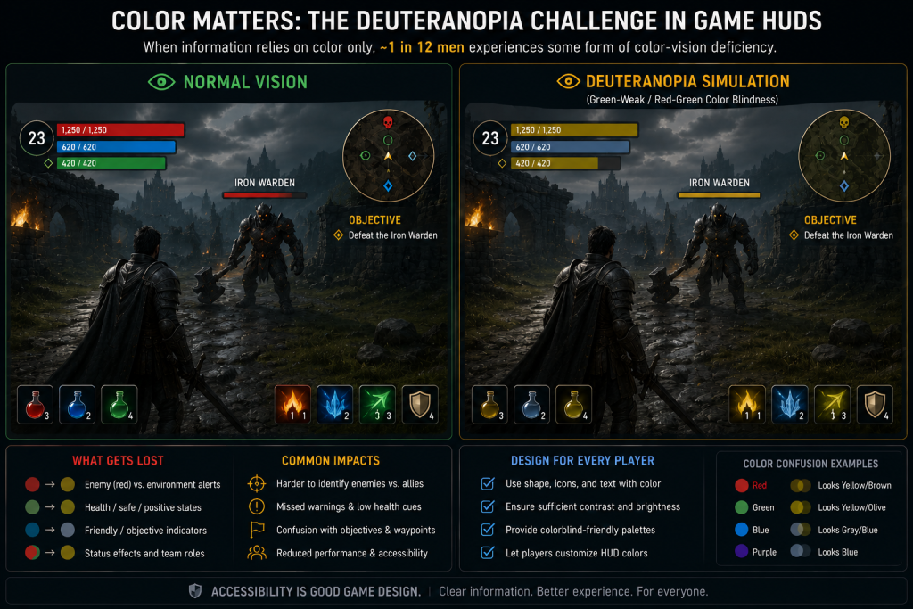
Color vision accessibility is a broader design requirement than a “colorblind mode” suggests: the mode itself is one possible setting, while the underlying requirement is that critical information stays readable without depending on hue alone – a distinction worth keeping in mind, since the fix is often in how the base UI communicates information, not just in what the optional mode changes.
A colorblind mode that only swaps a color palette after the fact tends to miss information that was never meant to be color-only in the first place. The starting principle, consistent with general accessibility standards for contrast and color use, is that color should never be the only carrier of critical information – it should be paired with shape, icon, pattern, or position. Nielsen Norman Group’s guidance on accessible visual design is a useful reference point here, though it’s written for web content and needs adaptation for game UI: standard text generally targets a 4.5:1 contrast ratio against its background, large text targets 3:1, and WCAG separately sets a 3:1 reference threshold for meaningful non-text UI components and graphics – a distinction worth keeping straight, since HUD icons and ability markers usually fall into that non-text category, not the text one. Game UI adds a complication web content doesn’t have: text and icons often sit over a moving, unpredictable background (the game world itself), so a single contrast check against one mockup background isn’t enough. A backing plate, outline, drop shadow, or adaptive-opacity treatment is usually needed, and the result should then be spot-checked across representative gameplay scenes – bright areas, dark areas, bloom, particle effects – since no single static check can establish legibility over every dynamic background a player will actually encounter.
For game UI specifically, that means building color-coded systems – health states, faction indicators, loot rarity, minimap markers – with a non-color fallback from the first pass, not as a separate “colorblind mode” layered on top. Denshattack!, a 2026 release whose developers detailed accessibility features ahead of launch, is a useful case: despite being a colorful game, none of its critical information depends on color alone – the developers paired every color cue with unique shapes and icons alongside a high-contrast UI option, so a colorblind player loses a redundant visual layer, not any actual information.
Practical architecture checklist:
- Design every color-coded UI element with a paired non-color cue (shape, icon, pattern) from the first mockup, not as a retrofit.
- Test palettes against protanopia, deuteranopia, and tritanopia simulators before locking a color system – not after art is finalized.
- Implement high-contrast presentation as a distinct, testable visual state rather than an uncontrolled palette swap – depending on the engine and UI framework, this might be alternate style tokens, a material parameter set, masks or outlines, or dedicated asset variants.
- Verify contrast against the range of backgrounds an element can actually appear over in-game, not just a static menu screen – use a backing plate, outline, or adaptive opacity where the background is unpredictable.
Subtitle Systems: More Than “Text at the Bottom”
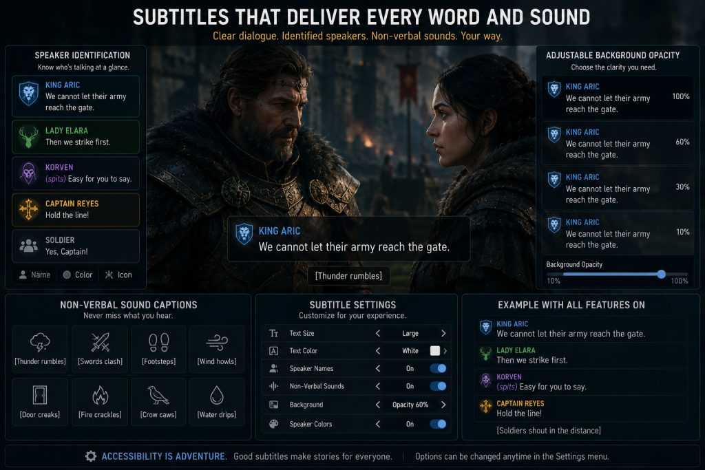
Subtitle quality is one of the more measurable accessibility features, because official platform guidance is specific about what “good” looks like. Xbox’s published Accessibility Guidelines for developers – specifically the text-display and subtitle/caption sections, XAG 101 and XAG 104 – specify that subtitle and caption text should default to a minimum readable height, with users able to scale it up to at least 200% of that default (not that the default itself should be 200% of anything). Speakers should be identified, using spatial indicators when the direction of a voice isn’t otherwise clear, with the speaker’s name reappearing in the subtitle line only when the speaker changes or after a significant pause. The guidance also draws a clear line between subtitles (spoken dialogue) and captions (non-verbal but meaningful sound, like gunfire or footsteps): where a game contains spoken dialogue or meaningful non-verbal audio, each content type needs appropriate coverage and separate authoring support – conflating them into a single “subtitle toggle” is a common design shortcut that under-serves deaf and hard-of-hearing players.
Recent implementations show what a more complete version of this looks like in production. Assassin’s Creed Black Flag Resynced‘s subtitle system includes color modification, speaker direction and speaker emotion indicators, and an additional larger text size option beyond the standard range, plus separate short “gameplay captions” for events that can’t be perceived visually – a distinct system from dialogue subtitles, built specifically because naval combat generates non-verbal audio information players need. Specific pixel values for subtitle scaling are implementation details rather than portable standards, since perceived size depends on resolution, viewport, platform, and UI scaling.
“Editorial illustration created for visual reference purposes. It does not represent a real project, client work, or official software screenshot unless stated otherwise.”
Practical architecture checklist:
- Build subtitles into the cutscene and dialogue pipeline itself, not as an overlay applied after scenes are locked – late integration commonly creates timing, authoring, localization, and safe-area problems, not just one of those.
- Store dialogue subtitles and non-speech captions as distinct content types, even if they share the same rendering component – this allows separate authoring, filtering, styling, localization, and user controls for each.
- Allow users to scale subtitle size to at least 200% of the defined baseline, and support adjustable background opacity and speaker identification as baseline capabilities, not late-stage enhancements.
- Enable subtitles by default, or present an explicit subtitle choice before the first plot-critical sequence – and surface essential accessibility setup before that same sequence, not after it, since context can already be missed by then; keep the full accessibility menu available at any time afterward.
Input Remapping: Data Structure Before UI
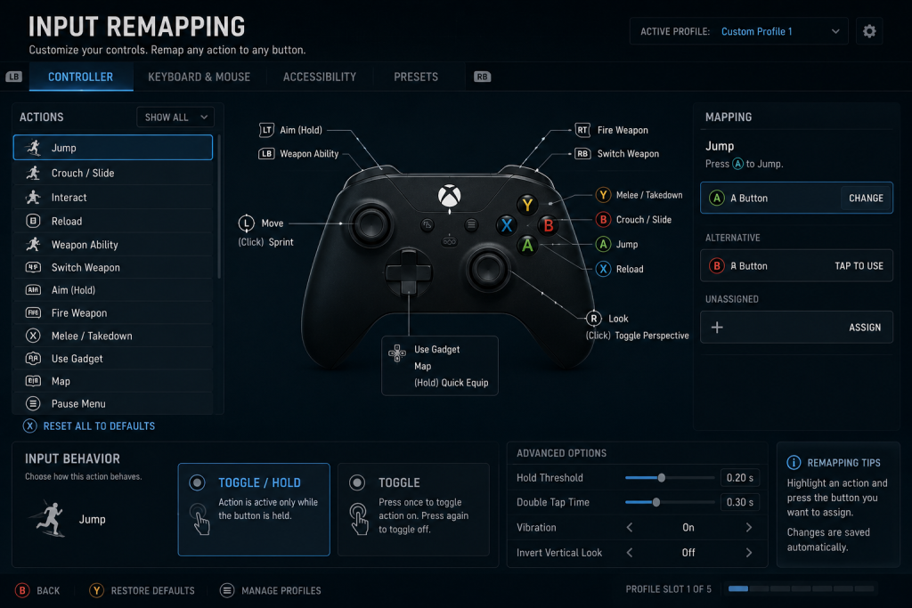
A common reason remapping becomes expensive to add late is that gameplay systems, tutorials, prompts, and minigames get authored around fixed physical inputs – quick-time events, tutorial text referencing a specific key, minigames built around a specific button sequence – each of which then needs individual rework once remapping is requested after the fact. The architectural fix goes deeper than “store bindings as data”: gameplay code needs to reference actions (Jump, Interact) rather than physical inputs (Space, E), with device-specific bindings mapped to those actions separately; on-screen prompts and tutorial glyphs need to read the current binding rather than hardcoding an icon; and the binding system needs conflict validation so two actions can’t silently claim the same input. Games shown at the 2026 Access-Ability Showcase demonstrate how several of these capabilities can appear together at the product level: Jigrift supports keyboard-and-controller rebinding, separate invert options for looking, zooming, and rotation, multiple cursor sizes, and field-of-view adjustment, while Kernel Hearts ships full remapping for controller, keyboard, and mouse alongside adjustable camera sensitivity and inversion.
“Editorial illustration created for visual reference purposes. It does not represent a real project, client work, or official software screenshot unless stated otherwise.”
Assassin’s Creed Black Flag Resynced shows a granular version of this: per-context binding (naval vs. on-foot inputs configured separately), left-handed button swaps, configurable hold/toggle behavior across gameplay actions, independently configurable stick and trigger deadzones, and adjustable haptic strength split by context (gameplay, cinematics, interface). That level of granularity is easiest to deliver when the underlying input system was designed as configurable data from the start – retrofitting per-context deadzone configuration onto a hardcoded input scheme late in production tends to be a substantially larger engineering task than building it in from the first input-handling pass.
Practical architecture checklist:
- Have gameplay logic consume semantic actions (Jump, Interact) rather than physical keys or buttons directly – device-level input handling stays isolated in the input layer, which is what maps a physical key or button to an action in the first place.
- Design any input-dependent minigame or QTE with an alternative input path from the start: support configurable hold/toggle behavior and alternatives to rapid, repeated, or simultaneous inputs, since converting one of these late can affect animation canceling, state machines, and multiplayer balance, not just a settings flag.
- Separate gameplay contexts (on-foot, vehicle/mount, menu) in the binding system so remapping one doesn’t silently break another – and give each context an explicit scope label with conflict validation, so players understand whether a change applies globally or only to one mode.
- Consider including an alternative control preset – left-handed, one-handed, or simplified – so players don’t have to construct an accessible layout from scratch. Where a preset isn’t appropriate for the game, provide full remapping and make sure the remapping menu itself stays operable with alternative inputs.
Where This Intersects the Rest of the UI System
Accessibility requirements also shape the choice between diegetic, spatial, meta, and conventional HUD presentation – we cover those trade-offs in more depth in our guide to diegetic and non-diegetic UI. The production rule that carries over here: whenever a design choice (an in-world UI element, a screen-space effect) creates an access barrier, preserve an alternative presentation path, and plan that alternative alongside the original choice rather than after players report a problem with it.
A useful reference point for existing implementations: Game UI Database’s dedicated Settings: UI & Accessibility category catalogs accessibility-specific screens – contrast options, colorblind settings, and in-game assistance menus – across more than 1,300 games, which is a practical way to survey how different genres and production scales have solved the same underlying problems.
Building It In vs. Evaluating a Vendor’s Accessibility Depth
Everything above is about how to design these systems. A related but separate question is how to tell, from the outside, whether a prospective UI/UX partner can actually execute at this level – which accessibility systems they’ve implemented in shipped production, how they handle the specific features covered here, and what their process looks like before you’re locked into a milestone structure. That’s a vendor-evaluation question rather than a design question, and it’s covered in more depth in our guide to choosing a game UX/UI studio, which walks through the specific checks that separate demonstrated production experience from a polished sales presentation.
How Nasty Rodent Approaches Accessibility in UI Production
Our position is that colorblind, subtitle, and input systems are UI-architecture decisions, planned alongside the first wireframes rather than requested as a late change order. When we scope a UX/UI production engagement, our standard is to flag where a design choice creates an accessibility dependency – a color-only status indicator, a fixed-input minigame, a cutscene without caption space – early enough that addressing it is a design decision, not a rework ticket. If you’re weighing whether to bring a partner in for the full production cycle or coordinate this work internally, that’s worth thinking through separately – see our breakdown of co-development versus outsourcing models. You can see the production standard we hold across shipped titles in our portfolio.