How to Estimate Game UI/UX Scope Beyond Screen Count
-

Written by
-

Updated on04.09.2026
-

Time to read14 min

- Why Screen Count Is Only the Starting Point
- Start With a UI Map, Not a Figma Page Count
- Count Screen Families and Reusable Components, Not Screenshots
- States Add Work at Different Levels
- Platforms and Input Methods Create Variants
- Localization Is a Layout Constraint, Not a Translation Line Item
- Accessibility Requirements Also Affect Scope
- Design Scope and Implementation Scope Are Not the Same
- When to Bring a UI/UX Vendor Into Scoping
- What to Send for a Reliable UI/UX Estimate
- A Simple Scope Worksheet
- What Usually Changes an Estimate
- Production Examples
- Weak Brief vs. Production-Ready Brief
- How We Approach UI/UX Scoping at Nasty Rodent
Game UI/UX scope estimation is the process of turning a game’s interface requirements into a brief a studio can actually plan and price against. Screen count is where most briefs start, but it is only one input among several – reusable components, meaningful interaction states, platforms and input methods, localization requirements, accessibility needs, and delivery depth all shape the real scope of the work. Treating these as interacting factors rather than a single number is what separates a brief that survives production from one that gets renegotiated at the first milestone review.
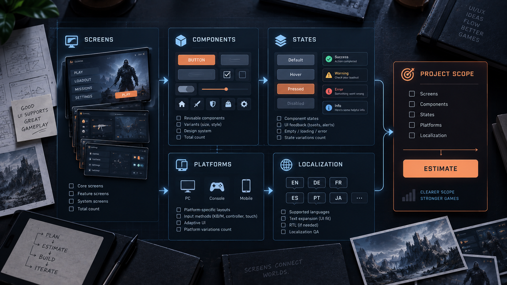
“Editorial illustration created for visual reference purposes. It does not represent a real project, client work, or official software screenshot unless stated otherwise.”
Why Screen Count Is Only the Starting Point
Ask for a UI/UX estimate, and the first number that comes back is almost always a screen count. It is the easiest thing to pull from a feature list, and it is the number every spec sheet has a column for. It is also, on its own, one of the weakest predictors of how much work is actually involved.
A “settings screen” is not one deliverable measured by its screen count alone. The same nominal screen can hide a shallow, single-platform layout or a deep, multi-platform system with gamepad navigation, several languages, and a handful of interaction states layered on top. Two studios can describe what looks like the “same” screen list and mean very different amounts of production work, simply because screen count says nothing about what sits behind each screen.
That gap between what a screen list shows and what it hides is exactly why platform, language, and delivery-depth questions matter as much as the count itself – and why treating them as a checklist to work through, rather than an afterthought, is the difference between a brief that holds and one that needs correcting mid-production.
Start With a UI Map, Not a Figma Page Count
Before screens get scoped individually, it helps to know how they connect. A UI Map – a flowchart of every screen and the paths between them – shows how screens connect, how deep common actions sit, and where dead ends or unnecessary navigation layers appear. We cover how to build one in our production guide to game menu navigation, and the same discipline applies to scoping: a screen that sits three navigation layers deep and is visited once is a very different scope item from a screen a player opens every session.
Scoping straight from a flat screen list, without this structure, is one of the more common ways an estimate misses real complexity – not because anyone miscounted screens, but because the map behind the list was never drawn.
Count Screen Families and Reusable Components, Not Screenshots
A screen list also tends to flatten a distinction that matters for scope: not every screen is a unique design problem, and not every visual instance is a separate screen.
| Unit | What it is | Scope implication |
| Unique screen | A layout with its own structure and purpose (main menu, inventory, settings) | Full design pass required |
| Screen family | Multiple screens sharing one layout and component set (a shop screen used across several item categories) | Shared base design reduces duplicated work, though individual instances can still need adaptation |
| Modal / overlay | A layer that appears over an existing screen (confirmation dialog, tooltip) | Lighter design pass, but its own state set |
| Reusable component | A UI element used across many screens (button, card, list item) | Core design and states can be reused across the screens that share it |
| Data variant | The same layout with different content (200 shop items on one card template) | Mostly content and QA volume, unless the content itself requires a structural variant |
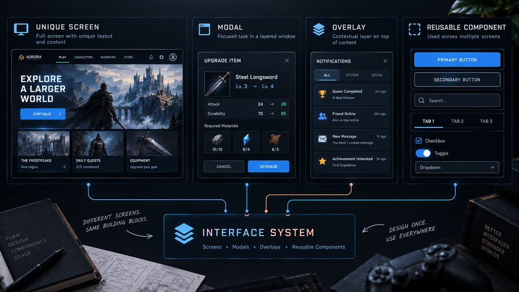
“Editorial illustration created for visual reference purposes. It does not represent a real project, client work, or official software screenshot unless stated otherwise.”
A shop with 200 items and one reusable card template is a very different scope item from 200 individually designed screens, even though both could be described as “a large shop section” in a brief. Separating unique design work from reusable systems and data volume is one of the more reliable ways to keep an estimate honest.

States Add Work at Different Levels
“States” is a useful scoping lens, but it works better broken into the level where a given state actually lives, rather than treated as one flat list applied uniformly to every screen.
Component states live on individual interactive elements: default, focus, hover, pressed, selected, disabled. A button or a list item typically needs a handful of these, and screens that reuse it can inherit the same state logic without redesigning those states from scratch each time.
Screen and data states live at the screen level: loading while content resolves, an empty state before any data exists, an error state for a failed request, sometimes an offline state. Not every screen needs every one of these – a static settings screen may never need a loading state, while a live shop or leaderboard screen usually does.
Game and business states are specific to the interface’s role in the game: locked versus owned, equipped, insufficient currency, claimed versus unclaimed. These tend to concentrate in commerce and progression screens and rarely apply to a main menu.
The useful question at scoping time is not “how many states does a screen need” as a universal number, but which of these three levels actually applies to each screen, and whether a state can be inherited from a shared component instead of designed again from scratch.
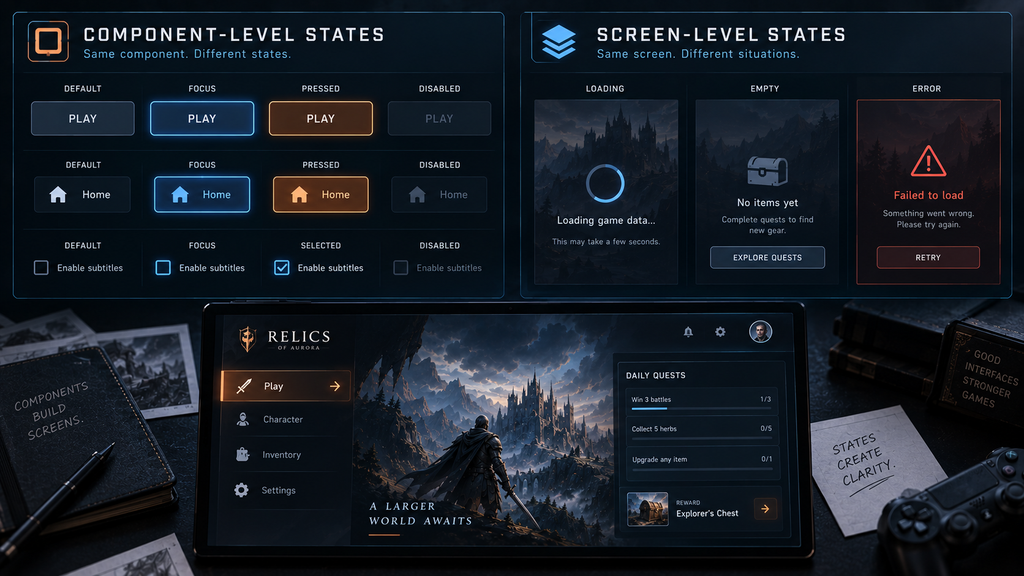
“Editorial illustration created for visual reference purposes. It does not represent a real project, client work, or official software screenshot unless stated otherwise.”
Platforms and Input Methods Create Variants
Platform and input method are their own scope driver, distinct from states, and it is easy to under-scope this axis by treating “add controller support” as a small addition to a mouse-first design.
Different input methods introduce different interaction requirements rather than a uniform multiple of the same states. Mouse interaction typically relies on hover and click. Controller and keyboard depend on an explicit focus order and navigation logic – which element is selected, and where focus moves next in each direction – that has to be designed deliberately, especially on grids and multi-column screens. Touch removes hover almost entirely and introduces its own constraints around target size and gesture behavior instead. These are three different sets of design decisions to inventory, not three identical copies of the same interaction states stacked on top of each other.
Platform brings its own layer on top of input: safe areas and overscan for television output, resolution scaling from a Steam Deck to a 4K display, and input-device-specific button prompts that need to update correctly when the active input device changes. Retrofitting a mouse-first layout for a controller after the fact is one of the more common ways a UI budget grows beyond its original estimate – designing focus and navigation in from the start is usually the cheaper path.
Localization Is a Layout Constraint, Not a Translation Line Item
Localization is the axis most likely to be under-scoped, because it reads as a translation task rather than a layout task. German commonly runs noticeably longer than its English equivalent, which is enough on its own to clip a button label or push an adjacent element out of a safe area in a layout that was only ever tested in English. The amount of expansion varies by language, string length, and context, which is why testing representative target-language strings – or a pseudolocalization pass – catches far more than reserving a single fixed percentage across every language.
Right-to-left languages such as Arabic and Hebrew typically require a mirrored layout and adjusted logical navigation alongside the translated text, though not every element mirrors automatically – directional icons need individual review rather than a blanket flip, and elements like logos or media-control icons are often left alone. CJK languages introduce a different kind of validation: glyph coverage, font fallback, and line-breaking and density behavior that a layout tuned for Latin script does not automatically handle.
None of this is a reason to treat localization as a late-stage pass. We go deeper into how localization issues surface at certification in our guide to console-ready UI outsourcing, where testing against real target-language strings before a build is locked – rather than after – is what keeps a layout problem from turning into pre-certification rework.
Accessibility Requirements Also Affect Scope
Accessibility is easy to leave out of an initial screen list, but it changes layout decisions in the same way localization does, and it is cheaper to design in from the wireframe stage than to retrofit later. Scalable text that reflows rather than overflows, sufficient color contrast against the game’s actual backgrounds rather than a neutral test background, and never signaling state through color alone are layout-level decisions, not a checklist applied after visuals are locked. Reduced-motion alternatives and remappable controls add their own review pass on top. None of this needs a separate accessibility phase bolted onto the end of a project – it belongs in the same scoping conversation as platforms, states, and localization, because it touches the same layouts.
Design Scope and Implementation Scope Are Not the Same
The same interface architecture can mean very different amounts of work depending on what “delivered” means. A wireframe and flow map is one deliverable. High-fidelity mockups in Figma are another. A documented design system with components and states ready for a team to build from is a third. Exported, engine-ready assets – atlases, sliced panels, icon sets at the right densities – are a fourth. And UI assembled directly inside the engine, whether that is UMG in Unreal or UI Toolkit in Unity, is a different scope again, one that depends on engine familiarity as much as design skill.
A brief that says “UI design for 20 screens” without specifying which of these outputs is expected leaves the biggest variable in the estimate undefined. Whether an existing design system already exists to extend, or the project is starting from a blank slate, changes this further – extending established rules for type, spacing, and component behavior is reliably faster than defining them for the first time. That assumes the existing system is coherent enough to extend; inconsistent or poorly documented legacy UI can add audit and migration work of its own before extension is even possible.
When to Bring a UI/UX Vendor Into Scoping
Some teams can scope and execute UI/UX work in-house, particularly with a senior designer who already has shipped-game experience and a stable, well-understood feature set. Where that changes is less about a screen-count threshold and more about which of the drivers above the team is actually equipped to reason about: an unfamiliar platform, a language list that includes right-to-left or CJK scripts for the first time, or accessibility requirements tied to a certification standard the team hasn’t worked against before are the kinds of gaps that are hard to see until they surface in production.
We go through the fuller in-house-versus-outsourcing decision, including where a hybrid pattern fits, in our technical checklist for choosing a game UX/UI studio. The short version for scoping purposes: bringing in outside expertise earlier in the brief, rather than after an in-house estimate has already been committed to a schedule, can catch a scope gap before it turns into implementation or schedule rework.
What to Send for a Reliable UI/UX Estimate
A scope brief that actually holds tends to answer the same set of questions, regardless of who is doing the estimating:
- Screen or feature list – even rough, it defines the shape of the scope.
- Platforms and input methods – gamepad support is a design discipline, not a checkbox.
- Target languages – the exact list, not just a count, since which languages matters more than how many.
- Engine and required output – mockups, exported assets, or UI assembled in engine.
- UI types in scope – diegetic and spatial elements involve 3D production, not just layout.
- Existing design system or art bible – extending rules is faster than defining them from scratch.
- Accessibility requirements – any certification or publisher standard that applies.
- Existing UI to replace or extend – a redesign and a greenfield build carry different risks.
- Deadline – a fixed date changes team size and parallelization, not only the schedule.
This is the same set of inputs our UI/UX team works from when scoping a project, because leaving any one of them out is what usually turns a confident-looking estimate into a mid-production correction.
A Simple Scope Worksheet
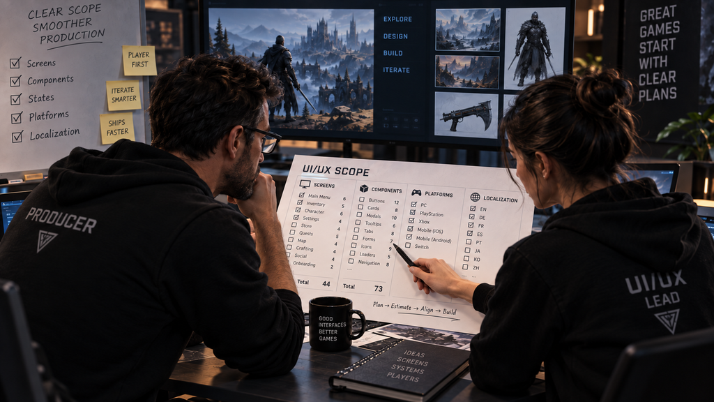
“Editorial illustration created for visual reference purposes. It does not represent a real project, client work, or official software screenshot unless stated otherwise.”
| Feature | Screen family | Reusable components | Meaningful states | Platforms / inputs | Localization risk | Output level |
| Main menu | 1 | Nav bar, button | Focus, pressed | KBM, gamepad | Low – short labels | Hi-fi mockup |
| Shop | 1 (many items) | Item card, currency label | Loading, empty, insufficient funds | KBM, gamepad, touch | Medium – price/label expansion | Assembled in engine |
| Settings | 1 | Toggle, slider | Focus, disabled | KBM, gamepad | Low | Design system + assets |
This table is an illustrative example of how to structure a brief, not a Nasty Rodent rate card or a claim about any specific project’s real numbers.
What Usually Changes an Estimate
A handful of changes reliably move a UI/UX estimate after it has already been agreed: a platform or input method added after the design has started, a language added late enough that layouts were never tested against it, a request to move from mockups to fully assembled in-engine UI, or an accessibility requirement introduced after visuals were already signed off. None of these are unusual requests on their own – the risk is in when they arrive relative to when the scope was locked.
Production Examples
Wave Master, developed by Banner Games, is a useful public example of what sits behind a UI/UX engagement in practice. Nasty Rodent partnered with Banner Games on the game’s UX/UI design and supporting graphic assets – on this project, the interface was not one workstream among several, it was the primary deliverable. The public case does not disclose an exact screen, state, or localization count, so those figures should not be inferred from it.
Bubble Quest of Vikings illustrates a different engagement shape. Nasty Rodent contributed UI as part of the game’s broader full-art production for Whaleapp LTD, alongside concept design, characters, environments, and visual effects. That makes it a useful example of why UI scope has to be separated out from adjacent art-production scope in a brief, rather than folded into a single “art production” line – even when one vendor delivers both. As with Wave Master, the public case does not disclose screen, state, or localization figures for the UI portion of the work.
Weak Brief vs. Production-Ready Brief
| Weak scope brief | Production-ready scope brief | |
| Screens | Screen count only | Screens plus reusable components and screen families |
| States | Not mentioned | Meaningful states identified per screen, by level |
| Platform | “Console” | Named platforms plus actual input methods |
| Languages | “8 languages” | Exact target language list |
| Scope of work | “UI design” | Defined output level (mockup, assets, in-engine) |
| Existing system | Not mentioned | Existing design system or greenfield explicitly stated |
A weak brief is not necessarily dishonest – it is usually just incomplete, missing inputs that were never asked for. The fix is asking for the fuller list before a number is agreed, not distrust of whoever wrote the first draft.
Not sure where your UI/UX scope actually stands? Send us your screen list and the inputs above, and we’ll walk through the scope drivers with you at sales@nastyrodent.com before putting a number on it.
How We Approach UI/UX Scoping at Nasty Rodent
At Nasty Rodent, scoping starts with the same inputs this article walks through, gathered before a single wireframe is drawn. If you’re weighing how UI/UX work should connect to your team’s own pipeline, our breakdown of UI/UX co-development versus outsourcing covers the engagement-model side of that decision.