
Player Retention Through UX Design: What Actually Moves the Curve
-

Written byDenys Zadoienyi
-

Updated on22.09.2026
-

Time to read14 min

- Retention Is an Outcome Metric, Not a UX Diagnosis
- Where the Business Impact Actually Shows Up
- The First Session Sets the Ceiling, Not the Floor
- What Keeps Players Past Week One: Pacing, Legibility, and Reward Feedback
- Diegetic vs Non-Diegetic UI: The Readability–Immersion Trade-Off
- Build vs Buy: Fixing Retention UX Without a Dedicated Team
- The Hidden Cost of the DIY Retention Fix
- Three Thresholds Where DIY Stops Being the Cheaper Option
- Production Examples: What Public Work Can Actually Show
- Quick Diagnostic Questions: Is Your Retention Problem Actually a UX Problem?
- Choosing a Partner for Retention-Focused UX Work
- Getting Retention Right Without Guessing
“Editorial illustration created for visual reference purposes. It does not represent a real project, client work, or official software screenshot unless stated otherwise.”
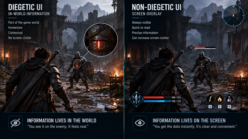
A studio ships an FTUE redesign, watches Day-7 retention move a few points, and nobody can say for certain whether the interface fixed it, a balance patch fixed it, or a marketing push changed who installed the game that week. This is the ordinary condition of retention work, not a failure of measurement discipline – UX sits inside a system with content cadence, matchmaking, monetization pacing, and server stability all pulling on the same curve at once. That entanglement is exactly why UX deserves a more careful accounting than it usually gets, not a less careful one. This guide is about the part of the retention problem that interface decisions can influence: what that contribution looks like, how to isolate it from the rest of the system, and where a producer should draw the line between a UX fix and a content problem wearing a UX costume.
Retention Is an Outcome Metric, Not a UX Diagnosis
D1, D7, and D30 indicate whether members of an acquisition cohort return around those respective retention horizons. Teams commonly read them as rough signals of early activation, mid-term engagement, and longer-term habit formation, but each one can reflect several systems moving at once, not a single cause. D1 is usually the horizon most exposed to first-session UX, because onboarding, information clarity, input friction, and early feedback all concentrate there – but it is still not a UX-only number: acquisition quality, performance, core gameplay, difficulty, and how well the game matched the store page’s promise can move the same metric as well. D7 sits further from pure UX territory, sharing the stage with early content depth, matchmaking quality, and the first meaningful progression unlock. By D30, UX is one contributor among a much broader set of drivers – content depth, progression, social systems, live-ops cadence, and core-loop strength carry most of the weight, though UX for returning-player flows, navigation, and event discoverability still matters.
This nuance matters because a widely repeated claim in onboarding literature states that progressive, well-paced onboarding produces Day-7 retention gains in the 15–25% range. That figure circulates across enough vendor blogs and hiring guides that it reads as settled fact. It should not be treated as an industry benchmark: the public examples behind it are project-specific, typically involve several simultaneous changes, and make it difficult to isolate FTUE or onboarding as the sole cause. Use your own before-and-after cohort data or a controlled experiment instead of importing a borrowed percentage as an expected result – that approach is covered later in this piece.
Where the Business Impact Actually Shows Up
For a producer planning a live-ops or mid-core title, the retention-UX connection has two concrete costs attached to it. First, a missed onboarding milestone rarely stays contained: when a first-session flow fails a playtest late in production, the fix touches HUD sequencing, tutorial scripting, and often a cinematic beat at once, which is a cross-team rework, not a single ticket. Second, every week spent diagnosing “is this a UX problem or a content problem” is a week the live-ops calendar doesn’t get, because the team responsible for the next content drop is the same team investigating the retention dip.
For an art director, the same problem shows up differently: a HUD or onboarding element that reads clearly in isolation can still fail once it collides with the game’s actual pacing, lighting, or platform constraints, and that failure may only become visible after release – through usability complaints, player feedback, or a shift in behavioral metrics that’s much harder to trace back to its source than it would have been at review time.
Both angles point to the same operational lesson – retention-UX problems are cheapest to catch before a milestone gate closes, not after a live cohort tells you something is wrong.
The First Session Sets the Ceiling, Not the Floor
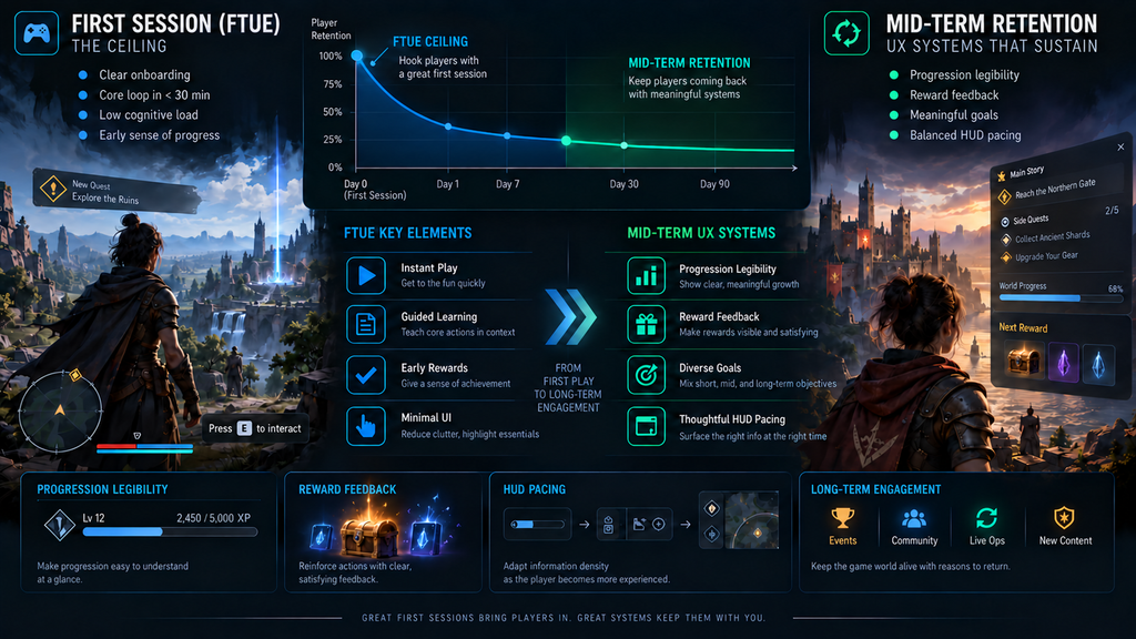
The first session determines how many players are even eligible to be retained past Day 7 – it sets a ceiling on everything downstream, but it is not itself where most of the retention work happens. A player who bounces during onboarding never reaches the systems that would have kept them past week one, no matter how strong those systems are. This is the argument for treating onboarding as a distinct production discipline with its own deliverables, sequencing, and testing pass, rather than folding it into general UX polish. Our production-focused breakdown of onboarding and FTUE design covers that side in depth – the push-versus-pull revelation problem, HUD introduction sequencing, and what a production-ready onboarding spec actually contains. This piece assumes that first-session groundwork is either already solid or already being handled, and focuses on what keeps a player around after the ceiling has been raised.
The distinction is worth holding onto at brief-writing time: a producer who diagnoses a Day-7 problem and asks for “a better tutorial” may be jumping to a solution before the affected layer has been identified. A tutorial that plays perfectly can still ship next to a Day-7 curve that stays flat, because the tutorial was never where the Day-7 problem lived.
“Editorial illustration created for visual reference purposes. It does not represent a real project, client work, or official software screenshot unless stated otherwise.”

What Keeps Players Past Week One: Pacing, Legibility, and Reward Feedback
Once a player survives the first session, retention becomes a question of whether the interface keeps confirming that continuing to play is worth the player’s attention. This is where extraneous cognitive load becomes a useful UX hypothesis rather than an abstract principle: if players spend unnecessary effort interpreting interface state instead of making gameplay decisions – an ambiguous icon, inconsistent color coding for threat versus opportunity, a minimap that requires interpretation rather than glance-reading – that friction can contribute to fatigue, errors, and disengagement over a session, not just within one. Our deeper treatment of player psychology in game UX walks through the cognitive mechanics – flow states, working-memory limits, and how reward-loop feedback either reinforces or undermines them – that sit underneath this pattern.
Nielsen Norman Group’s research on onboarding tutorials versus contextual help found that forced walkthroughs in application UX get skipped often, get remembered poorly once dismissed, and don’t reliably improve how well someone performs the task afterward. That finding comes from application UX, not games, but it offers a useful analogy: intrusive, out-of-context guidance – a forced mid-session pop-up, an unrequested HUD callout – can interrupt a player’s current goal in the same way. Game teams still need to validate the effect inside their own interaction loop rather than assume the finding transfers unchanged.
Three UX areas worth investigating in mid-term retention work are:
- Progression legibility. Can a player tell, at a glance, how close they are to the next meaningful unlock? A progression system that is mechanically generous but visually opaque can produce disengagement similar to a genuinely slow one, because the player’s perception of pace can influence the decision to keep playing even when the underlying progression math is generous.
- Feedback latency and clarity. The gap between an action and its visible consequence is a UX variable, not a purely technical one. A delayed or ambiguous hit-confirmation, loot notification, or rank-up animation can read as “nothing happened,” even when something did.
- Session-end framing. Does the player leave with a clear understanding of what they achieved, what remains available, and what they can meaningfully pursue next time? An ambiguous or abrupt session end leaves that question unanswered.
These systems extend beyond onboarding and often become more important as the player encounters deeper progression and repeat-session loops. They are also cheaper to test with a structured playtest pass than to diagnose from a live retention dashboard weeks after launch.
Diegetic vs Non-Diegetic UI: The Readability–Immersion Trade-Off
“Editorial illustration created for visual reference purposes. It does not represent a real project, client work, or official software screenshot unless stated otherwise.”
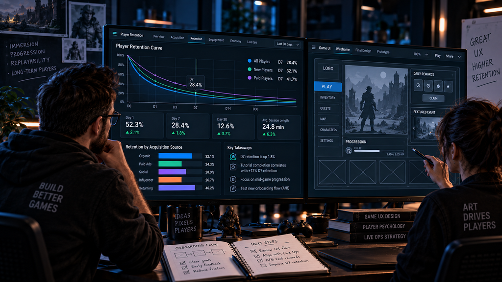
One UX decision that can influence both readability and immersion is whether a given piece of feedback – a health warning, a resource counter, a mission update – lives inside the game world (diegetic) or floats above it as an overlay (non-diegetic). Diegetic choices preserve immersion, and immersion is plausibly connected to the longer-horizon retention story, though the link runs through player investment rather than being a direct, measurable effect of the UI choice itself. Diegetic elements also carry a legibility risk that non-diegetic overlays don’t – a warning light embedded in a cockpit dashboard has to compete with lighting, camera angle, and distance in a way a fixed-position HUD icon never does. Our breakdown of diegetic and non-diegetic UI design principles covers the four-type framework for making that call deliberately rather than as a studio-wide stylistic default. For retention purposes, the practical rule is narrower than a full style philosophy: reserve diegetic framing for moments that build emotional investment, and keep anything a player needs to read under time pressure – health, ammo, an objective that’s about to expire – in a format that doesn’t ask them to hunt for it in the world first.
Build vs Buy: Fixing Retention UX Without a Dedicated Team
A team with UX capability, access to player behavior data, and enough production capacity can often investigate a well-scoped retention-related UX problem in-house. The practical setup varies by team: the important part is working from a defined list of suspected friction points, validating those hypotheses through telemetry or observed player behavior, and measuring the result after a targeted revision. For a single, well-scoped problem – a confusing HUD icon, a reward notification that reads as silent – this is entirely achievable without outside help, and plenty of studios run exactly this loop successfully.
The honest complication shows up when the problem isn’t singular. A team diagnosing “Day-7 feels soft” without a clear hypothesis is running an open-ended investigation, not a scoped fix, and that investigation competes directly with whatever content the same designers were supposed to be shipping that sprint.
The Hidden Cost of the DIY Retention Fix
The categories below are not Nasty Rodent benchmarks or a specific client’s numbers – actual duration and cost depend on team size, platform count, hiring market, and existing testing infrastructure, none of which a general guide can responsibly quantify. Use the list as a planning checklist for your own estimate, not as a citable figure.
| Hidden cost category | What it looks like in practice |
| Designer time diverted from content | UX investigation work displaces whatever content or feature milestone the same designer was otherwise assigned to |
| Technical debt from rushed fixes | A HUD patch shipped without full state-tracking support can need a second pass once edge cases surface in live telemetry |
| Recruitment cost if the gap is structural | Hiring and ramping a dedicated UX designer, if the team concludes it needs one rather than a one-off fix, adds recruitment and onboarding overhead on top of the fix itself |
| Opportunity cost of a wrong diagnosis | A sprint spent adjusting UX when the real driver was matchmaking quality or content pacing is a sprint the retention curve doesn’t recover from being spent elsewhere |
| Playtesting infrastructure gap | Teams without a standing playtest panel often discover the need mid-investigation, which delays validating whether the fix actually worked |
Three Thresholds Where DIY Stops Being the Cheaper Option
- Scope threshold. If the suspected issue spans several connected UX systems – HUD legibility, progression pacing, and reward feedback together – changes become harder to isolate and validate independently.
- Team-availability threshold. If investigating the issue repeatedly displaces planned product or content work, external capacity may become the more economical option.
- Diagnostic-confidence threshold. If the team cannot formulate a single, testable UX hypothesis for the drop, more discovery work is needed before a redesign is scoped. That discovery can be handled internally or with an external UX partner – the point is running it deliberately rather than guessing and measuring.
Production Examples: What Public Work Can Actually Show
We don’t publish client retention figures, and readers should be skeptical of any vendor content that implies undisclosed cohort results without naming the engagement. What we can point to is the UX/UI production discipline itself, on record:
Wave Master, for Banner Games. Nasty Rodent partnered with Banner Games on the game’s UX/UI design and its supporting graphic assets. On this project the interface wasn’t one workstream among several – it was the primary deliverable. No retention metrics are published for this engagement, and none are implied here; it stands as evidence of UX/UI production depth, not a retention case study.
Bubble Quest of Vikings, for Whaleapp. Bubble Quest of Vikings is one of the mobile free-to-play titles Nasty Rodent has contributed stylized production work to, alongside broader asset categories for the same client base. As with Wave Master, no retention figures are attached to this work publicly, and this reference is included as production context, not as a performance claim.
The honest takeaway: a vendor’s ability to talk fluently about retention-relevant UX systems is a reasonable thing to evaluate at selection time. A vendor’s claim to have moved your specific retention number, without a disclosed and attributable case, is not.
Quick Diagnostic Questions: Is Your Retention Problem Actually a UX Problem?
Answer each honestly before scoping a fix:
- Can you name the specific screen or system where players are dropping off, or only the day-number where the curve softens?
- Has your team shipped a content or balance change in the same window as the retention dip, unaccounted for in your analysis?
- Do support tickets or streamer footage mention confusion, or only difficulty complaints?
- Is your progression system’s pacing visible to a new player within their first three sessions, or does it require reading patch notes to understand?
- Have you compared retention across platforms, or only looked at an aggregate number that could be masking a platform-specific UI failure?
- Does your team already have access to suitable playtest participants, or would participant recruitment and test setup delay validation?
- Can your UX-capable designer state a single hypothesis for the drop, or are they still exploring several at once?
- Is the suspected fix scoped to one UX system, or does it touch HUD, progression, and reward feedback simultaneously?
There is no universal score for this list. The goal is to determine whether your team has a specific, testable UX hypothesis, or only a retention symptom that still needs root-cause investigation before anyone scopes a fix. If most of your answers point to “we’re not sure yet,” that uncertainty – not the fix itself – is what an outside audit is for.
Choosing a Partner for Retention-Focused UX Work
Retention-focused UX work asks something slightly different of a vendor than a general UI overhaul does: the studio needs to be comfortable working backward from ambiguous metrics to a specific interface hypothesis, not just executing a defined visual brief. If you’re evaluating outside partners for this kind of engagement, our checklist for choosing a game UX/UI design studio covers the shipped-portfolio and process questions that separate a vendor who can run this kind of diagnostic work from one who only executes a settled spec.
Getting Retention Right Without Guessing
The teams that move a retention curve deliberately, rather than by accident, share one habit: they treat “why did this number move” as a question with a specific, falsifiable answer, not a vibe to be addressed with a general polish pass. That means separating the first-session ceiling from the mid-term sustaining systems, distrusting round industry percentages that arrive with no cohort data attached, and running a scoped diagnostic before committing a sprint to a fix. Retention UX is not a mystery discipline – it is a small number of legible systems, tested against real player behavior, with the honesty to admit when the dip in front of you isn’t a UX problem at all.
If your team is looking at a softening retention curve and isn’t sure whether the fix belongs to UX, content, or somewhere else entirely, we can review your onboarding-to-mid-game flow and give you a concrete read on where we’d start looking.